Portfolio State of Origin Designs (by Bowakawa)

Remove this Banner Ad

Re: Bowakawa's State of Origin

Southern Cross is probably the opposite of what you're arguing though. Multiple sporting organisations, and for that matter nations, identify with it - New Zealand, Papua New Guinea, Samoa and Brazil all have Crux on their flags.

Like I suggested before, it's interesting to compare the NT/Uluru argument with the Victoria/Melbourne skyline argument in the TWP competition thread.
I was making a point that the southern cross is on our flag, and that is seen as a symbol of us.
 
Re: Bowakawa's State of Origin

If colour was the criterion, State of Origin would replace the AFL.:thumbsu:
 

Log in to remove this ad.

Re: Bowakawa's State of Origin

they all look great mate, continue the tremendous work :thumbsu: !!
Thanks a lot :)

Alright, here's the final installment... or is it :cool:
(by that I mean if I think of a cool idea for New Zealand, I'll probably put it up here)

South Australia!
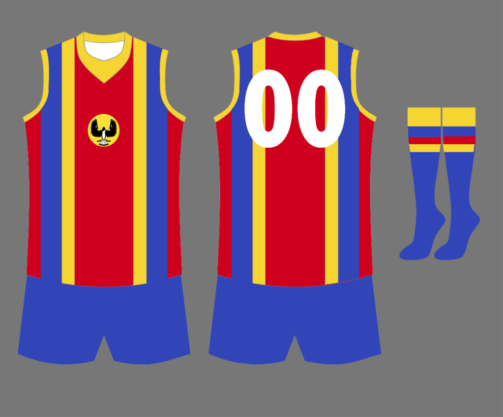
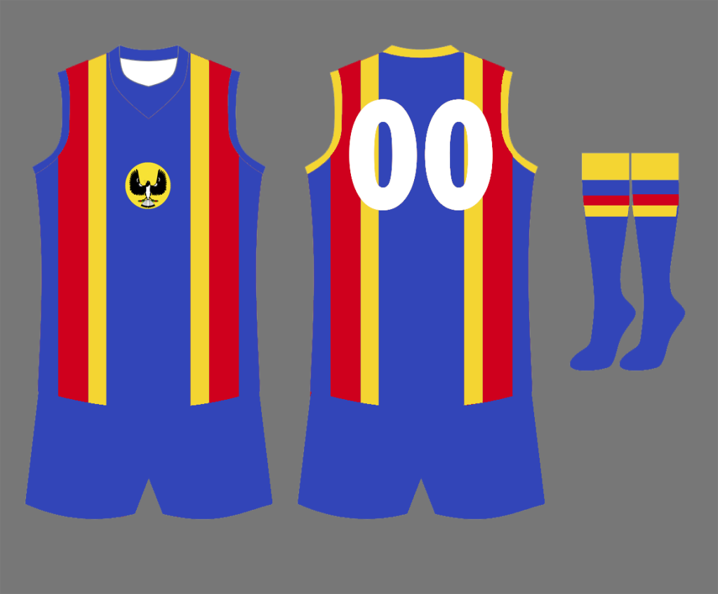
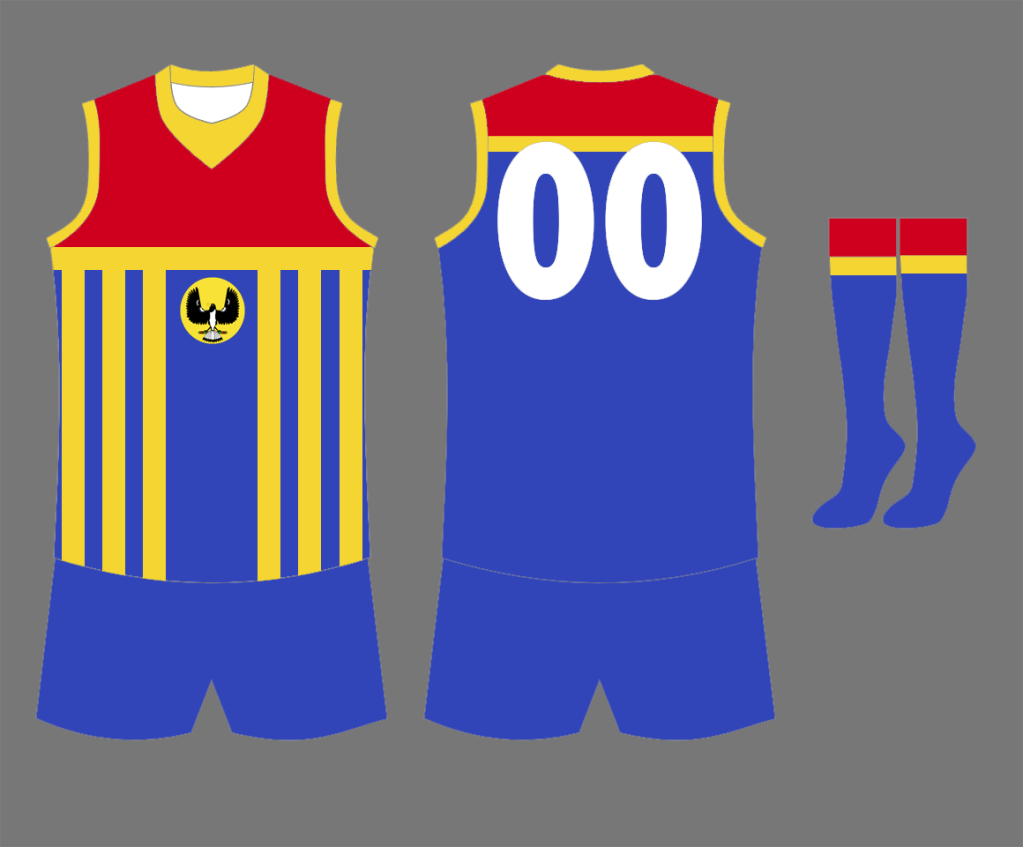
I decided to move away from the 2-vee design SA used in their later years competing in State of Origin, and created a design 'inspired' by the one they used in the 70s and most of the 80s.
I lightened the shade of blue so it wouldn't be too reminiscent of the Adelaide Crows, and added a Prison-Bar heritage so it'd represent Port Adelaide too, the State's most history-rich club.

Home:
SA1.png


Blue Alternative:
SA2.png


Prison Bar Heritage:
SAprisonbar.png
 
Re: Bowakawa's State of Origin

Yeah agree with Andonis, you cant get rid of the V's
 
Re: Bowakawa's State of Origin

These are good designs, but TBH, I'd rather the V's. :eek:

Yeah agree with Andonis, you cant get rid of the V's
Yeah, the Vees are a good design, but my aim for the thread was to take modern takes on the traditional State of Origin guernseys, but still make them look like they could fit in the others. I think to change it up for all the other teams but to leave South Australia with their two Vees just where they left off would be a bit of a cop-out, although I was seriously tempted to do that... it was hard to make a design that differentiated itself from South Australia's previous guernseys, haha.
 
Re: Bowakawa's State of Origin

Yeah, the Vees are a good design, but my aim for the thread was to take modern takes on the traditional State of Origin guernseys, but still make them look like they could fit in the others. I think to change it up for all the other teams but to leave South Australia with their two Vees just where they left off would be a bit of a cop-out, although I was seriously tempted to do that... it was hard to make a design that differentiated itself from South Australia's previous guernseys, haha.

Yeah, it's hard to differ from a team/state which has stuck wiith a certain design for a while. Don't worry, I know what you mean :thumbsu: I do like the prison bar idea though :thumbsu:
 

(Log in to remove this ad.)

Remove this Banner Ad

Back
Top