ClarkeM
Wonders 🏆🏆🏆🏆
- Mar 14, 2007
- 53,921
- 50,566
- AFL Club
- Collingwood

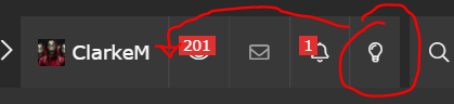
Minor suggestion.
Can we please move the Dark Mode Light button at the top to the left of the watched threads instead of on the right side of the notifications button.
Misclicking notifications and hitting dark mode is annoying - maybe just me but I seem to do this a lot. Then have to click it again to get it back to Dark Mode, just annoying.