Smoooothy
SACK THE LOT OF THEM!
- Jan 12, 2005
- 24,313
- 22,287
- AFL Club
- Adelaide
- Other Teams
- North Adelaide; ConeyIslandWarriors
can we ban this flog yet?
Follow along with the video below to see how to install our site as a web app on your home screen.
Note: This feature may not be available in some browsers.
can we ban this flog yet?
forgive me, but your track record for posting absolute bollocks leads me to think you are a trollSo you just ban me because i don't share your opinion and or agree with every thing you say at pat you on the back?
forgive me, but your track record for posting absolute bollocks leads me to think you are a troll
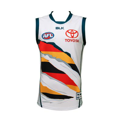
it's not great, but its not horriblebut surely you agree the new clash guernsey isn't up to scratch?
it's not great, but its not horrible
I actually think its good. I like the more modern take. I think it will look awsome on game day. Surely you agree?but surely you agree the new clash guernsey isn't up to scratch?
I actually think its good. I like the more modern take. I think it will look awsome on game day. Surely you agree?
...they won't look professional out there
Next time i think the club should let the fans come up with a design and have a vote on it like the SANFL guernsey.
The fans know what they want.
oh God no!
I fear we may have pulled the trigger a year early, Jimmy ain't here yet, isn't that the only reason they employed her there in the first place?
I keep on thinking swim between the flags.Can I just say that I don't think the latest clash guernsey is that bad, not good but not bad either, certainly not bad enough to get me worked up over it. Although I do like the following rendition from NikkiNoo.
What I really don't like are the side panels on our main guernsey!
I know, the lines they put down the side make them sorta look like a flag pole and the claw marks are wind socks or something.I keep on thinking swim between the flags.
I think I was referring to the home guernsey. With the side panels the red and gold look like the life saving flags.I know, the lines they put down the side make them sorta look like a flag pole and the claw marks are wind socks or something.
absolutely. The adelaide now news story also has a few subtle digs at our clash guernsey with quotes like 'still feels like a traditional football guernsey' and 'the beauty of our three jumpers is that they are all to a consistent design'Yeah the ferals teal Guernsey is a shocker yet its still better than our abomination.
no where near the worst. murder of crows had it covered easily
What I really don't like are the side panels on our main guernsey!
exactlyThe murder of crows is your classic example of designing something which looks okay on a computer screen but terrible in real life. I really like all the idea of using a murder of crows but those tiny details are impossible to spot when your actually watching the footy. Also probably doesn't help that the television networks in Australia are stuck in the dark ages of standard definition.