maybe something similar to this?Totally agree, I think it would be good for the club to try a few designs while it is young. Soccer do it all the time and I would love to see a all black or Crows dark blue with the GC logo. The first ever members cards in 2009 had this and it looked wicked.
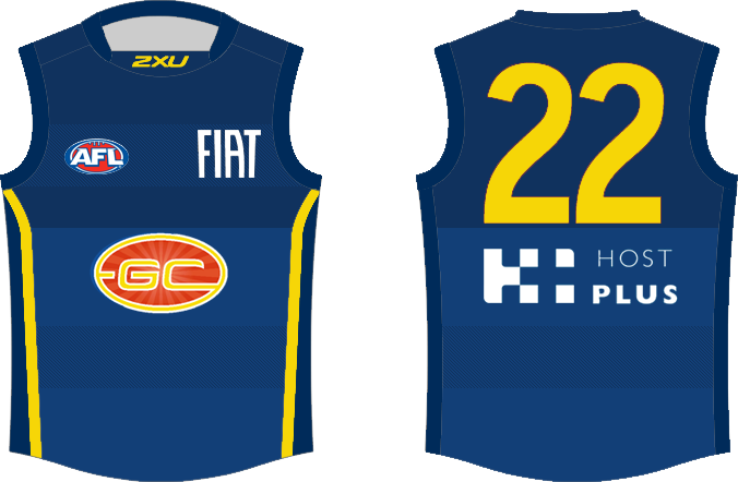
tried to base it off the argentina soccer team's away kit.
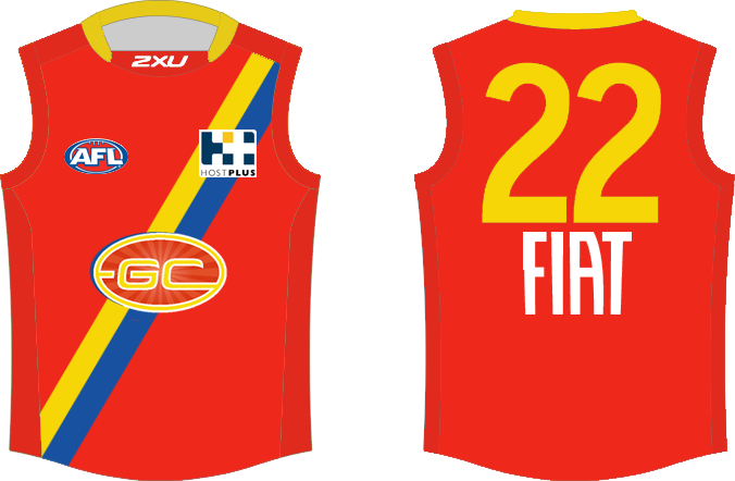
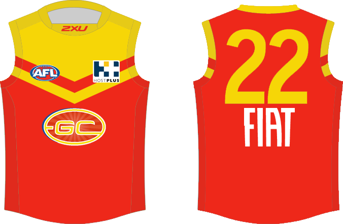
did up another couple random designs tonight after finding some inspiration.