General Bombers Talk Potential change to Heritage Guernsey?

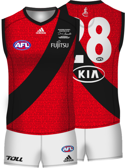
What will the new 'Heritage Guernsey' look like?


  • Total voters
    13
  • Poll closed .

Remove this Banner Ad

This one would be the best if they want to maintain the heritage jumper IMO. Would be one of the best away jumpers in the AFL.
140272_d1b165474eb5d7c65ed24e60d4b44606.png


Posted by Stewart2Austin

This one with the monogram in the middle would be interesting.
 
AC Milan is irrelevant to discussion because the laws enforced by UEFA state that: "In order to minimise colour clashes, a team's first-choice and second-choice kit must differ visibly and contrast with each other."

Also, you're comparing a team that's apart of a 18 team league to a 454 team union

And not forgetting that soccer shirts have the club emblem on the breast so, regardless of colours and patterns, there is always that as the defining characteristic of the shirt. We don't have that in AFL, so the nearest thing to keeping the 'Essendon' in the jumper is the red sash.

Just my two cents, anyway.
 
Blah blah not a real supporter blah blah tradition blah blah move with the times etc etc.

There is more than the black jumper with red sash that makes Essendon however there is nothing wrong with tradition either.

The whole degradation of conversation whenever this topic is discussed is boring.

I don't mind the blast sash with red because the colors are same and it's better than the grey.

I understand why some care but I think the colors are the most important thing.
 

Log in to remove this ad.

I'll return to what I always say...

Clashes really weren't an issue once. It's been whipped up into one.

Started watching footy in the B and W era of TV's. Never had an issue differentiating teams.
 
That jumper looks super classy. Just a bit thinner sash and black lining around the neck and arms would be perfect as previously mentioned. On another note though, I know people think caring so much is stupid. But don't you think Essendon fielding a jumper with a red sash for the last 120 is kind of cool? It's a good tradition.
 
personally I reckon that looks awesome. The sash could be a bit thinner, but I don't mind the aesthetic at all, and as for the EFC logo, why we don't make more use of that I have no idea, it's so good

It'd be one of those rare occasions they could do an entire merchandise line on it, re-hashing all the same stuff and it would be a good thing.
 
I thought the reason we went with grey in the jumper, was red being identified as a dark colour by the AFL.

How that makes grey acceptable, I'm not so sure.

As staunch as some are that we should never have been forced into clash strips - I say that now it's a requisite that we milk the cow for all it's worth. Lets be the first side to have multiple clash strips for the season. MLB and NFL have throwbacks. NHL have third unis. We could have one for each round.

The green jumper has somewhat piqued my interest. I did find it funny that the shortened URL had ump and clash strip in the title... because no one would want to clash with the umpires shirts.
 
I think everyone is missing something here. It sounds like we've had a bit of a 'win' with our discussions with the AFL. If it was something as simple as an inverted sash then it wouldn't have taken 'a few months of discussions'.
It's ridiculous, but simply having the League admit that if Gold Coast and Footscray can use red as a "light" colour, so can Essendon, that counts as a win.
 
It's ridiculous, but simply having the League admit that if Gold Coast and Footscray can use red as a "light" colour, so can Essendon, that counts as a win.
Well those teams both have white jumpers as well but Gold Coast and Sydney can wear their red jumpers against St.Kilda, Melbourne, Richmond, Port Adelaide and Fremantle which are the teams that the AFL says we clash against.
Although, I get the feeling that the AFL only said that red isn't an appropriate colour so we'd stop wearing the fat sash.
 

(Log in to remove this ad.)

Back
Top