Klim
Brownlow Medallist
- Sep 17, 2013
- 12,532
- 10,363
- AFL Club
- Sydney
All look horrible. Plus I don't think they'll give them a stock template.
Follow along with the video below to see how to install our site as a web app on your home screen.
Note: This feature may not be available in some browsers.
All look horrible. Plus I don't think they'll give them a stock template.
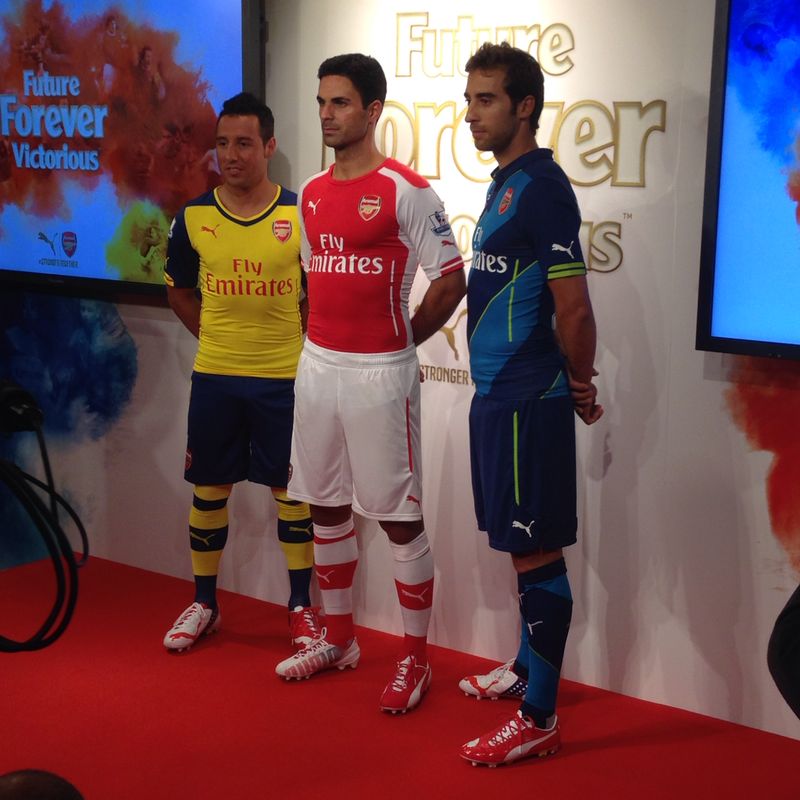
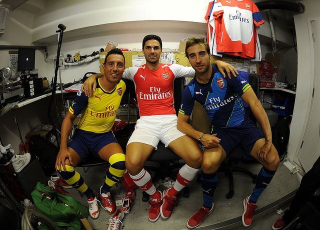
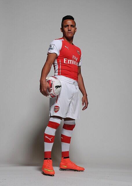
Should have waited for Sanchez to arrive.
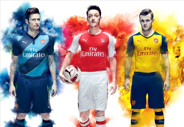
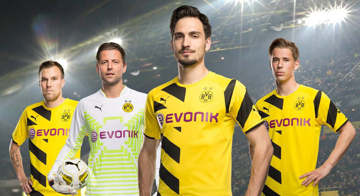
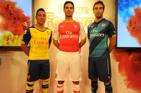
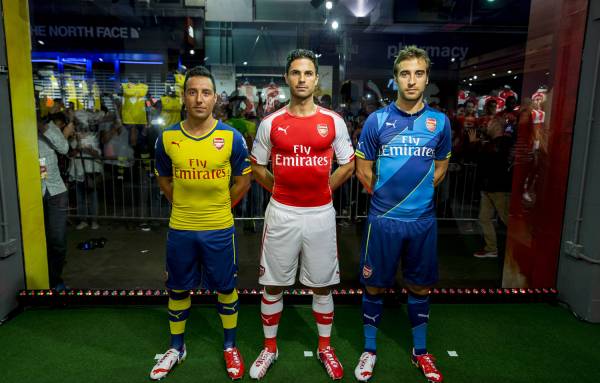
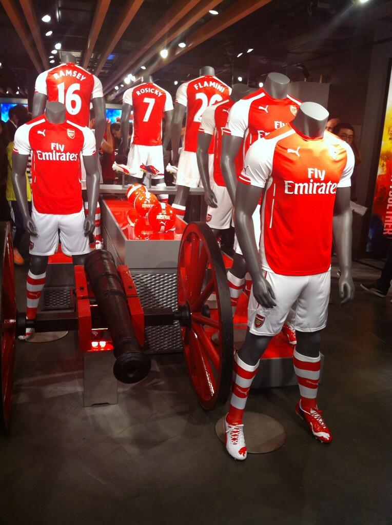
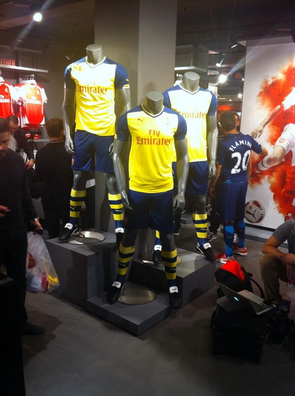
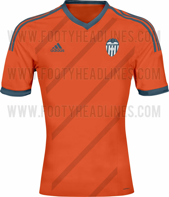
I find the loose shorts the weird thing about their kits. Their kits look like compression gear, so skins are the only thing missingAgain Puma going with the funny "tight-torso, loose arms" fit. Doesn't really look right. I'm not really a great fan of our (Arsenal's) new kits, though I think that Dortmund one is good.
If they didn't have cylinders for arms, they wouldn't be loose.Again Puma going with the funny "tight-torso, loose arms" fit. Doesn't really look right. I'm not really a great fan of our (Arsenal's) new kits, though I think that Dortmund one is good.
")

They're all bloody horrible, I don't even know where to start.I see no class in the Arsenal kits.


I see no class in the Arsenal kits.


Manchester United plc (NYSE:MANU) has reached a ten-year agreement with adidas for a global technical sponsorship and dual branded licensing deal for a minimum guarantee of GBP 750 million, subject to certain adjustments, beginning with the 2015/2016 campaign.
For the 2014/2015 season, Nike will continue in its role of technical sponsor and trademark licensee.
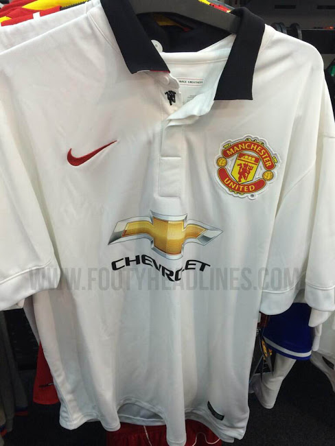
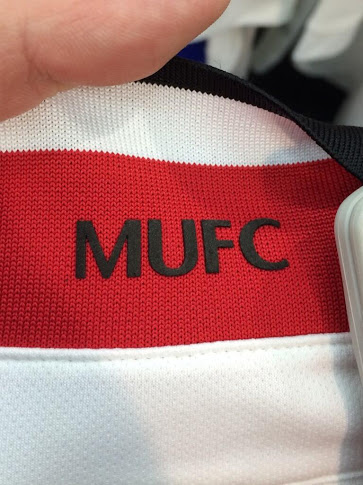
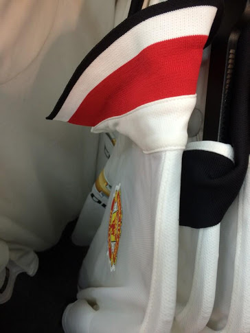
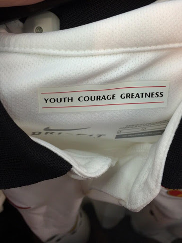
The devil where the button is is not necessary.This is the new Man Utd 2014-2015 Away Jersey. The new Manchester United 14-15 Away Kit is mainly white with a classical black polo collar, which features a inconspicuous devil detail.
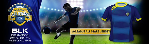
The Jets' new strips are out tomorrow, made by BLK, and apparently the stripes cut-off oddly and there's a fair bit of 'new' colour. 'til then, look at the grouse job they've done for the even grouser A-League All Stars

Horrible. ISC did a 100x way better job.