


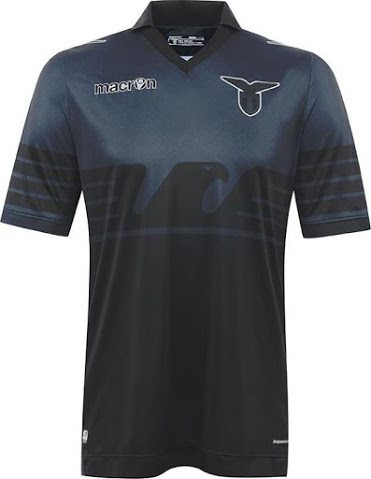
Goalkeeper away kit. Not pictured maybe?Pretty s**t.
I thought they said five kits too? Even including the GK one (which I thought was an away strip – wasted) there's still one more left.
Navigation
Install the app
How to install the app on iOS
Follow along with the video below to see how to install our site as a web app on your home screen.
Note: This feature may not be available in some browsers.
More options
You are using an out of date browser. It may not display this or other websites correctly.
You should upgrade or use an alternative browser.
You should upgrade or use an alternative browser.
Discussion Soccer/Association Football New Kits
- Thread starter Silent Alarm
- Start date
- Tagged users None
- Status
- Not open for further replies.
- Moderator
- #4,227
Glad Jets returned gold back as an away kit.
I still can't get over how ridiculous having stars for GF wins is though.
The away kit is the white one. The gold is a third kit and will be worn on three occasions throughout the season, chosen by the fans I think
____
.
- Sep 1, 2009
- 7,496
- 8,950
- AFL Club
- Brisbane Lions
- Other Teams
- Everton, Brisbane Bullets, Thai Port FC
Damn! That's disappointingThe away kit is the white one. The gold is a third kit and will be worn on three occasions throughout the season, chosen by the fans I think
Red and blue stripes (circa 2011-12) for home and gold for away would be perfect for them
I liked the other Newcastle United style black and white kit myselfDamn! That's disappointing
Red and blue stripes (circa 2011-12) for home and gold for away would be perfect for them
")
- Jul 9, 2010
- 24,163
- 26,536
- AFL Club
- Fremantle
- Thread starter
- #4,230
The worst thing is the Jets again dissolve their identity. What are they? Not gold anymore, not blue and red stripes anymore. Next season they'll change it up again.
Almost every single team in the league has no idea what they are or any continuity in their designs. The Wanderers are set forever. The Victory have had some good continuity and not having a 'v' for a short while seems an anomaly more than an inconsistency... I guess Brisbane and Sydney have realised they don't want their superfluous blues and oranges respectively. But what about the rest of them?
Melbourne City – white is a bad home colour in Australia. It's very weak and bland, and when every other side in the comp has it as an away strip, you give off a vibe of inferiority. What's their go? Will they really wear that thing forever? Will they just end up recycling Man City's third choices every few years?
Perth Glory – stripes or pinstripes? Purple and white and that's it? Keep the kits to simple designs, bring in a predominately hooped or striped variant for away solutions, but far out... bring back the orange! How many sports sides in the world have purple and orange? And how many can associate it with genuine success and good times? It is arguably THE definitive Australian domestic soccer colourway. It's very bold, but it's also strangely strong. You can have any average and stock Nike/Adidas/Umbro in the world, but just those two colours on it, and it could be a classic.
Adelaide – s**t kits since day dot. Terrible missed chances of emphasising a state-identity. Probably not an issue of identity at all, but their poor execution of kits and their logo makes me hate it.
Phoenix – Black home shirt, stripes, mostly yellow or mostly black, all yellow (basically) this year. What is the go? Black and yellow stripes are fine. No one'll hate them for keeping the status quo.
Mariners – I love you but jesus christ. These new strips are absolute gold and I'm seriously considering buying one because, no s**t, they'll be up there one day. As anti-classic as the Socceroos spew kit. It's so tacky and regional league and regional club. But aside from that... hoops, stripes, centre-panels, white socks... and they change their home colour every year. Why can't they just jump onto something and keep it? There's enough room to manoeuvre the clash solutions if they want to change things. Why don't they have a distinctive home kit yet? There are so many inspirations worldwide... jump on one.
Klim
Brownlow Medallist
- Sep 17, 2013
- 12,532
- 10,363
- AFL Club
- Sydney
Away GK kit.I thought they said five kits too? Even including the GK one (which I thought was an away strip – wasted) there's still one more left.

Only because Reebok supposedly didn't have a template with stripes for the Nux to use. The intention was to wear stripes from day one.Phoenix – Black home shirt,
Been mostly yellow since we got Adidas.mostly yellow or mostly black, all yellow (basically) this year. What is the go? Black and yellow stripes are fine. No one'll hate them for keeping the status quo.
I think our brand is fine. Still have a yellow shirt with black shorts and socks. We'll probably return to the stripes in the next two years

Greater Gattsby
♛ All Class ♛
- Oct 6, 2011
- 8,865
- 11,421
- AFL Club
- North Melbourne
- Other Teams
- Melbourne Victory | West Ham United
You've summed it all up perfectlyThe worst thing is the Jets again dissolve their identity. What are they? Not gold anymore, not blue and red stripes anymore. Next season they'll change it up again.
Almost every single team in the league has no idea what they are or any continuity in their designs. The Wanderers are set forever. The Victory have had some good continuity and not having a 'v' for a short while seems an anomaly more than an inconsistency... I guess Brisbane and Sydney have realised they don't want their superfluous blues and oranges respectively. But what about the rest of them?
Melbourne City – white is a bad home colour in Australia. It's very weak and bland, and when every other side in the comp has it as an away strip, you give off a vibe of inferiority. What's their go? Will they really wear that thing forever? Will they just end up recycling Man City's third choices every few years?
Perth Glory – stripes or pinstripes? Purple and white and that's it? Keep the kits to simple designs, bring in a predominately hooped or striped variant for away solutions, but far out... bring back the orange! How many sports sides in the world have purple and orange? And how many can associate it with genuine success and good times? It is arguably THE definitive Australian domestic soccer colourway. It's very bold, but it's also strangely strong. You can have any average and stock Nike/Adidas/Umbro in the world, but just those two colours on it, and it could be a classic.
Adelaide – s**t kits since day dot. Terrible missed chances of emphasising a state-identity. Probably not an issue of identity at all, but their poor execution of kits and their logo makes me hate it.
Phoenix – Black home shirt, stripes, mostly yellow or mostly black, all yellow (basically) this year. What is the go? Black and yellow stripes are fine. No one'll hate them for keeping the status quo.
Mariners – I love you but jesus christ. These new strips are absolute gold and I'm seriously considering buying one because, no s**t, they'll be up there one day. As anti-classic as the Socceroos spew kit. It's so tacky and regional league and regional club. But aside from that... hoops, stripes, centre-panels, white socks... and they change their home colour every year. Why can't they just jump onto something and keep it? There's enough room to manoeuvre the clash solutions if they want to change things. Why don't they have a distinctive home kit yet? There are so many inspirations worldwide... jump on one.
Why is white a bad home colour in Australia? It's hot.
Greater Gattsby
♛ All Class ♛
- Oct 6, 2011
- 8,865
- 11,421
- AFL Club
- North Melbourne
- Other Teams
- Melbourne Victory | West Ham United
Change your home and away kits and it's all good.Why is white a bad home colour in Australia? It's hot.
Visually m8Why is white a bad home colour in Australia? It's hot.
cannavo
LFG #16
Chelski Jets
Damo FC
Team Captain
- Apr 13, 2015
- 405
- 545
- AFL Club
- Adelaide
i didWhen you said hoops, I thought you meant something similar to what Barca have.
Hardly, nothing wrong with white. Real Madrid are one of the classiest looking sides going round. Personally in in the red and white camp and still wear my heart merch but white is still a winner.Visually m8
But that's another country. We're talking about Australia hereHardly, nothing wrong with white. Real Madrid are one of the classiest looking sides going round. Personally in in the red and white camp and still wear my heart merch but white is still a winner.
Tottenham, Real, Swansea, Vancouver et al look great because they are white with fine piping and trim, not white with an offset two-tone blue stripe and massive Etihad logo cutting into said stripe
Yeah but it's perceived as an away colour in Australia, that's just innately what people think of. The league itself is littered with white aways even though it's not convention in Europe.carls12 40796662 said:Hardly, nothing wrong with white. Real Madrid are one of the classiest looking sides going round. Personally in in the red and white camp and still wear my heart merch but white is still a winner.
- Jun 12, 2012
- 20,534
- 65,313
- AFL Club
- Port Adelaide
Tottenham, Real, Swansea, Vancouver et al look great because they are white with fine piping and trim, not white with an offset two-tone blue stripe and massive Etihad logo cutting into said stripe
This, this and this.
White can look awesome in its simplicity, especially when contrasting with dark shorts imo, but those two off-centre rectangles just spew all over it.
akkaps
Community Leader
- Mar 20, 2012
- 47,448
- 32,666
- AFL Club
- Carlton
- Moderator
- #4,244
For those interested, here's the 2015/16 EPL Handbook. It has all the clubs kits and more inside
http://m.premierleague.com/content/...handbooks/premier-league-handbook-2015-16.pdf
http://m.premierleague.com/content/...handbooks/premier-league-handbook-2015-16.pdf
Klim
Brownlow Medallist
- Sep 17, 2013
- 12,532
- 10,363
- AFL Club
- Sydney
Heardy_101
LET'S GO BRANDON
For those interested, here's the 2015/16 EPL Handbook. It has all the clubs kits and more inside
http://m.premierleague.com/content/...handbooks/premier-league-handbook-2015-16.pdf
AFL take note.
Klim
Brownlow Medallist
- Sep 17, 2013
- 12,532
- 10,363
- AFL Club
- Sydney
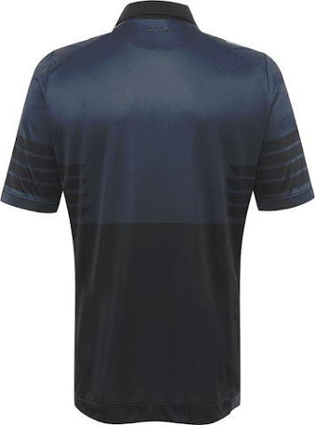
Lazio 15-16 Europa League Shirt.
THis is one of the greatest things of my lifeFor those interested, here's the 2015/16 EPL Handbook. It has all the clubs kits and more inside
http://m.premierleague.com/content/...handbooks/premier-league-handbook-2015-16.pdf
phhhhhwoaoooooooooooohLazio 15-16 Europa League Shirt.
- Status
- Not open for further replies.
Similar threads
- Replies
- 41
- Views
- 2K
- Replies
- 2
- Views
- 248
