I love all the WAFL shields. When I see a footy team with a shield logo I think it makes the club look that much more professional. Shields should be a requirement.
The Original Eagles logo is so well designed. It's so simple but so effective, and most importantly, ties in perfectly with arguably the biggest piece of continual WCE brand equity, the wings.
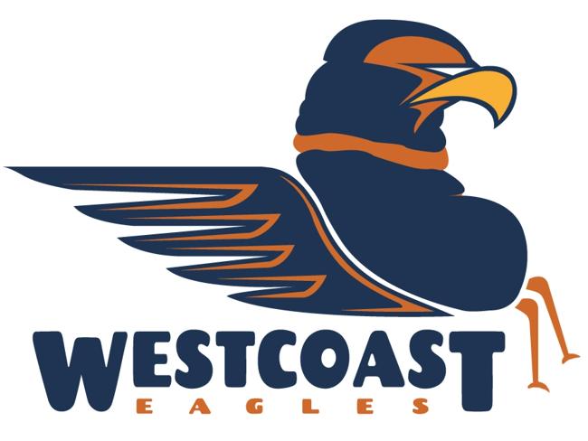
The 2000 Eagles head was never designed to fit in with the wings, structurally it is so incongruous that it has pushed them up and up to the little chicken wings we are stuck with now. It's a really ordinary, out-of-date logo, which stinks of ochre.
I don't know if it's the faux-retro movement, but Dynamo is actually making a little comeback in the world of design. It's actually not a bad-looking typeface, and I honestly cannot picture any other paired with the original head.
It's the Hartford Whalers logo of the AFL - distinctive, bold, symbolic and bloody timeless. I've mulled over this, and I can't possibly make it any better than it actually is. My dream Eagles kit is gold and royal wings jumpers with this beautiful thing sitting on its own (no wordmark), larger than it was in the 90s, right on the guts where it was made to be.
Shield or not, this classic contemporary piece of Australian graphic design needs to be returned. Permanently.
This site uses cookies to help personalise content, tailor your experience and to keep you logged in if you register.
By continuing to use this site, you are consenting to our use of cookies.


")
