Navigation
Install the app
How to install the app on iOS
Follow along with the video below to see how to install our site as a web app on your home screen.
Note: This feature may not be available in some browsers.
More options


You are using an out of date browser. It may not display this or other websites correctly.
You should upgrade or use an alternative browser.
You should upgrade or use an alternative browser.
What the supporters want - A message to Andrew Fagan
- Thread starter CrowAboutIt
- Start date
- Tagged users None
- Mar 20, 2013
- 4,948
- 4,982
- AFL Club
- Adelaide
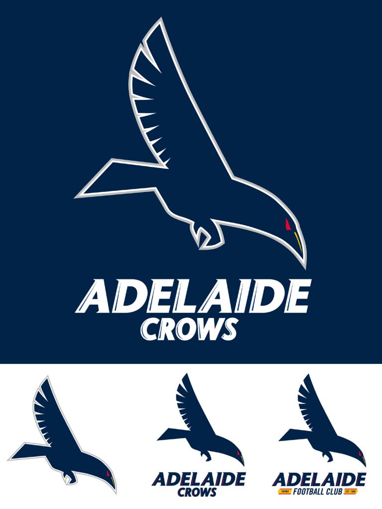
Love thisHad a crack at a front on Crow logo as a lot of people here seem to like that option. Think I still prefer the side on style to be honest but whatever it takes to get rid of the current one.
View attachment 87005
More 'logo' style than other front ons, strong, edgy
Prefer red footy though with maybe yellow beak? Possibly some yellow/red highlights with thin lines in the wings but that may be too busy
Tex Support
Club Legend
- Oct 17, 2012
- 2,032
- 3,675
- AFL Club
- Adelaide
- Other Teams
- Norwood, Houston, UT Longhorns
This is a ripper - best one I've seen yet.Had a crack at a front on Crow logo as a lot of people here seem to like that option. Think I still prefer the side on style to be honest but whatever it takes to get rid of the current one.
View attachment 87005
Really crisp. Good job mate.
Where's this side on one? Start a logo thread with the designs, then we'll get em out on twitter.
Going for a new look logo, I really like 23_fan version from here. Actually looks like a crow and has a hardness to it. From a merchandise pov, the simplicity and the limited colour palate works best.

CrowsAlways83
Senior List
- Mar 26, 2014
- 265
- 475
- AFL Club
- Adelaide
there is no way they would put a football on the logo, incredibly ******* twee, that went out with the cartoon VFL logos of the 80's.
Maybe replace the football with 'AFC'? Although one could argue our current logo falls under cartoon too!
I really hope they change to something more aggressive anyway, really like the look of the front on crow.
23_fan
Senior List
- Jun 26, 2011
- 165
- 769
- AFL Club
- Adelaide
Love this
More 'logo' style than other front ons, strong, edgy
Prefer red footy though with maybe yellow beak? Possibly some yellow/red highlights with thin lines in the wings but that may be too busy
I've tried a few different variation before the one I posted. Red footy looks best but then there is no yellow at all (could fix this by having yellow in the text as per the current logo but I'm not a fan of that font). Yellow eyes don't look hard enough and yellow beak loses the Crow feeling a bit.
There is still something missing I feel but I haven't figured it out yet. If I do I'll post an updated version.
- Feb 3, 2004
- 17,999
- 24,204
- AFL Club
- Adelaide
- Other Teams
- panthers, ukraine & broncos
Maybe replace the football with 'AFC'? Although one could argue our current logo falls under cartoon too!
I really hope they change to something more aggressive anyway, really like the look of the front on crow.
I really liked the AFC tops that the players wore a few years ago, so text like that could work. That said, I don't mind the footy in there at all.
23_fan
Senior List
- Jun 26, 2011
- 165
- 769
- AFL Club
- Adelaide
Maybe replace the football with 'AFC'? Although one could argue our current logo falls under cartoon too!
I really hope they change to something more aggressive anyway, really like the look of the front on crow.
I think if we didn't want the footy we could just put the text in some sort of box and have the claws holding that. You would then need the ball or something to replace with if you just wanted the logo image and not the text. Either way it could be made to work, that version is just a concept. I seriously doubt the club will take a direct copy of any of these.
- Mar 20, 2013
- 4,948
- 4,982
- AFL Club
- Adelaide
Original crows logo had a yellow beak so doing that could be a bit of a tip of a cap to the history there...I've tried a few different variation before the one I posted. Red footy looks best but then there is no yellow at all (could fix this by having yellow in the text as per the current logo but I'm not a fan of that font). Yellow eyes don't look hard enough and yellow beak loses the Crow feeling a bit.
There is still something missing I feel but I haven't figured it out yet. If I do I'll post an updated version.
Agree red eyes not yellow, that just looks out of place.
Yellow outline on the underside of each "feather" on the wings (essentially where the white lines between them now are) could add that extra touch of yellow too.
Agree re font, current one is terrible, needs a strong bold font
- Mar 20, 2013
- 4,948
- 4,982
- AFL Club
- Adelaide
if the ball were unpopular you could just have the claws holding nothing but realigned/redesigned as if they are ready to grab something (more centralised and front on)You would replace it with something, whether it be "AFC", "A" or one of the shield logo or official crest, but it won't ever just be a ball.
CrowsAlways83
Senior List
- Mar 26, 2014
- 265
- 475
- AFL Club
- Adelaide
I really liked the AFC tops that the players wore a few years ago, so text like that could work. That said, I don't mind the footy in there at all.
Yeah I don't mind how it looks now either, curious to see how it would look to replace the football with text (either AFC, Adelaide FC or similar), might also give more opportunity to play around with colours then?
Either way, great work by 23_fan, shame you aren't in charge of this stuff at the club lol!
Bacon8
Cancelled
there is no way they would put a football on the logo, incredibly ******* twee, that went out with the cartoon VFL logos of the 80's.
droll. How many Club logos now carry a ball on it like we need to be reminded what sport we are playing? The AFL's logo is irrelevant. We don't do this stuff anymore

The VFL Logos of the 80s adn the AFL of the early 90s logos were awesome! i loved the shield logo! sick of our game becoming americanised. Englsh soccer teams keep their traditional logos. we should go back to our old one from the 90s with the shield.there is no way they would put a football on the logo, incredibly ******* twee, that went out with the cartoon VFL logos of the 80's.
awesome! i used love collecting footy stickers in the early 90s and getting the shiny logo stickers haha these logos remind me on then.droll. How many Club logos now carry a ball on it like we need to be reminded what sport we are playing? The AFL's logo is irrelevant. We don't do this stuff anymore
View attachment 87456
- Mar 20, 2013
- 4,948
- 4,982
- AFL Club
- Adelaide
its funny how we made our new logo appeal more to children, yet back then each club had an official logo and one of these.droll. How many Club logos now carry a ball on it like we need to be reminded what sport we are playing? The AFL's logo is irrelevant. We don't do this stuff anymore
View attachment 87456
That way the club can have a traditional, strong element but still appeal to children.
Why don't we bring back this idea instead of trying to appeal to 2 vastly different demographics/purposes
we still kind of do in a way, the Club puts the original shild logo on it's letterheard in official correspondence. It's like the 'child' logo option is for the official merch stuff, and the old logo is for when we are serious.its funny how we made our new logo appeal more to children, yet back then each club had an official logo and one of these.
That way the club can have a traditional, strong element but still appeal to children.
Why don't we bring back this idea instead of trying to appeal to 2 vastly different demographics/purposes
I liked the shield logo as well but I guess it limited the Clubs and make them all look the same and they wanted to brabd themselves how they wanted. I remember the 1970's VFL logos, the top section of the outline was in VFL blue regardless of your clubs colours.The VFL Logos of the 80s adn the AFL of the early 90s logos were awesome! i loved the shield logo! sick of our game becoming americanised. Englsh soccer teams keep their traditional logos. we should go back to our old one from the 90s with the shield.

Things i want: A better away/clash jumper (similiar to the the crows SANFL side)
Bring back the original crows logo
Get rid of claude the crows and bring back the camry crow that we ised in the 90s
change the lyric at the start of the crows club song to the "we are the mighty adelaide crows" not "and we're knowen as the adelaide crows"
and the big one...... Build the fans a club/pub/bar function centre in the city or close to the city with dining facilities, entertainment room, pokies, sports bar TAB. This is long over due.. those scum bags at port have "The port club"... we need something like this. Id really love the crows to buy Thebby oval and build the function centre there and have the crows SANFL side use that as their home ground. It willnever happen but thats what id love.
- Mar 20, 2013
- 4,948
- 4,982
- AFL Club
- Adelaide
except for the fact that the child one is the one that gets used 99% of the time and in the places that count, the heritage one is only there in places its hardly noticed and not even seen by anyone outside the bubble that is within the club and its already members.we still kind of do in a way, the Club puts the original shild logo on it's letterheard in official correspondence. It's like the 'child' logo option is for the official merch stuff, and the old logo is for when we are serious.
I more mean as a way of promoting the club
Use the real one on most mercy, the cartoon one on children's merch, etc
This is how I remember the official logos. I had a dufflecoat with a Collingwood one back in the day in Melbourne.View attachment 87460
What is the Cat doing in the logo?!
Similar threads
- Replies
- 34
- Views
- 988
- Poll
- Replies
- 4K
- Views
- 133K
- Replies
- 2K
- Views
- 60K
