- May 25, 2009
- 4,016
- 2,775
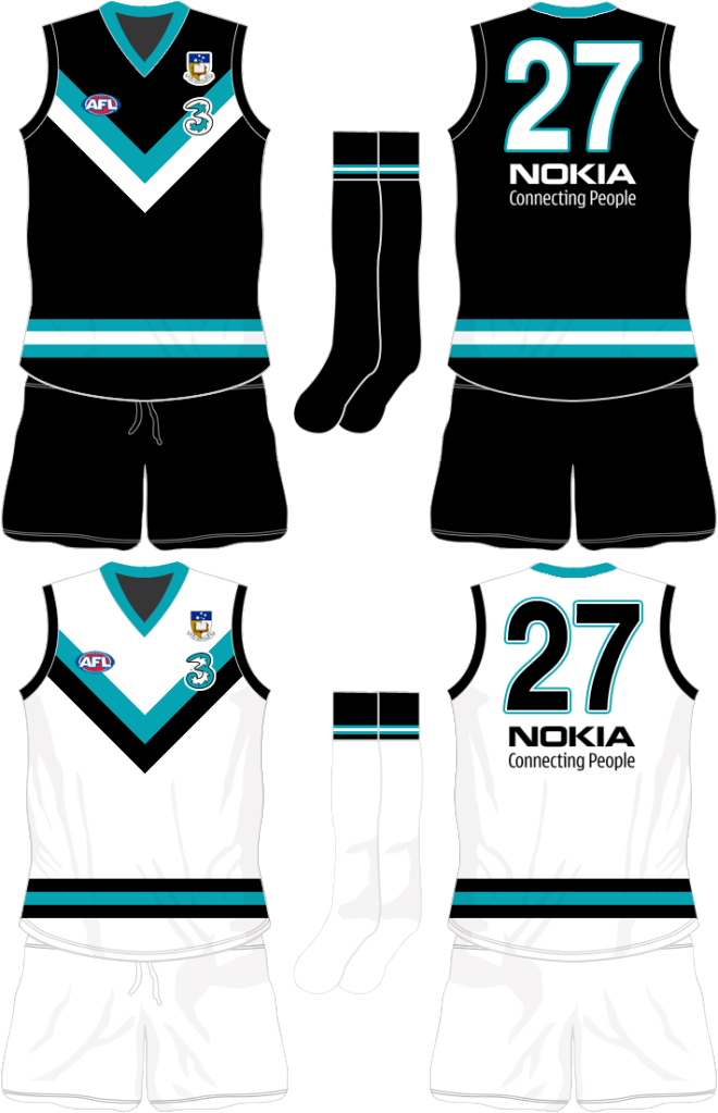
- AFL Club
- Port Adelaide
Here's the record of what's been done
MOTW Honour Roll
Brisbane and North was also and option in Round7 (dunno if this counts or not, coxy??)
Round 9 was Freo and Brisbane. Round 10 was Adelaide, Collinwood and WB.
MOTW Honour Roll
Brisbane and North was also and option in Round7 (dunno if this counts or not, coxy??)
Round 9 was Freo and Brisbane. Round 10 was Adelaide, Collinwood and WB.

")