Navigation
Install the app
How to install the app on iOS
Follow along with the video below to see how to install our site as a web app on your home screen.
Note: This feature may not be available in some browsers.
More options


You are using an out of date browser. It may not display this or other websites correctly.
You should upgrade or use an alternative browser.
You should upgrade or use an alternative browser.
Resource www.footyjumpers.com
- Thread starter Mero
- Start date
- Tagged users None
Mero
Norm Smith Medallist
- Thread starter
- #6,477
It might not refresh properly, the website hosting it has some sort of weird caching rule to stop files being downloaded all the time.
http://footyjumpers.com/images/Adelaide-logo-1997.gif
Last edited:
tribey
ʎǝlʞuᴉH ʞɔɐS

It might not refresh properly, the website hosting it has some sort of weird caching rule to stop files being downloaded all the time.
http://footyjumpers.com/images/Adelaide-logo-1997.gif
You are a genius <3
I know this is the thread where there shall be no judgement of nitpickers but honestly m8 how did you even notice thisMero, a correction.
You've currently got the 1997-8 Adelaide crest as sporting a generic font:
View attachment 432191
When it was actually this one or possibly two - 'Crows' looks different to 'Adelaide' (taken from the IP Australia site):
View attachment 432194
Cheers.
Mero
Norm Smith Medallist
- Thread starter
- #6,481
If the logo is as shown in the graphic on the jumpers they use, I will change it to that one.Mero .will you design the suns guernseys 2018 to reflect the removal of the background of the logo, now it is just plain or will you say "Oh its just the change of lighting'? because it isnt its removal of the sunbeams
Given they've used someone else's template, I don't 100% believe it will look like that until I see it in use.
If the logo is as shown in the graphic on the jumpers they use, I will change it to that one.
Given they've used someone else's template, I don't 100% believe it will look like that until I see it in use.
Last year's graphic had the background missing on the GC logo, but it was still there on the actual jumpers.
Don't think it is going anywhere.
TheLoungeLizard
The world's most handsome man
There looks to be the new collar/template don't forget
cannavo
LFG #16
It's all there, Black and White, clear as crystal! Not really though.
Some of the years are a mess. In 1983 the logo before the one pictured was still being used in the records. Plus no mention of the prior flag swap 1993-2003 and the continued use of the 4th logo throughout the 80's and early 90's and it's first use was in 1976 rather than 1978
Record for reference

Also spotted on an AFL Buy/Swap/Sell

2 shades of the 1st jumper plus the 1982 jumper has a Green collar with the Burgundy flaps
Some of the years are a mess. In 1983 the logo before the one pictured was still being used in the records. Plus no mention of the prior flag swap 1993-2003 and the continued use of the 4th logo throughout the 80's and early 90's and it's first use was in 1976 rather than 1978

Record for reference

Also spotted on an AFL Buy/Swap/Sell

2 shades of the 1st jumper plus the 1982 jumper has a Green collar with the Burgundy flaps
SJ
Premium Platinum
Also the circular logo (1983) was reused in 1995.It's all there, Black and White, clear as crystal! Not really though.
Some of the years are a mess. In 1983 the logo before the one pictured was still being used in the records. Plus no mention of the prior flag swap 1993-2003 and the continued use of the 4th logo throughout the 80's and early 90's and it's first use was in 1976 rather than 1978View attachment 435521
Record for reference
View attachment 435524
SJ
Premium Platinum
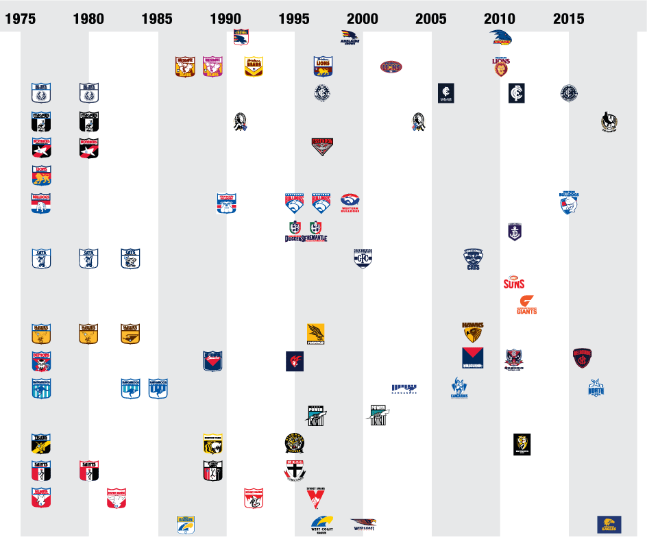
What formally happened mid-way through the early 1990s whereby most clubs started to leave the Marbold shield simultaneously?
Mero
Norm Smith Medallist
- Thread starter
- #6,492
The AFL allowed them to seek their own branding, while still retaining ownership of the final product.What formally happened mid-way through the early 1990s whereby most clubs started to leave the Marbold shield simultaneously?
I believe this was after a 'fact finding' junket to the US and UK during which the marketing dept determined that establishing a unique brand for each club was a good idea. Apparently Manchester Utd don't have to look like Liverpool, and the New York Giants don't have to look like the San Francisco 49ers. And therefore, Carlton don't have to be branded to look like Collingwood. (I remember Football Ltd mentions this)
When Collingwood stepped out & introduced a new logo, granted immediately after a premiership, their merchandise sales went to the moon.
Father Jack
Brownlow Medallist
- Mar 23, 2006
- 22,936
- 25,122
- AFL Club
- West Coast
- Other Teams
- Tottenham Hotspur FC
I'm no branding expert, but I've always thought it strange that North Melbourne moved away from the (iconic imo) silhouette side-on kangaroo logo.
CollarJazzKnee
All Australian
- Mar 17, 2015
- 851
- 1,057
- AFL Club
- Geelong
- Other Teams
- Green Bay Packers
Surely Sydney are due for a rebranding? While the logos ok, it's hardly a "classic"..
CollarJazzKnee
All Australian
- Mar 17, 2015
- 851
- 1,057
- AFL Club
- Geelong
- Other Teams
- Green Bay Packers
Oh fwiw I really miss the GFC as geelongs primary logo. Looks classier than a stupid cat head! Would love to see the one on our jumper become the main logo
It was voted the best AFL club logo on here a couple of years ago, so I'm not sure the regulars on here would agree with you, haha.Surely Sydney are due for a rebranding? While the logos ok, it's hardly a "classic"..
Gydafud
Premium Platinum
I always thought St Kilda, Richmond and Collingwood nailed it with a "timeless" looking logo. Now it seems the Saints are due to change.
chiwigi
I’ll make tears from your Wines.
Doubtful as they have taken the side panels off the clash guernsey as well.Won't that have Black side panels? Like the Clash and Preseason from this year?
atlaser
Cancelled
- Jun 21, 2015
- 652
- 1,149
- AFL Club
- St Kilda
I always thought St Kilda, Richmond and Collingwood nailed it with a "timeless" looking logo. Now it seems the Saints are due to change.
Please no, never. there is absolutely no reason to change it, it's been the same for decades, won the flag in it, it's been on the jumper for approaching 100 years, it would be an absolute travesty to change the image of the club like that.
Gydafud
Premium Platinum
Oh I don't think they should at all, but doesn't mean the marketing department doesn't think so...Please no, never. there is absolutely no reason to change it, it's been the same for decades, won the flag in it, it's been on the jumper for approaching 100 years, it would be an absolute travesty to change the image of the club like that.
