Navigation
Install the app
How to install the app on iOS
Follow along with the video below to see how to install our site as a web app on your home screen.
Note: This feature may not be available in some browsers.
More options


You are using an out of date browser. It may not display this or other websites correctly.
You should upgrade or use an alternative browser.
You should upgrade or use an alternative browser.
Discussion Tasmania AFL Jumper Design
- Thread starter fargothegreat
- Start date
- Tagged users None

.png")
Looking back on what has been done with the Suns and Giants, jumper elements have been trademarked ie wave, big G etc so there is potential that element could be part of the jumper.
Like people have said - the foundation jumper doesn’t mean it is the permanent jumper. It could be the jumper for their VFL entry in 2025, it could be the jumper they were in their inaugural AFL game with a different home / away / clash set being used for the rest of the games
Like people have said - the foundation jumper doesn’t mean it is the permanent jumper. It could be the jumper for their VFL entry in 2025, it could be the jumper they were in their inaugural AFL game with a different home / away / clash set being used for the rest of the games
Jack Stevens
#2 Ticket Holder

I think the biggest issue with the whole reveal is the lack of cohesion between the "modern" and "unique" logo and the stale old MS Word-designed jumper, which has left everybody a bit disappointed. And that's before getting into the state jumpers used by clubs debate.
Tandy
Norm Smith Medallist
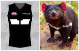
I do like they've got a few shades of green in their to use in the future though. The myrtle along with a lighter green used in the right way whether it be outlines in lighter green to define say a chevron or diamond or whatever could look niceAnd here it is again, the background of the header image on the membership homepage. That's the jumper i was shown
View attachment 1932282
It was that green design, with the T and map as per the state jumper. So largely the state jumper, but different background.
Bjo187
Premiership Player
- Apr 30, 2020
- 3,192
- 4,205
- AFL Club
- Essendon
Except GWS imo they nailed it one of the best in the AFL.
It's decent now. But the needles "greater' in the name and the dull faded orange and grey originally was a big let down at the time. Puma coming on board helped significantly.
Jack Stevens
#2 Ticket Holder

This was posted by u/Skiapodes on r/AFL.
I know this logo isn't to everyone's tastes, but I think it looks pretty clean here and is obviously scalable, which is pretty important for a club logo. They set a very low bar, but this is much better at launch than what Gold Coast of GWS coughed up.
ETA: "we are the team" has to be the worst motto going around though
Bjo187
Premiership Player
- Apr 30, 2020
- 3,192
- 4,205
- AFL Club
- Essendon
View attachment 1932517
This was posted by u/Skiapodes on r/AFL.
I know this logo isn't to everyone's tastes, but I think it looks pretty clean here and is obviously scalable, which is pretty important for a club logo. They set a very low bar, but this is much better at launch than what Gold Coast of GWS coughed up.
It's just so weird that the AFL don't seem to give a s**t about club designs. Ever since I could take an interest in this, being the mid 90s onwards, they have all been a big let down. Whether it's name, colours or design. This one we already knew the name and colours and they still managed to ruin the remaining parts.
Bjo187
Premiership Player
- Apr 30, 2020
- 3,192
- 4,205
- AFL Club
- Essendon
Feel like with any release these days, fashion, sport, tech etc. It's far easier to become underwhelmed because of the sheer number of leaks and discussion than what would have happened pre-internet.
Nuh I was disappointed by all the other ones too. I think the only expansion clubs that nailed it were the crows and eagles.
Mac Ropod
Senior List
- May 27, 2008
- 195
- 474
- AFL Club
- North Melbourne
Them's devil markings!Courtesy of IP Aus, strange to not unveil these alongside the other stuff:
View attachment 1932398View attachment 1932399
This has also been submitted for trademark in amongst all the new Tassie entries:
View attachment 1932400
What is it? Anybody's guess, but I supposed it could be for a jumper design. Something like:
View attachment 1932401View attachment 1932402
Attachments
some premium content coming out of the interwebs 
Logo definitely a downgrade on what they had... Already feels like it will be dated by the time 2028 rolls around.
On the jumper, it's fine as a 'foundation' (hopefully meaning 'placeholder') jumper... they can pull out the map anytime for a throwback/heritage design so I hope they go with something different by the time they take the field.


SmittyRFC
Debutant
- Dec 26, 2009
- 57
- 43
- AFL Club
- Richmond
View attachment 1932517
This was posted by u/Skiapodes on r/AFL.
I know this logo isn't to everyone's tastes, but I think it looks pretty clean here and is obviously scalable, which is pretty important for a club logo. They set a very low bar, but this is much better at launch than what Gold Coast of GWS coughed up.
ETA: "we are the team" has to be the worst motto going around though
That motto...hints of a club song?
"We are the team in the AFL,
One of the teams of all time,
We exist to play football,
and will play it against others"
Fizzler
BBTB
- Dec 26, 2013
- 12,781
- 16,367
- AFL Club
- Port Adelaide
- Other Teams
- OKC, Coburg, Werribee, Storm, QPR
It’s strange too because it’s not like they brought out a logo that looks like it’s from 2009 or something, which is something I saw someone say in this thread about the Talent League Devils logo. They likened it to the Cats and Hawks logos, but I think those logos were pretty future proofed and the only reason they might look dated now is because they have been around for a while now, which isn’t really the case for the Devils old logo. This new one though is so right now that it’s going to properly look dated very soon when AI stops being such a current trend (and we’re already heading there aesthetics wise). And especially in a world where a “less is more” approach has been and will continue to be the norm, I just see this logo sticking out like a sore thumb when placed with the other 18 clubs. Maybe it’ll grow on me though, who knows.I've never seen a logo that aged the moment it was revealed. It makes the Adelaide Crows emblem look like a stroke of graphic design genius. Even the Essendon logo that's been kicking around for well over 20-years now has more character and charm.
Just embarrassing really for everyone involved - the club, the members/supporters and of course the AI-generation software the 'logo' was produced on.
- Thread starter
- #889
Here is a very quick attempt to tie the brand identity and the foundation jumper together a bit better:


Fizzler
BBTB
- Dec 26, 2013
- 12,781
- 16,367
- AFL Club
- Port Adelaide
- Other Teams
- OKC, Coburg, Werribee, Storm, QPR
I don’t think the line/dot pattern is the issue for me, I think it’s almost entirely the shape. I’m having trouble getting a Tasmanian Devil from the logo because the mouth doesn’t look like a mouth, and thats a problem they encountered when they went the complete side on perspective rather than a slight angle facing the front. The Hawks, Crows and maybe the Eagles are the only clubs who went with the same side profile but the mouths are closed for all of them. As a result of not seeing the inside of the mouth, it just kinda looks like a neck, and therefore I’m just seeing a fox in the logo until the bottom tooth kind of registers in my brain. And Tassie Devils don’t really have fur like a Lion’s mane either, so the green shape is really throwing me too.I think one of the pitfalls of the logo is that it doesn't have a distinguishable shape.
Feels like their design philosophy, which judging by the press conference was to make it 'wild' , has led them to a visual identity that while trying to be unruly and animalistic more so looks a bit uneven.
View attachment 1932080
The line work and shading works for the promo material:
View attachment 1932084
But on the logo itself it's a bit much. And I think is what's spurring on the AI accusations, cos it's a similar kind of 'burst' style to what some AI programs produce when you put logo on the end of a prompt.
Personally, I think the front half of the Devil is pretty good, it's just the back that makes it seem a bit off.
From a less is more approach, I prefer it toned down like so:
View attachment 1932098
_Cerberus_
Club Legend
- Sep 30, 2022
- 2,081
- 3,908
- AFL Club
- Western Bulldogs
Personally feel they should have gone with just green and yellow, or green and white, or green, black and white. Instead of that bright red part that just doesn't flow well in my opinion. It was a piss lazy attempt to "be the same as the state representative jumper, but not quite the same". Also fans should have had full say in polls on colors and styles etc. Not corporate groups and a couple of ex players.
The last three teams the AFL have introduced. Suns top is plain as, Giants feels blocky, but at least the orange was fresh/nice. All feel souless and very American/corporate.
I know its only the "foundation" top. So hopefully heaps changes in the next few years. Even using the Devil logo instead of the map of TAS doesn't seem to suit the top. The design and colors has no real flow to it.
Mac Ropod
Senior List
- May 27, 2008
- 195
- 474
- AFL Club
- North Melbourne
View attachment 1932517
This was posted by u/Skiapodes on r/AFL.
I know this logo isn't to everyone's tastes, but I think it looks pretty clean here and is obviously scalable, which is pretty important for a club logo. They set a very low bar, but this is much better at launch than what Gold Coast of GWS coughed up.
ETA: "we are the team" has to be the worst motto going around though
I’d like to see a close-up of the logo on this shirt. I’m thinking it might look clean and scalable (wordmark aside) because it may not include all ten colours of the official logo, let alone all its teeny-tiny details?
Also, pour one out for the Adelaide Crows logo, now a distant second place on the number-of-colours-in-a-club-logo ladder with a mere seven.
lake81
Rookie
- Oct 10, 2012
- 21
- 119
- AFL Club
- Fremantle
Glad they didn’t use that pattern in the jumper. The problem is the logo will change over time, like all sports team it will get redesigned.
But the home jumper should always stay the same, it should be strong and simple. Not just a logo or in this case map slapped in the middle. A problem all the newest clubs have had!
Even if they have both been changed since there first few season Freo and Port both did something strong and different, and now both have classic jumpers which would remain even if there logos get redesigned.
A map with a T in it looks like what it is, a design by a team that originally juts wore whatever they could rather them design something properly
The logo is a more fear-inducing, tattoo-friendly version of this:


- Jul 26, 2023
- 1,309
- 2,957
- AFL Club
- Adelaide
Big backtrack there!
Sam Hall
Senior List

some premium content coming out of the interwebs
Logo definitely a downgrade on what they had... Already feels like it will be dated by the time 2028 rolls around.
On the jumper, it's fine as a 'foundation' (hopefully meaning 'placeholder') jumper... they can pull out the map anytime for a throwback/heritage design so I hope they go with something different by the time they take the field.
View attachment 1932548 View attachment 1932547
View attachment 1932546
Anyone else notice ol' mate in the pies shorts?

Bjo187
Premiership Player
- Apr 30, 2020
- 3,192
- 4,205
- AFL Club
- Essendon
Big backtrack there!
At least they are aware of the backlash it copped. I don't trust the AFL not to come up with something s**t anyway, there are so many great designs online, it's like these morons are ambivalent to social media and have to pick out one random graphic design company each time that does a terrible job.
Clubs don't need to spend $$$ on Graphic Design Companies. Just come on Big Footy and pay royalties to whichever design they go with from off here. Many of the designs on here are far superior to what Clubs pay designers to come up with. Both jumpers and logos.At least they are aware of the backlash it copped. I don't trust the AFL not to come up with something s**t anyway, there are so many great designs online, it's like these morons are ambivalent to social media and have to pick out one random graphic design company each time that does a terrible job.
Similar threads
- Replies
- 8
- Views
- 573
- Replies
- 0
- Views
- 508
- Replies
- 4
- Views
- 749
