Not sure the club would have final say on sponsor logo. if you're paying for placement you would generally have close to the final say.
 maybe we are paying kookaburra
Follow along with the video below to see how to install our site as a web app on your home screen.
Note: This feature may not be available in some browsers.

Not sure the club would have final say on sponsor logo. if you're paying for placement you would generally have close to the final say.
maybe we are paying kookaburra
Given the AI polo on Kookaburra's site and Punter's photo wearing the actual polo has the CHiQ reversed, maaaaybe there is a chance your black letters is on the final product? It would make sense given both black on white and white on black reverse is on their website so it is approved styling guide?I think we were fortunate for so long that Mazda was such a colour-neutral logo.
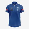
I don't like the solid black box of 'CHiQ' and I very much don't like the orange 13Cabs logo.
This was a 30 second job in Photoshop, but tell me this doesn't look 100% better;
View attachment 2467840
Log in to remove this Banner Ad
Not just us.They don't make any club gear in chubby chap sizes so I don't get too excited nor interested generally. These look ok and will look even better on a winning team. Curious as to why we are with a traditional supplier of cricket gear. Obviously they are trying to buy into the AFL market but are we the only team they could get? Why us? Just an interesting partnership tbh and I reckon there are more questions as to why us. Anyway, win some games and this will be the best clothing deal for decades.

Same here.I'm also a nerd because I went "oooh backpack".
")
Is this legit?? Neckline is terrible and what’s with the line protruding outside the centre stripe near neckline!I don't mind the guernsey although it does look a little amateurish around the neck.
View attachment 2467733
The Royal Blue looks a darker than last seasons Puma guernseys and the stripes are wider, the front now looks more blue than white.
That's what I'm talking about, may be poor stitching as it's on both sides, but whatever it is it looks amateurish.Is this legit?? Neckline is terrible and what’s with the line protruding outside the centre stripe near neckline!
Dislike it all!! A Kookaburra logo and a Kangaroo emblem! Total design clash! Looks effing ridiculous.Good idea starting new thread.
As I said in the Puma thread, I think my main issue with this gear is I just don't like the 'CHiQ', 'Intrepid, and '13Cabs' logos. They don't 'match' or blend-in with our colours well at all. But sponsorship dollars are always a good thing so it's something I'm sure I'll get used to.
I like the puffer vest.
View attachment 2467738
View attachment 2467739
View attachment 2467740
View attachment 2467741
View attachment 2467742
View attachment 2467743
View attachment 2467744
Looks effing dreadful! Someone stitched it half asleep!That's what I'm talking about, may be poor stitching as it's on both sides, but whatever it is it looks amateurish.
Whoever signed off on that should be sacked!That's what I'm talking about, may be poor stitching as it's on both sides, but whatever it is it looks amateurish.
Not bad if you’re 100 years old.
We should have a wide brim with corks on there somewhere and launch it the Melbourne Australia souvenir shopDislike it all!! A Kookaburra logo and a Kangaroo emblem! Total design clash! Looks effing ridiculous.
Get a grip.Looks effing dreadful! Someone stitched it half asleep!
Absolutely hate the Kookaburra and Kangaroo together on merch. It just looks wrong.
I dunno about you, but I want my 1991 Ridgeback, with a Kangaroo sticker signed by Ricky Ponting, now.Get a grip.
Agreed. Its boring gear.All the people having a crack about people whinging clearly don’t understand the importance of having a marketable “brand” and a product people want to wear. This day and age that’s exactly what a football club is, especially merchandise. If it’s not something that is cool people won’t buy it or wear it which ultimately will cost the club longer term (will affect future deals).
The new stuff looks cheap and tacky. Have a look at the retro stuff last few years done by Puma - sold like hot cakes and were everywhere at games. Kids and millennials want to wear stuff that looks good.