Navigation
Install the app
How to install the app on iOS
Follow along with the video below to see how to install our site as a web app on your home screen.
Note: This feature may not be available in some browsers.
More options
-
Mobile App Discontinued
Due to a number of factors, support for the current BigFooty mobile app has been discontinued. Your BigFooty login will no longer work on the Tapatalk or the BigFooty App - which is based on Tapatalk.
Apologies for any inconvenience. We will try to find a replacement.
You are using an out of date browser. It may not display this or other websites correctly.
You should upgrade or use an alternative browser.
You should upgrade or use an alternative browser.
Discussion AFL Gather Round - Round 5, 2025: Photos and Discussion
- Thread starter cannavo
- Start date
- Tagged users None
🥰 Love BigFooty? Join now for free.
Heardy_101
MAGA - Make Albo Go Away
So, using today's game as an example, no team should wear white shorts against North ever again.
Ginga_Ninja
Draftee
- Oct 19, 2024
- 19
- 138
- AFL Club
- Geelong
This brighter yellow and blue on the eagles jumpers look so much nicer then their usual shades.
Gold coast should incorporate both red and pink. Now that would be unique
Gold coast should incorporate both red and pink. Now that would be unique
Log in to remove this Banner Ad
Lifeblood was promoting it on its socials on the same day that the guernsey was announced.Huh... Was the Swans jumper promoted as a Lifeblood promotion at all before tonight? It's a cool concept ("bring back the red") but I wasn't sure if it was simply confined to the white warm-up shirts, not the guernsey itself
The GC colours are nice but feels a bit much like a training kit to me.
- Aug 1, 2005
- 5,402
- 7,384
- AFL Club
- Western Bulldogs
- Other Teams
- Footscray
Big training kit vibes from GC.
The Gold Coast pink kit looks phenomenal, really “pops” on screen (although I don’t think it should be their new home, maybe an away jumper though).
I like the West Coast guernsey but the shoulder panels ruin it, they also should’ve worn gold shorts with this jumper.
Probably in the minority here but I’ve always thought West Coast should wear their gold jumper against teams like Carlton, Collingwood, Port etc.
I like the West Coast guernsey but the shoulder panels ruin it, they also should’ve worn gold shorts with this jumper.
Probably in the minority here but I’ve always thought West Coast should wear their gold jumper against teams like Carlton, Collingwood, Port etc.
Reminds me of Penrith's away strip (worn in the Grand Final win over Storm last year)Big training kit vibes from GC
Supercheapgiants
I'm Blue
Sensed a massive clash today with WCE and Carlton, especially out in the sun the colours were very clashyThe Gold Coast pink kit looks phenomenal, really “pops” on screen (although I don’t think it should be their new home, maybe an away jumper though).
I like the West Coast guernsey but the shoulder panels ruin it, they also should’ve worn gold shorts with this jumper.
Probably in the minority here but I’ve always thought West Coast should wear their gold jumper against teams like Carlton, Collingwood, Port etc.
seaforthswan
glebegreyhound
- Apr 18, 2013
- 480
- 616
- AFL Club
- Sydney
- Other Teams
- UTS Bats, Manly Marlins
Essendon?
wtf.
Red shorts.
cmon.
wtf.
Red shorts.
cmon.
Heardy_101
MAGA - Make Albo Go Away
I agree and have said the same thing previously. Seeing the Peril more isn't a bad thing.Probably in the minority here but I’ve always thought West Coast should wear their gold jumper against teams like Carlton, Collingwood, Port etc.
seaforthswan
glebegreyhound
- Apr 18, 2013
- 480
- 616
- AFL Club
- Sydney
- Other Teams
- UTS Bats, Manly Marlins
Must be a jumper size thing, the logos relation to the Flamehead looks the same on both jumpersweird that majority of the Melbourne guernseys have the logo placement like the right, but the left looks correct.
Also number too low which seems to be an NB thing
seaforthswan
glebegreyhound
- Apr 18, 2013
- 480
- 616
- AFL Club
- Sydney
- Other Teams
- UTS Bats, Manly Marlins
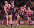
Saints in WHITE shorts today.
Should be fine clash-wise
Should be fine clash-wise
🥰 Love BigFooty? Join now for free.
The white shorts look great with the Saints hoops. Fits the look better than black would’ve.
Heardy_101
MAGA - Make Albo Go Away
GWS do not need the white outline with their numbers.
- Oct 5, 2017
- 1,427
- 1,209
- AFL Club
- Sydney
- Other Teams
- Port Melbourne, Norwood, St George
No top back sponsor for Port tonight, Hawthorn would've been better off wheeling out a replica of their mid 70s to late 90s guernsey
- Oct 30, 2014
- 5,290
- 11,124
- AFL Club
- Western Bulldogs
Does Port Adelaide now have a gap between the white and teal stripes similar to the bulldogs jumper’s hoops although not as big?
jumperfan
Premium Platinum
- Nov 17, 2023
- 2,501
- 5,102
- AFL Club
- St Kilda
- Other Teams
- Footy
Yes, looks ok, not entirely sure why they've done it thoughDoes Port Adelaide now have a gap between the white and teal stripes similar to the bulldogs jumper’s hoops although not as big?
pattymalone00
Club Legend
Similar threads
- Replies
- 31
- Views
- 2K


 for whoever designed that