Remove this Banner Ad

Poll NAFL 2019 - Round 3

Vote for your favourite in each matchup


  • Total voters
    27
  • Poll closed .

🥰 Love BigFooty? Join now for free.

Xdj3HCe.png


Poll will be open for 3 days.
Please vote in each of the games.
Do not vote for yourself.


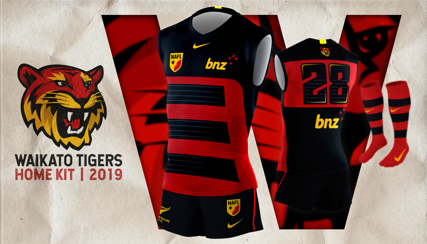
Waikato vs Toowoomba
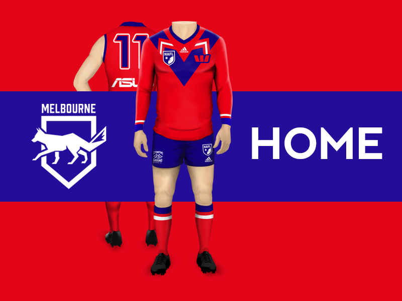
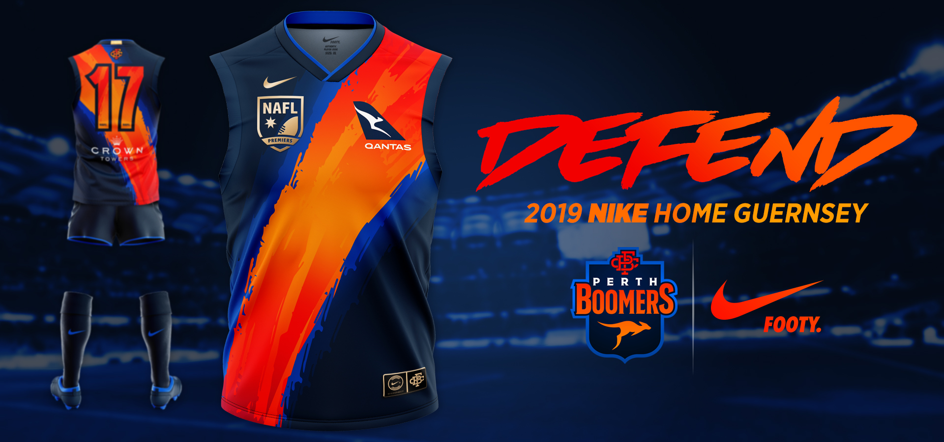

BAtqjZm.jpg


vNhxhfN.jpg


Melbourne vs Perth

lsc5kym.png


48735650748_f18537a88e_o.jpg


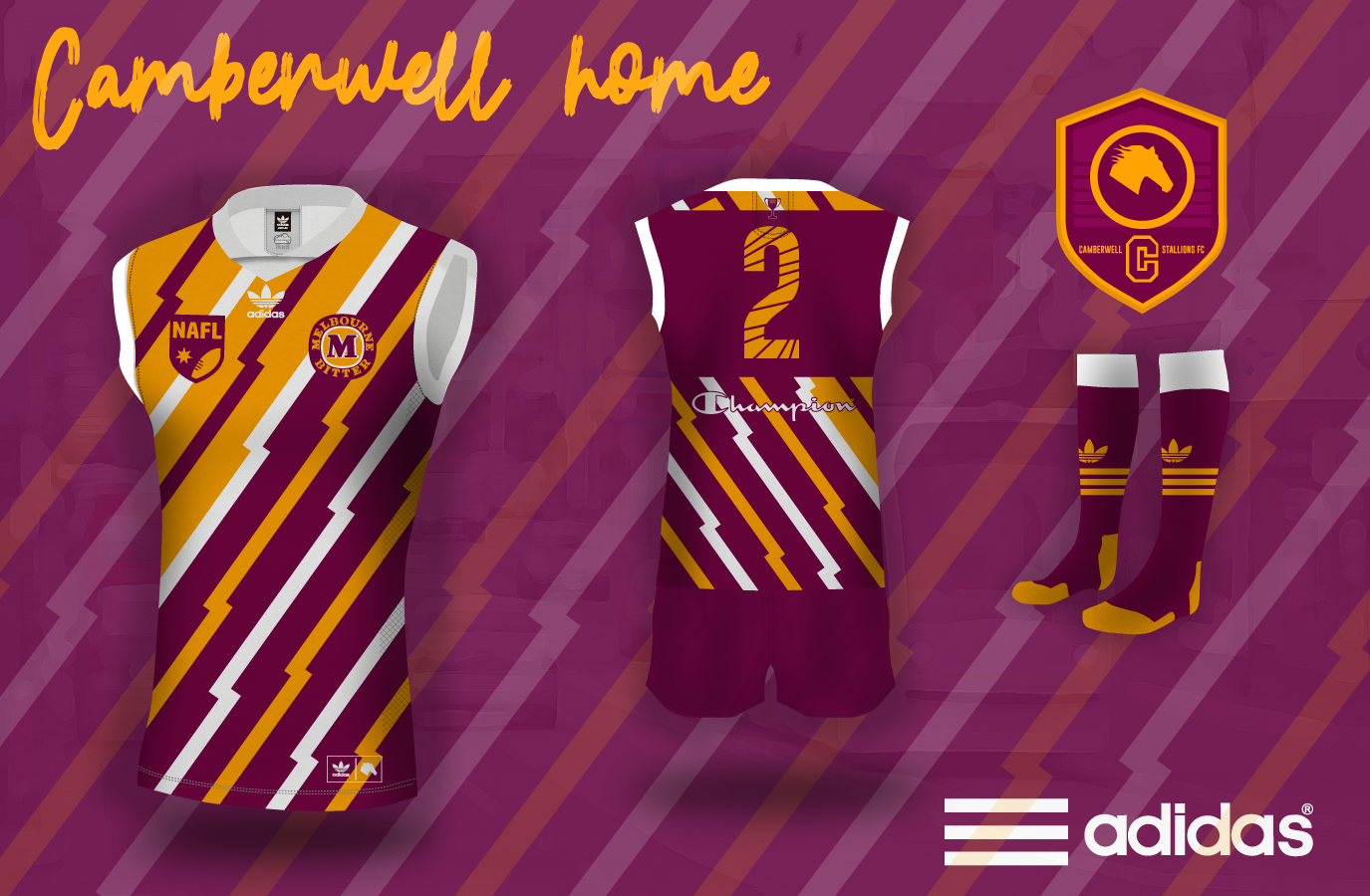
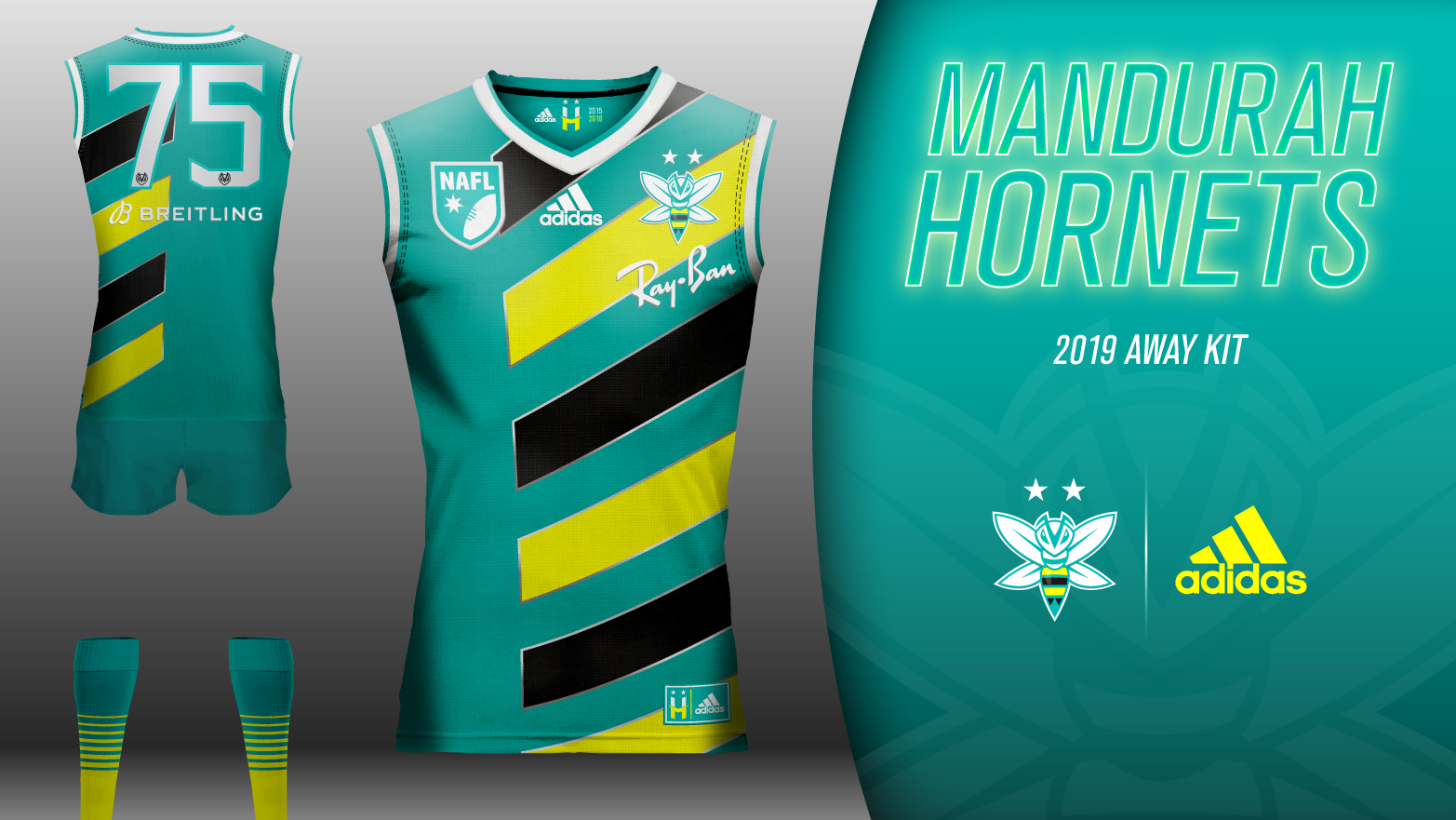
Camberwell vs Mandurah

48819523416_4972e9b855_o.png


8pzGyfp.png


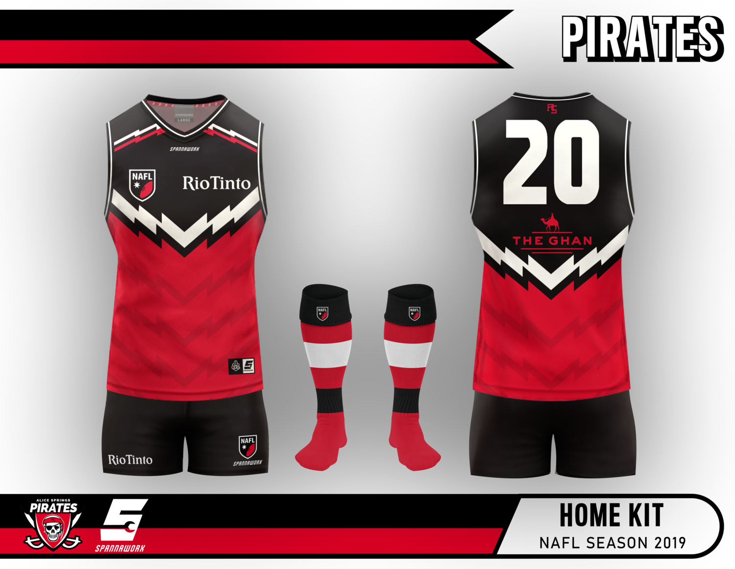
Alice Springs vs Geelong

SE2onCR.png


ngCc3wW.jpg


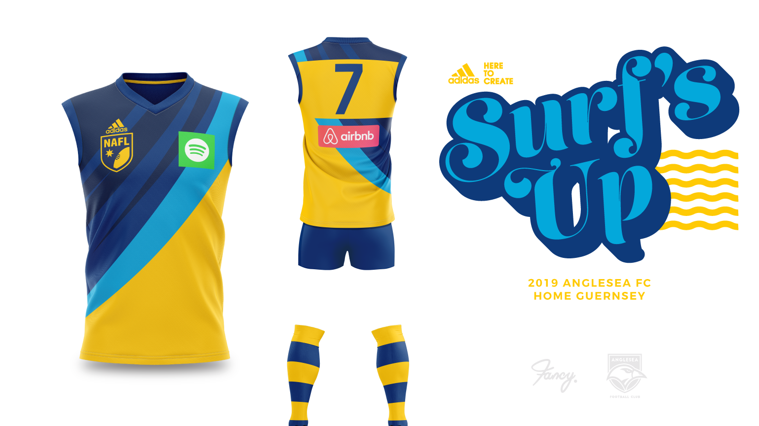
Brunswick vs Anglesea

Lzd5TIa.png


WFisjeA.png


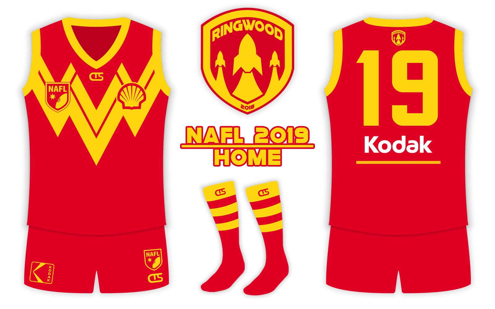
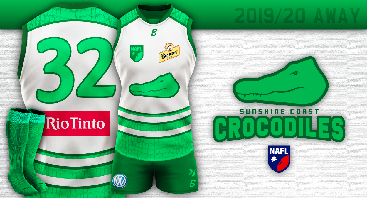
Ringwood vs Sunshine

Ti5taVR.jpg


Fx22Zb8.png


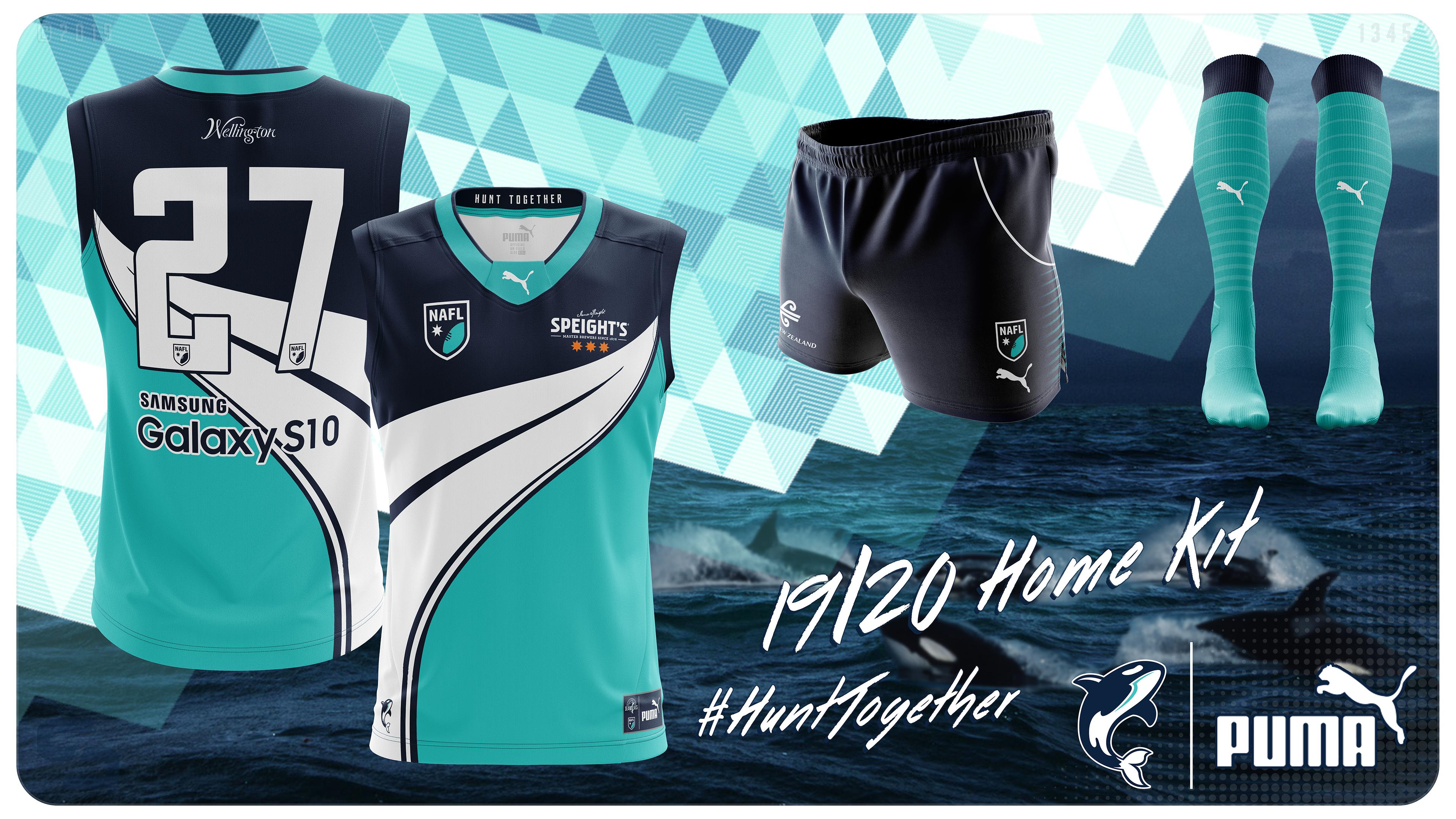
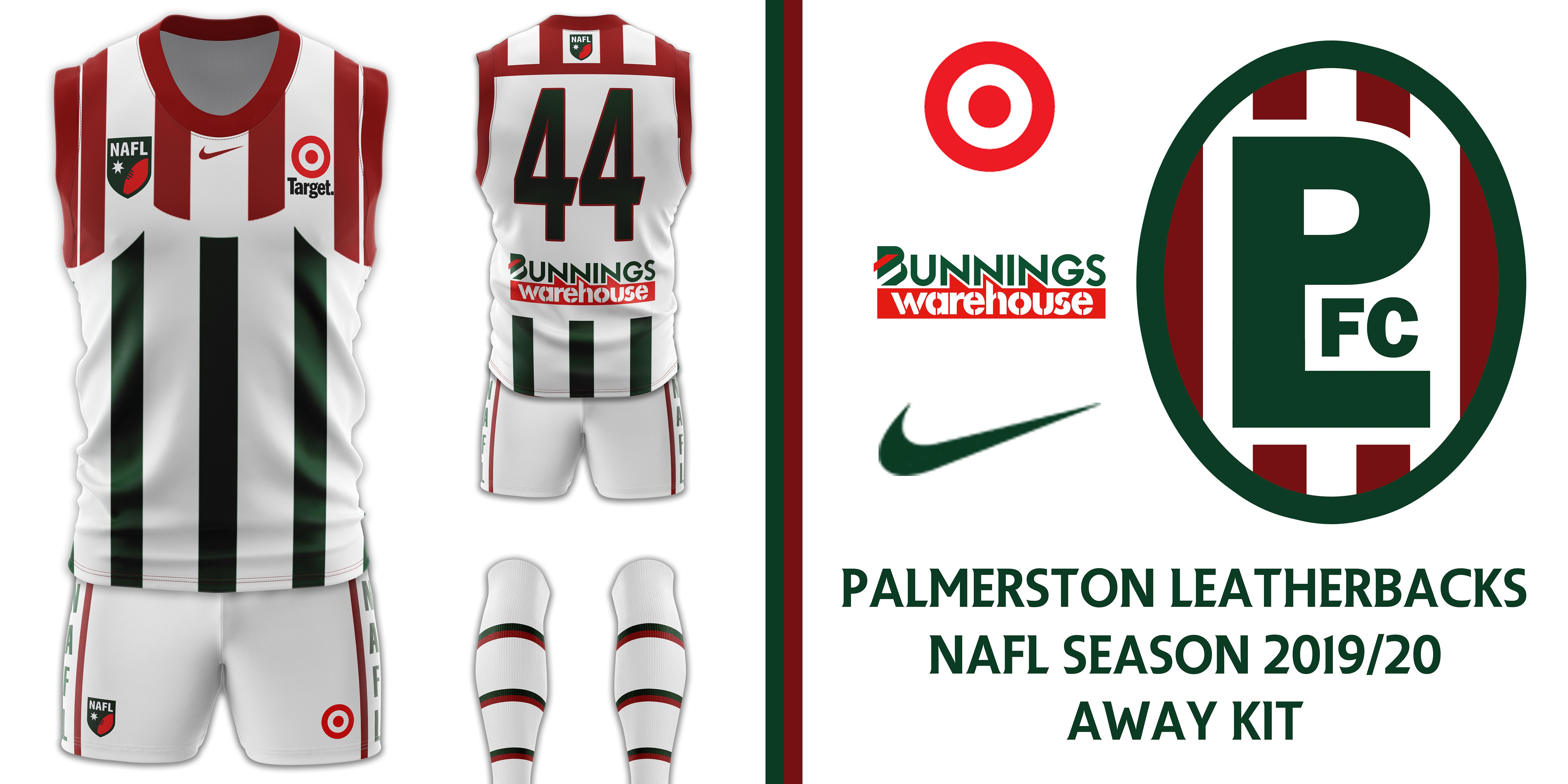
Wellington vs Palmerston

ppreIXj.jpg


I080hA3.jpg
 
No offense to caloschwaby or Kangas_11 but I'm pretty surprised at my results the past two rounds. Wouldn't mind some early feedback on the Sunshine Crocs if anyone is up for it.
 
No offense to caloschwaby or Kangas_11 but I'm pretty surprised at my results the past two rounds. Wouldn't mind some early feedback on the Sunshine Crocs if anyone is up for it.

I mean, I’ve voted for you in both rounds and I really like your entry - everything from the design to the template to the presentation is a huge leap forward and you’ll be contending if you keep it up.

Sadly, and it’s a weird one, but I think green typically polls poorly and perhaps the design is “too green”.

Can’t really think of a logical reason outside of that.
 
No offense to caloschwaby or Kangas_11 but I'm pretty surprised at my results the past two rounds. Wouldn't mind some early feedback on the Sunshine Crocs if anyone is up for it.
Just not a big fan of big areas in that shade of green especially on a white bg, personally I feel that that tone is more suited to linework. Also I don't like the roundness of the number font and the croc - They look childish to me. The front of your latest jumper has four shapes floating independently on the white bg, there's no anchor.

Plus the croc image isn't very inspiring - it kind of looks like a big green shoe. I would have had a front on image of the crocs face semi-submerged like about to attack, though that's probably hard to pull off as a simple logo!

Trust me when I say it's still much better than anything I can do, but if you want honest feedback, there it is.
 
Last edited:

Log in to remove this Banner Ad

No offense to caloschwaby or Kangas_11 but I'm pretty surprised at my results the past two rounds. Wouldn't mind some early feedback on the Sunshine Crocs if anyone is up for it.
None taken at all, I have no expetations set given it's my first year :)

I actually like your concept and colour scheme, the two tones of green work fine together - perhaps though it looks a bit too "Bintang Bali" like with the logo being smacked right in the middle of a white-base?
 
I mean, I’ve voted for you in both rounds and I really like your entry - everything from the design to the template to the presentation is a huge leap forward and you’ll be contending if you keep it up.

Sadly, and it’s a weird one, but I think green typically polls poorly and perhaps the design is “too green”.

Can’t really think of a logical reason outside of that.
Just not a big fan of big areas in that shade of green especially on a white bg, personally I feel that that tone is more suited to linework. Also I don't like the roundness of the number font and the croc - They look childish to me. The front of your latest jumper has four shapes floating independently on the white bg, there's no anchor.

Plus the croc image isn't very inspiring - it kind of looks like a big green shoe. I would have had a front on image of the crocs face semi-submerged like about to attack, though that's probably hard to pull off as a simple logo!

Trust me when I say it's still much better than anything I can do, but if you want honest feedback, there it is.
None taken at all, I have no expetations set given it's my first year :)

I actually like your concept and colour scheme, the two tones of green work fine together - perhaps though it looks a bit too "Bintang Bali" like with the logo being smacked right in the middle of a white-base?
Thanks gents! Love the big green shoe bit austinnn.
 
No offense to caloschwaby or Kangas_11 but I'm pretty surprised at my results the past two rounds. Wouldn't mind some early feedback on the Sunshine Crocs if anyone is up for it.
I've been 50/50 with voting on your kit for the other couple of weeks but the thing I think pushes me away is just the tone of the lighter green. I love two-toned colour schemes but I think if it was a bit less lighter it would be getting my vote. Also, I love the Croc moniker but for next season try incorporate that into your design, like have a croc popping up from the bottom of the jumper (like the Jaws film poster) or something like that. Otherwise a great logo.
 
FWIW, I tried to channel an ice hockey vibe, which I knew was risky, but it was outside the box. I've channeled another sport elsewhere and that too I expect to be somewhat of a fail :p
 

Remove this Banner Ad

🥰 Love BigFooty? Join now for free.

Back
Top