Competition NAFL 2023 HQ

Remove this Banner Ad

Hey everyone, I was just wondering if anyone could give me some feedback on my Newcastle entry this season. I feel that I am slowly getting stronger with my designs but still feel I am missing some things, be as honest as you want with it too. Good luck to all the teams left in the finals race this season!
I personally felt you could have done more with it, your women's design was great in the color set and would have been better for the men that's just me looking at it though, your away was alright but I wasn't too keen on the colors, your retro design was great and would be nice in the home color scheme, overall good work I thought it was great just a lot of strong teams, that have access to photoshop and other resources that cost a bit, I don't but that how it is, keep it up keen to see what you do next season
 
Hey everyone, I was just wondering if anyone could give me some feedback on my Newcastle entry this season. I feel that I am slowly getting stronger with my designs but still feel I am missing some things, be as honest as you want with it too. Good luck to all the teams left in the finals race this season!
Personally, I found the Newey tops refreshing at first, but after a few rounds, the gradient on the numbers and the un-football-like colours started annoying me.

I liked the surfing references though and I liked the lighter version.

Overall it was one of the better submissions in my view but could have provably been a little more subtle.
 
Hey everyone, I was just wondering if anyone could give me some feedback on my Newcastle entry this season. I feel that I am slowly getting stronger with my designs but still feel I am missing some things, be as honest as you want with it too. Good luck to all the teams left in the finals race this season!

I've been waiting for this post because I have a little graphic that I made when discussing your entry with Freight Train after round 1!

I think your designs and aesthetic are wonderful, but you end up with your blue-pink gradient and entry in general looking a bit washed out for a couple of reasons. First is that your template makes your black very grey, which lowers the contrast against the blue-pink, and then there is also stuff I think you can do with the gradient itself to boost vibrancy.

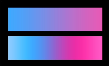
Here's what I made to show Freight Train all those weeks ago:

4lJiFzK.jpg


The top one is a basic blue to pink gradient (which is mostly what I think you've done?), where you end up with a lot of that dull purplish colour in the middle. The 2nd one is what I would do, which is bring those colours a lot closer to the middle of the gradient to reduce the purple, punch up the saturation, and then have the saturation fading slightly and brightness punching up at the ends so each colour has it's own mini gradient within itself. Doing these things will give you a much more vibrant gradient that I think would really increase the visual impact of your entry.

This is one of those things that matters much more on screen than it does in real life, but obviously that's the arena we're playing in.

The other thing i'd do is mess with the highlight overlays in your template to get your blacks blacker. Vibrancy comes from contrast, and especially given your theme it's really important.

Your identity is great and you're putting out better entries every season, so you're really not far away from the top teams here.
 

Log in to remove this ad.

Remove this Banner Ad

Back
Top