Poll NAFL - Round 10 - Logo Round

Which jumper do you prefer? Do not vote for yourself.


  • Total voters
    35
  • Poll closed .

Remove this Banner Ad

Maybe I'm still in logoOTW mode but IMO anyone who created an original who lost to someone who borrowed artwork has the right to feel pretty aggrieved. It's a design competition after all.
 
Maybe I'm still in logoOTW mode but IMO anyone who created an original who lost to someone who borrowed artwork has the right to feel pretty aggrieved. It's a design competition after all.

It is primarily a guernsey design competition, the logo round is just a one off and was never designed to be for specific logo designers. As such I have no issue with using elements from other images to create a new logo.

If it was just a create a logo comp then it would be different.

I freely admit (and have done so many times before across many competitions) that my shark is not my own, however it was edited to create the Makos logo. I do this as I am a guernsey designer, not a logo designer, my efforts go into the uniforms and the logos are just used to bring the design together (though I have done some logos from scratch (usually the less complex ones).
 

Log in to remove this ad.

It is primarily a guernsey design competition, the logo round is just a one off and was never designed to be for specific logo designers. As such I have no issue with using elements from other images to create a new logo.

If it was just a create a logo comp then it would be different.

I freely admit (and have done so many times before across many competitions) that my shark is not my own, however it was edited to create the Makos logo. I do this as I am a guernsey designer, not a logo designer, my efforts go into the uniforms and the logos are just used to bring the design together (though I have done some logos from scratch (usually the less complex ones).
I totally agree in general, but I guess I feel it's a bit of a different story in logo round
 
I'm a little less gracious in defeat now, haha.

Then again, in most other competitions, I've heavily borrowed art work for logos, and sometimes for jumpers. There's a fine line between appropriating and recolouring, though.
 
Logo_zpseedd19ae.png

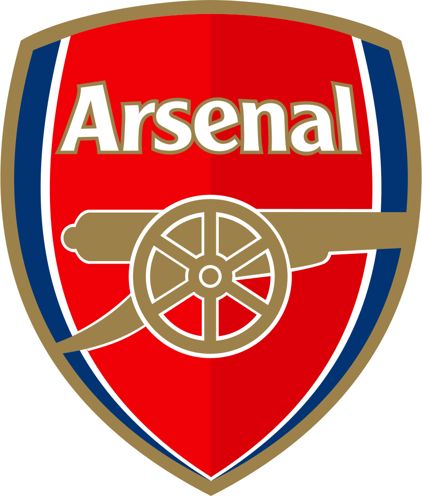
I thought this would look a lot better in my head, but then when I finished it was really bland and the font looks terrible, wish I could go back and change stuff. Also, the idea behind using a Melbourne Victory/Arsenal shield was to have a modernised version of a traditional logo, whereby the sidepanels from the jumper, meet the vee to for an M, which represents Port Macquarie.

melbourne-victory-ends-partnership-with-energywatch_00046725-leadimage.jpg


870px-Arsenal_FC.svg.png
I thought I'd seen that shield before! I couldn't figure out where I'd seen it :p
 
Suggest not bothering with a logo round next season.
Personally, I think it's a good way to break up the season as well as the competition in terms of rankings.

Gives some a chance to catch up, and gives others a pain.
 

(Log in to remove this ad.)

Personally, I think it's a good way to break up the season as well as the competition in terms of rankings.

Gives some a chance to catch up, and gives others a pain.

It's a good idea in theory but I'm not really sure what's being measured by this vote.
 
Back
Top