Poll NAFL - Round 13

What jumper do you prefer? Do not vote for yourself.


  • Total voters
    28
  • Poll closed .

Remove this Banner Ad

NAFL - Round 13

Poll will be open for 4 days.

Do not vote for yourself or ask people to vote for you, you will be penalised.


Vote once in each game (besides your own).


Home team image is on top.


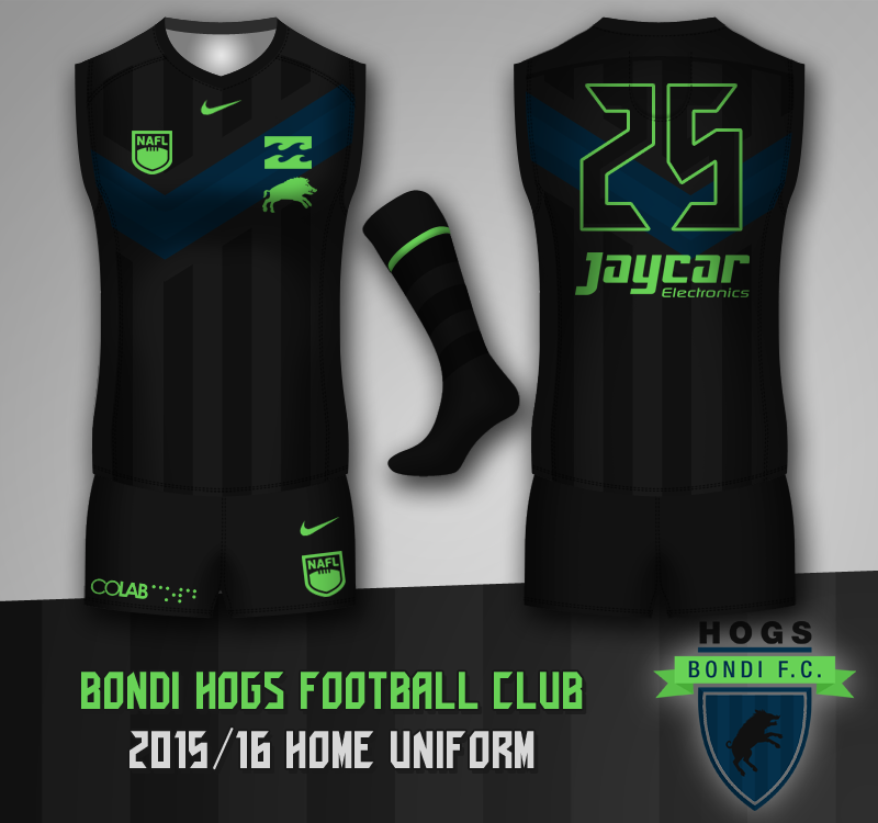
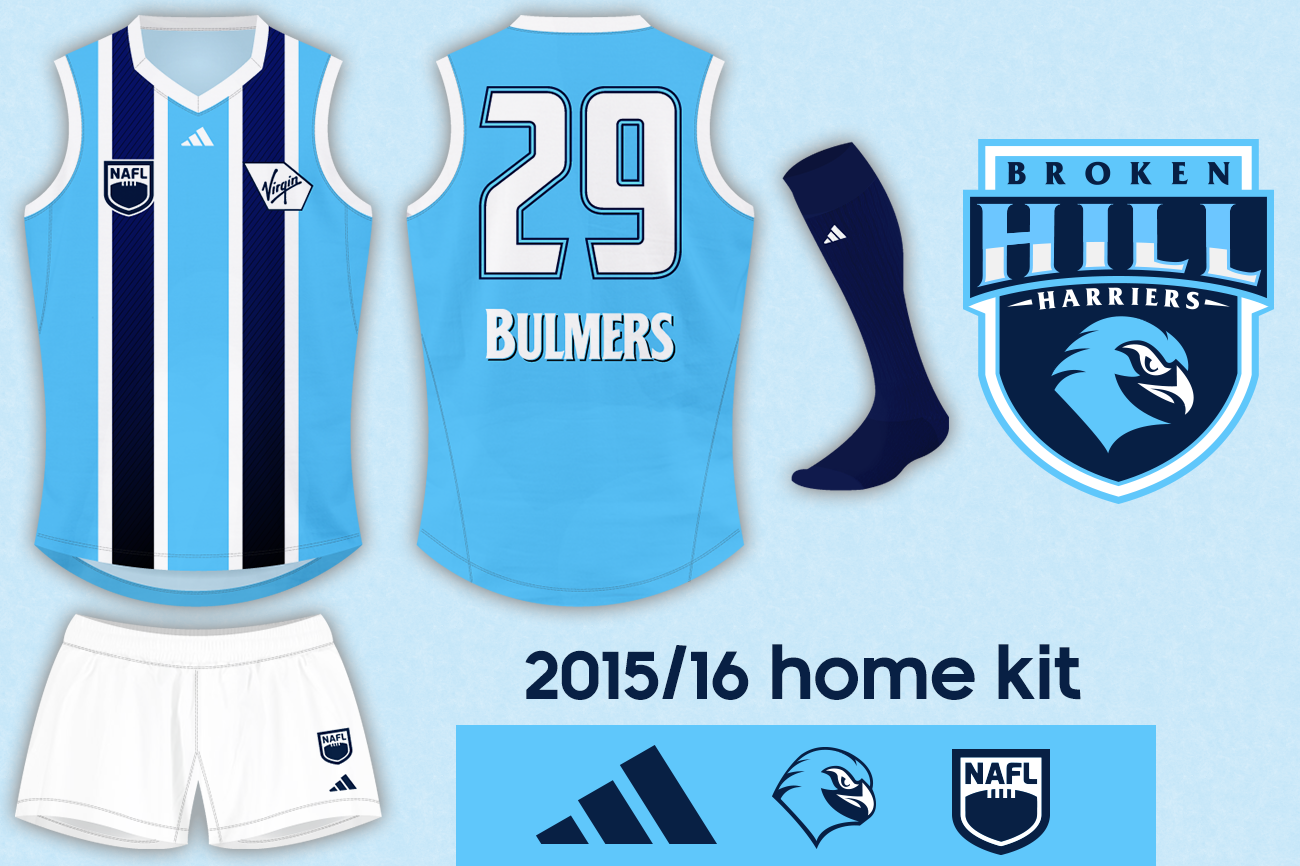
Bondi Hogs v Broken Hill Harriers


pzPHBpT.png


mRARw4c.png


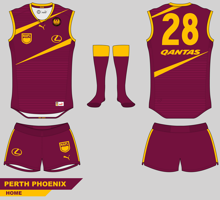
Perth Phoenix v Hahndorf Eagles


Perth%20Phoenix%20Home_zps1m9ooatx.png~original


hfc2_zpsua3xxcyj.png


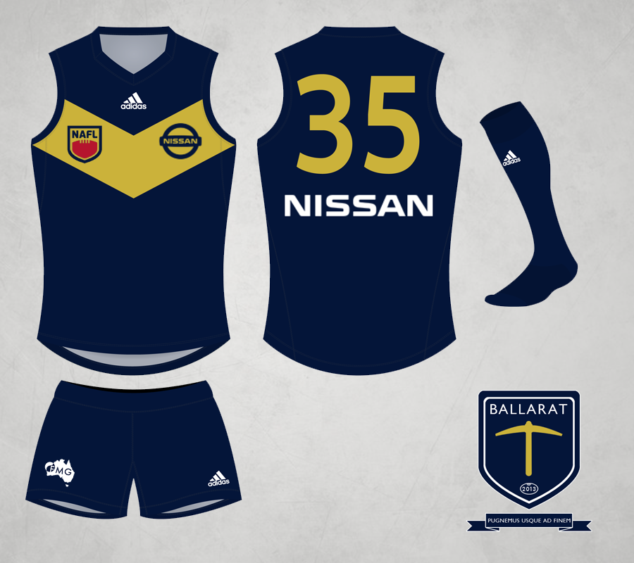
Waikato Tigers v Ballarat Diggers


201516Homekita87e7.png


Pw09nxb.png


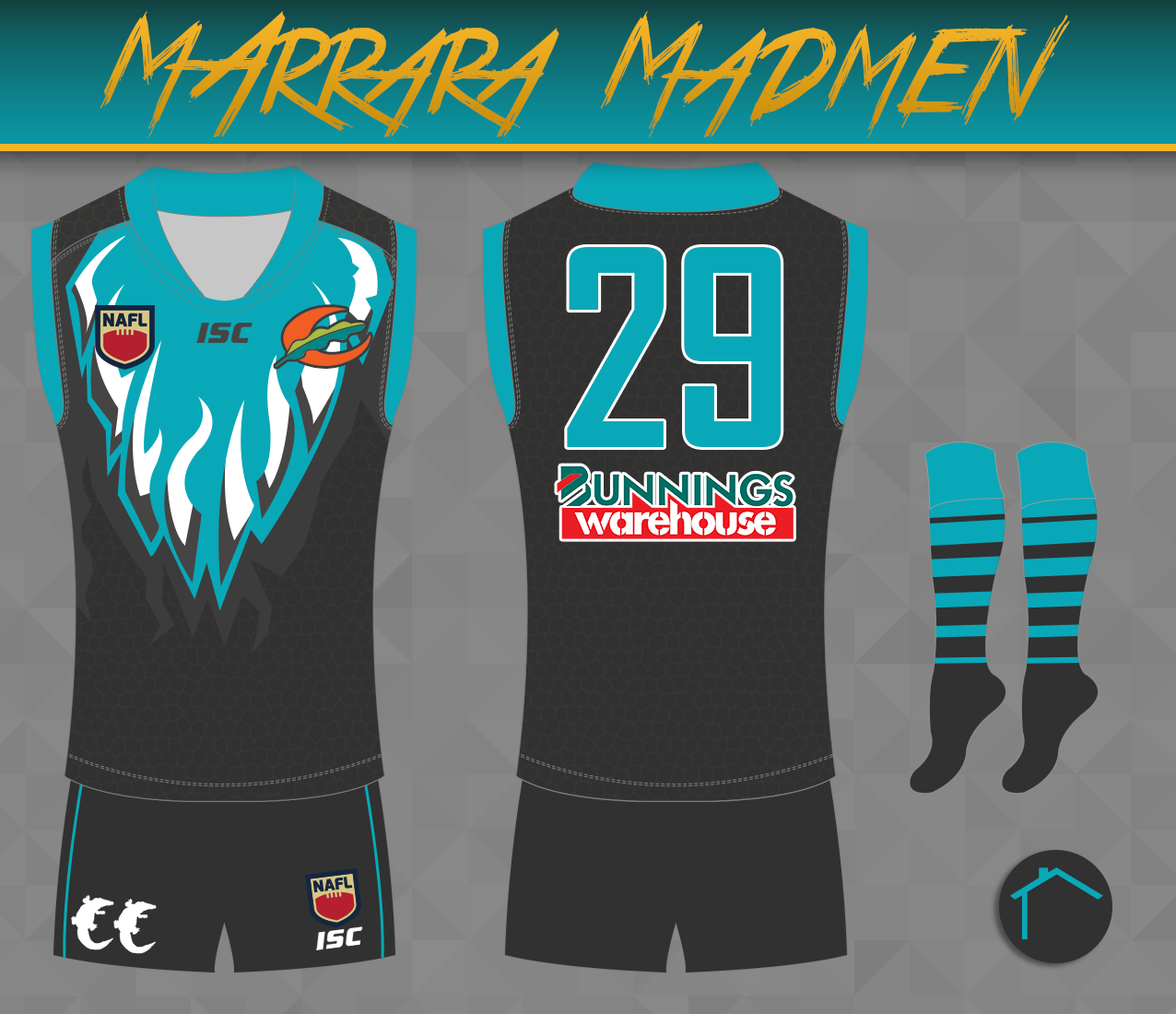
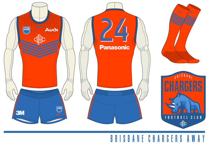
Marrara Madmen v Brisbane Chargers


SrtmcSN.png


Brisbane%20Chargers%20Away_zpsfy2po85t.png


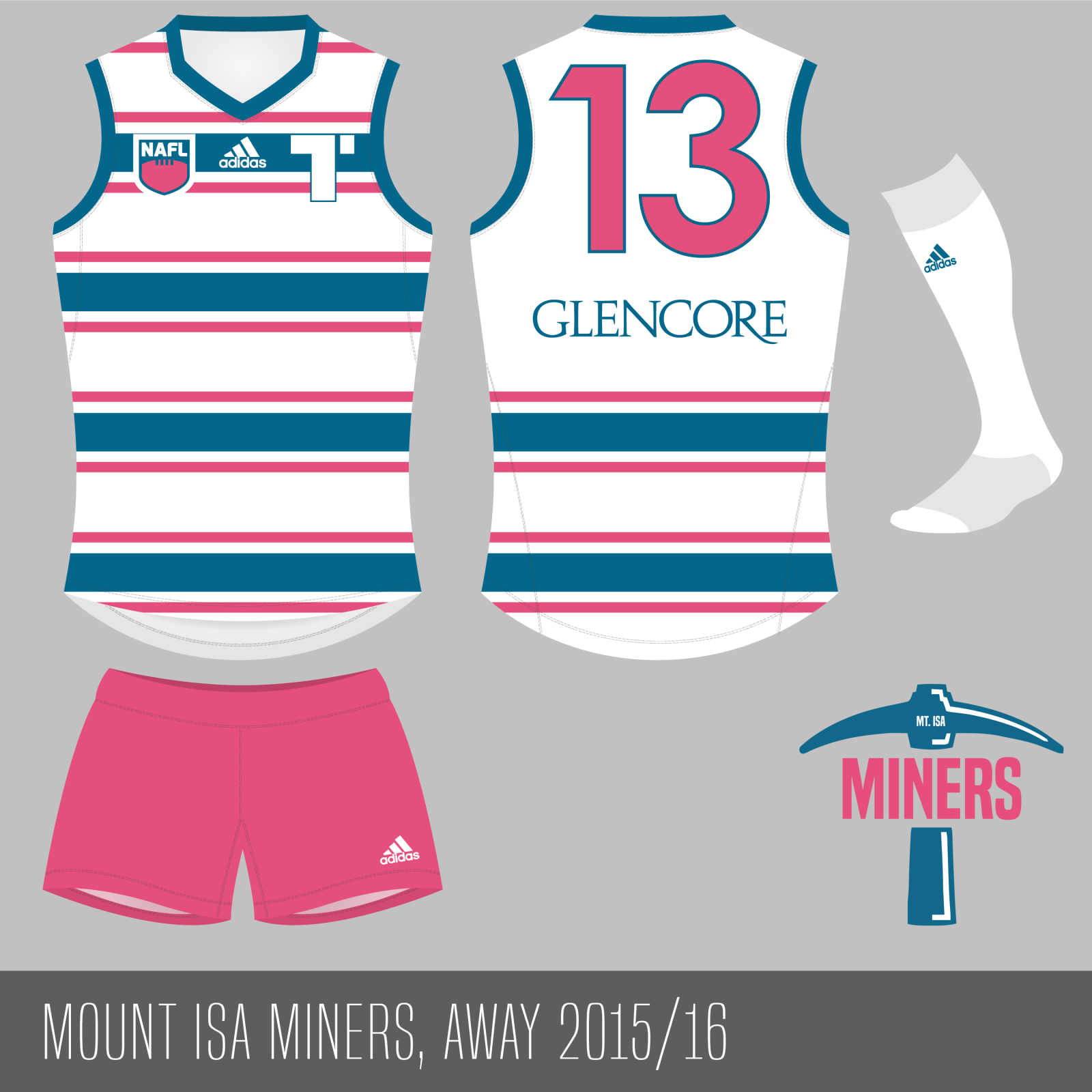
Capital Hill Kookaburras v Mount Isa Miners


Capital%20Hill%20Home_zpsps3xve8o.png


34fdziw.png


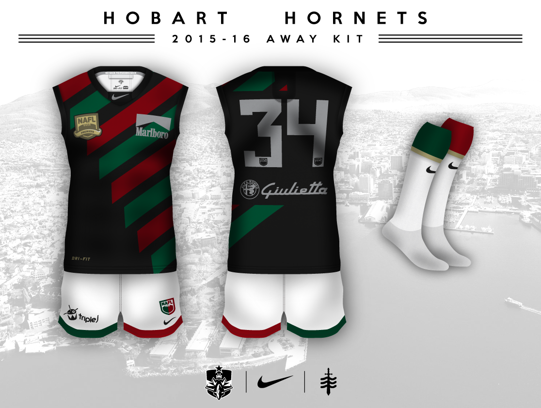
Greensborough Golds v Hobart Hornets


GreensyGoldsHomeEntry_zps4zdgofyx.png


AGE7QA6.png


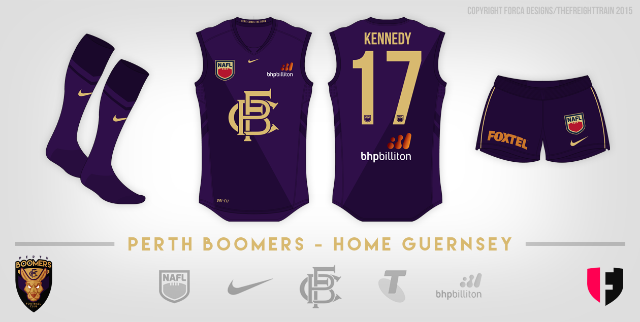
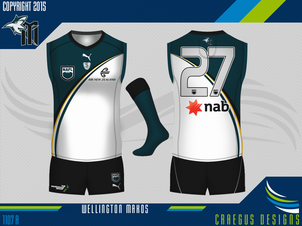
Perth Boomers v Wellington Makos


21575932743_e19b18c9c8_o.png


Wellington%20Makos%20Away%20Australia%202015_16_zps2pio1w9z.png


Canberra Magpies v Adelaide (Great White) Sharks


YY6pPn7.png


Adelaide%20Sharks%20Clash_zpsdnkeape1.png


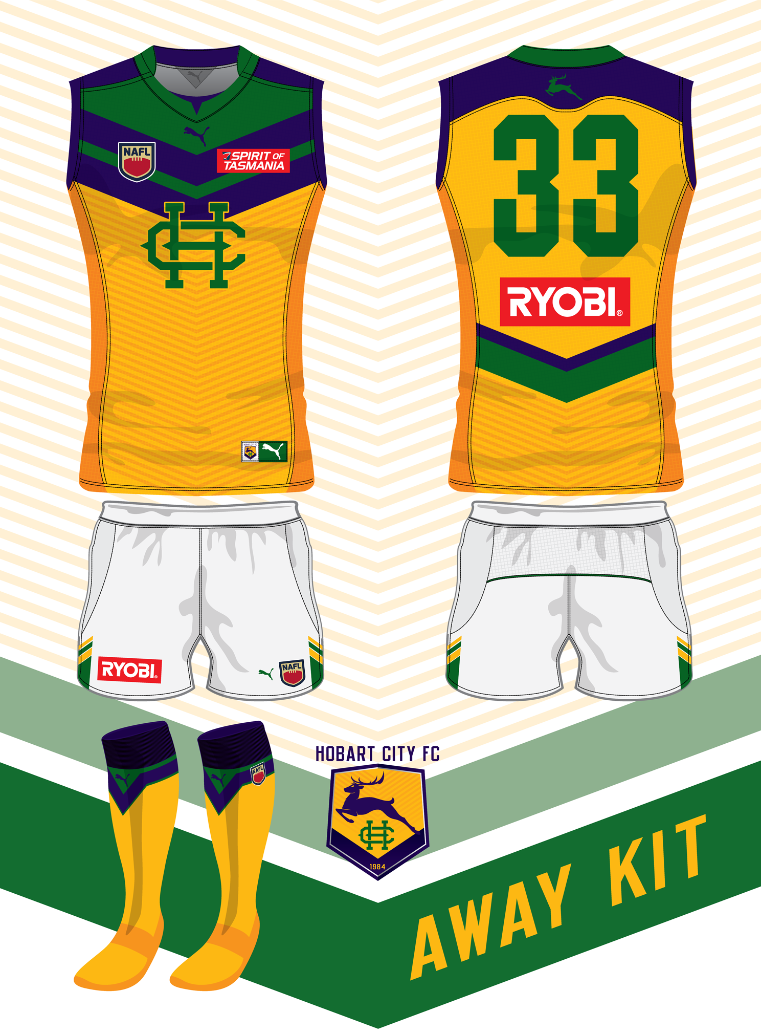
Southern Tip Swordfish v Hobart City FC


Home_zpsjsdkq4cu.png


3On0S0E.png


Log in to remove this ad.

I've got a feeling I'll lose this one for the pure simplicity of the Magpies' jumper. I love it, though. It looks great.

EDIT: .... or not? :confused:

Honestly I think Klim's design is a little too simple. But it would be an amazing design with some gold accents and maybe keeping colour in the NAFL logo- just to prevent that sense of "greyscale". But I do love the simplicity as a guernsey in itself, it's just a matter of how it competes with the more "out-there" designs in the comp.
 
I've got a feeling I'll lose this one for the pure simplicity of the Magpies' jumper. I love it, though. It looks great.
Cheers now I'm getting slaughtered.
Honestly I think Klim's design is a little too simple. But it would be an amazing design with some gold accents and maybe keeping colour in the NAFL logo- just to prevent that sense of "greyscale". But I do love the simplicity as a guernsey in itself, it's just a matter of how it competes with the more "out-there" designs in the comp.
Hey mate yeah played safe on the home and got a bit modern on the clash after last year's feedback by a couple of users. I do take everyone comments and hope to aim bigger and better for the next season. Improving on my mistakes because everyone makes them.
 
Cheers now I'm getting slaughtered.

Hey mate yeah played safe on the home and got a bit modern on the clash after last year's feedback by a couple of users. I do take everyone comments and hope to aim bigger and better for the next season. Improving on my mistakes because everyone makes them.

That's what it's about man. Definitely not ripping into your design but with these competitions you gotta go outside the box, I feel.
 
That is an interesting looking footy oval...
For this match, there's no home ground advantage like the FA Community Shield plus it's getting a gig at Wembley Stadium to promote the game internationally much like the AFL and that exhibition match in China
Hope that explains it ;)
 
Cheers now I'm getting slaughtered.

Hey mate yeah played safe on the home and got a bit modern on the clash after last year's feedback by a couple of users. I do take everyone comments and hope to aim bigger and better for the next season. Improving on my mistakes because everyone makes them.

Design is tougher to get right, but to your credit you've totally taken everyone's advice on board with regards to a clean entry and good execution. I'm looking forward to your applying your attention to detail to something a bit more adventurous in the next comp.
 

(Log in to remove this ad.)

Back
Top