Discussion Should Fremantle #ReturnTheAnchor?

Should Fremantle...

  • #ReturnTheAnchor

  • remain boring?


Results are only viewable after voting.

Remove this Banner Ad

Not jumper anchor but anchor related. The logo anchor seems a bit too plain. If they stylised the logo anchor a little (something cleaner than this obviously) it could translate to the jumper fairly well if the were to ever revert back to an anchor jumper design. Would maintain a consistent image between the two also.

Freo logo.jpg
 
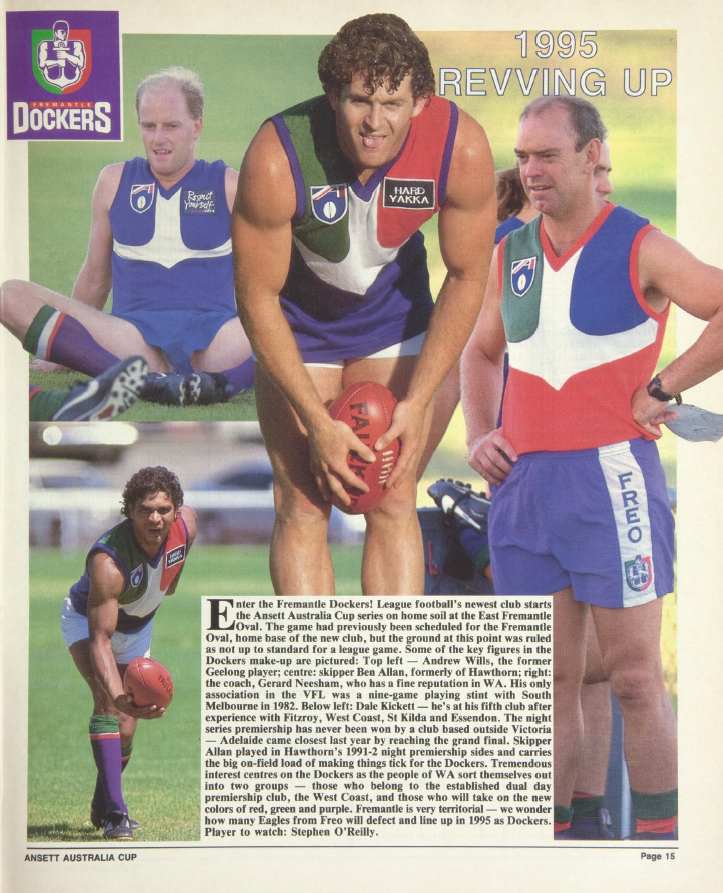
The rest of these designs are complete eyesores, but I still maintain that a white anchor with a plain purple base is Fremantle's ideal jumper design, as seen in the top left worn by Andrew Wills (I think that's him).

2LjYsfm.png
 

Log in to remove this ad.

The rest of these designs are complete eyesores, but I still maintain that a white anchor with a plain purple base is Fremantle's ideal jumper design, as seen in the top left worn by Andrew Wills (I think that's him).

2LjYsfm.png
I liked the home jumper. Minority view it seems!
 
4 colours is a bit too much for me. I think keeping the green could have been achieved. Really wish they wore the green anchor guernsey last year instead of the old home one
I would've said keep Purple, Red and White. Purple represent a new and vibrant bluish hue of East Freo and Red to keep the colour of South Freo.
 
It's amazing this thread is still going. Fremantle's current imagery (logo, jumper AND colours) is the best in their history and their indigenous jumpers are consistently some of the best. They've also played in a Grand Final, a couple of prelims and a number of finals series, which is the kind of thing that people will associate that himagery with in decades time. Freo fans will be arguing to keep the chevrons in 50 years time.
 
Last edited:
Yeah, I always found it quite clever that the team's main colour is effectively a blend between East & South Freo's colours. Not sure if it was intentional or not.

After the fact they have tried to claim it, but AFAIK, the original intention claimed was that the dockworkers in Freo would often wear navy beanies and singlets that would end up sun bleached into a purple hue.

End of the day though, it’s just because purple was a popular colour for sports teams in the 90s.
Yep, that was the reason the Glory was purple, it woz kool
 
Yep, that was the reason the Glory was purple, it woz kool

teeeeeeeechnically, the Glory was purple and orange as a direct rip of the Phoenix Suns branding which they’ve had since the 70s but purple being the “cool, fresh and edgy” colour of the 90s would have played it’s part.
 

(Log in to remove this ad.)

Purple anchor as home, White anchor as away, Green as clash?

The anchor always suffered because of 90's designs. More modern, cleaner designs that aren't so busy would help the anchor a lot.
 
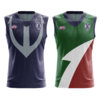
Ripped from my AFL Nova portfolio but if they were to return to the anchor it might be best if they kept the Purple + White combo instead of adding green and red back into the mix, save that for a heritage guernsey of sorts. This is what I would go for if they were to returned the fabled anchor. And there's probably enough white on the Home jumper to make it look good and compatible with white shorts for use as an away when there is no clash.
View attachment 868560View attachment 868561
I strongly agree, the red and green look out of place, for me, it's better just haze and white. The anchor should be thick like yours, but I'd like to see it a tad big longer. The Anchor just looks so much more powerful and intimidating, the current one just looks really weak.
 
After all, isn't the point to "hit 'em real hard & send 'em down below"? ;-)
Yes, except that's being done to the opposition. Not placing an anchor around your own neck to send yourself down below.

purple being the “cool, fresh and edgy” colour of the 90s would have played it’s part.
I thought that was teal. RIP Vancouver Grizzlies.
 
The anchor should be thick like yours, but I'd like to see it a tad big longer.


Jokes aside yeah I agree I like the idea of the anchor as the main symbol for the club. And while there's some good history behind the current design, I think they should embrace the anchor, or at the least utilise it a lot more.


Jokes aside yeah I agree I like the idea of the anchor as the main symbol for the club. And while there's some good history behind the current design, I think they should embrace the anchor, or at the least utilise it a lot more.

Haha, I thought that came off perverted, too, after I posted it. The broader anchor just looks more intimidating. There's other clubs, too, that have better older designs that have been discarded, like North Melbourne's blue guernsey with the white V, and it's logo underneath.
 
Fremantle's identity issues come down to not being based in Freo but a dusty wasteland.

first: keep the home strip as it is now.

I'd hunker down on the tradition of the town and its connection to football. mainly, the fact that Freo is just full of federation-era buildings. integrate those consistent elements. I'd co-opt the great fonts you see on those buildings to integrate into the logo, but to use as an official club font. something like this:
1597754820230.png
1597754895603.png
1597754943486.png
1597755026970.png

the Anchorman was a classic too; it's hard to pull off a human mascot and in world sport, who else does it? it looked surprisingly prideful and strong for a purple cartoon, essentially. I'd try and bring that back as part of the new logo.

for an away strip, I'd try and use a beige or off-white as you see on the buildings. they also have these heavy, simple verandahs and pillars and diagonal lines... I'd integrate them into the chevron design, maybe having the three major chevrons in purple and the rest in two-tone, which'd be a slight nudge to a design as worn by the initial Fremantle Football Club:
1597754648912.png

I think the classic green and red have their place. it's part of history and it's part of its quirkiness. after a couple of seasons, you could bring those colours back in and play with them a lot more in stuff like polos and membership roll-outs. but for the first couple of years, hunker down on the solid purple-and-white look and get the new look out there. green and red training jumpers always looked class, so I'd make them a permanent fixture. definitely feel like the initial anchor jumpers should be worn a couple of times a year; I like the idea of the green being our 'MCG' or Victorian jumper (except for finals).
 
I've always liked the anchor, even now I think the logo is great and their current guernsey's are pretty much perfect.

But I've still been playing around with their identity just or fun, started to design a new logo and Guernsey a few weeks back, these are early stage concepts and haven't been thought out or refined much, just can't get my anchor working over the jumper...

Anchor-Logo.jpg Freo-Anchor.jpg
 
Back
Top