Zoops
Club Legend
- Apr 20, 2017
- 1,406
- 5,416
- AFL Club
- Melbourne
- Other Teams
- Vancouver Canucks, Southampton FC
Follow along with the video below to see how to install our site as a web app on your home screen.
Note: This feature may not be available in some browsers.

I'd feel more comfortable as a parent with my child displaying the relatively 'cuter' yet still fierce Devil logo in Map of Tassie than the demented AI bastard child of a logo they've come up with.View attachment 1933335
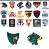
Side by side with the other league logos, one fits the overall well-established simplified aesthetic and sits about middle of the pack and also very versatile (colouring of shielf can be altered to fit in any graphical situation, I prefer the red border), while the other one looks clearly like AI-generated IT work experience kid job that we all know it was lol
And I guess it's also a nice bonus that the former actually looks like the thing its representing
When they started talking "wild" in the lead up to the logo reveal, I started to get excited that there might be a logo with similar taste to Minnesota Wild NHL logo. Tasmanian Wild could have been a good name, too... would have been unique... but, they've mailed the colours, I'm fed not convinced by the logo and a little whelmed by the jumper.What was the whole 'wild' thing. Unnecessary
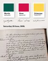
What wouldve been cool is if the jock tag was the shape of the islandNot sure if I ever got around to posting these left over concepts but here they are anyway. Just goes to show it doesn't have to be anything crazy. They should embrace the Rastafari vibes
View attachment 1933080View attachment 1933081View attachment 1933082
The old logo looks like a trophy head on a house lounge room wallView attachment 1933335
Side by side with the other league logos, one fits the overall well-established simplified aesthetic and sits about middle of the pack and also very versatile (colouring of shielf can be altered to fit in any graphical situation, I prefer the red border), while the other one looks clearly like AI-generated IT work experience kid job that we all know it was lol
And I guess it's also a nice bonus that the former actually looks like the thing its representing

View attachment 1933465
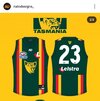
This was always my #1 choice for first year home jumper from magpienato, and the fact he could make the logo monochrome like this - it can be used on any background and be any colour and still stand out. Plus the shield design doubling up as a map of Tasmania. With the new logo none of this can be done easily unfortunately.

View attachment 1933335
Side by side with the other league logos, one fits the overall well-established simplified aesthetic and sits about middle of the pack and also very versatile (colouring of shielf can be altered to fit in any graphical situation, I prefer the red border), while the other one looks clearly like AI-generated IT work experience kid job that we all know it was lol
And I guess it's also a nice bonus that the former actually looks like the thing its representing

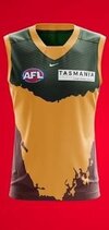
This would look so much better if it was stylised, rather than a detailed map.Saw this on Facebook and there is something I just like about this jumper. The way the map creates a yoke and side panels just works for me.
I'd probably flip the colours around so the map part is green but it's an interesting take. The large map would probably also look good as an outline similar to the GWS never surrender or Adelaide gather round jumper.View attachment 1933685
It's decent now. But the needles "greater' in the name and the dull faded orange and grey originally was a big let down at the time. Puma coming on board helped significantly.
Might be something to do with the fact that the "old" Devils logo (was made in 2018 so hardly old) actually looks like a Tasmanian Devil.
This new Tasmania logo is the textbook definition of amateur. Lacks structure, lacks character, lacks distinction and most importantly lacks integration with any aspect of the Tasmanian identity whatsoever.
To say it already looks aged isn't entirely true because that would imply it was ever really in vogue or contemporary with any design style or convention.
I've tried to make some logos/emblems in my time here and trust me, it takes an amateur designer to know an amateur design. You're absolutely entitled to your opinion but it's clear you're not really sure what you're talking about.
The two stripes have always been my preferred choice and with the recent reveal here's my revised concept. The 1980 state jumper is the blueprint.View attachment 1933310
View attachment 1933313
It's not about 'realism' it's about looking 'like' the animal and the new Tassie logo looks like a furry more than anything which is the issue at hand. It is unrecognisable and a logo that isn't recognisable is functionally bad.How many of the team logos go for realism? Mainly the bird teams...
Collingwood and Swans the main two stuck to more realistic looks, Eagles, Crows have had varying designs.
This perfectly shows the issue with the new logo. To say it sticks out like a sore thumb would be an understatement. It will not translate well onto merchandise, TV and pretty much anywhere it's applied because it has been designed poorly and unprofessionally.View attachment 1933335
Side by side with the other league logos, one fits the overall well-established simplified aesthetic and sits about middle of the pack and also very versatile (colouring of shielf can be altered to fit in any graphical situation, I prefer the red border), while the other one looks clearly like AI-generated IT work experience kid job that we all know it was lol
And I guess it's also a nice bonus that the former actually looks like the thing its representing
You're worried about this jumper not having a 'pro team look' and yet you're fine with the new logo? I'll have what you're smoking RastamanLooks like an ammo teams not a pro teams "look" imo.
Is that meant to be a negative? It looks charming and timeless and would last 15+ years of use while the new logo aged the moment it was introduced.The old logo looks like a trophy head on a house lounge room wall
I mean that was just the first version of it that I saw on google images and could edit into the image on snapchat. Through the many versions of it, its as easy as recolouring it properly to make it stand out (as seen in my post below it showing magpienato's design, an easily superior application for the U18 logo.whereas to me, looking at this on a phone, I feel the old (u18s) logo scales really poorly – look how the face blends into the shield and your eyes are drawn simply to the yellow mouth area – as opposed to the new logo, which for all its detail and weird chin, actually scales quite well
It's not about 'realism' it's about looking 'like' the animal and the new Tassie logo looks like a furry more than anything which is the issue at hand. It is unrecognisable and a logo that isn't recognisable is functionally bad.
You're worried about this jumper not having a 'pro team look' and yet you're fine with the new logo? I'll have what you're smoking Rastaman
