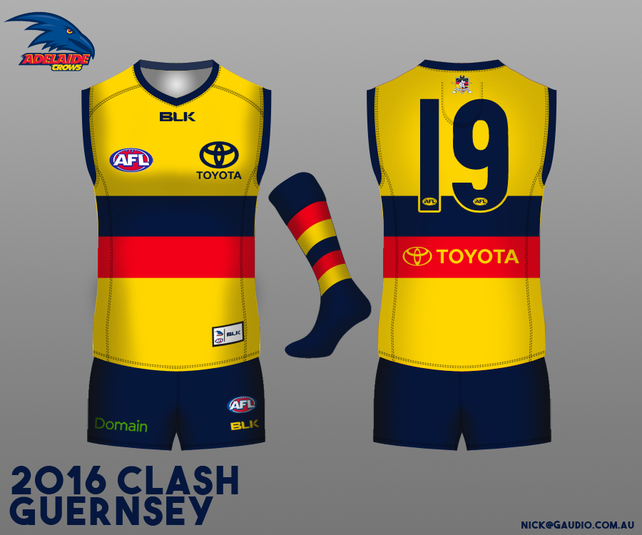
2016 Clash Guernsey: Two Designs Confirmed!

Which one is best?

  • A

  • B

  • C

  • D

  • E


Results are only viewable after voting.

Remove this Banner Ad

IMO the two best guernseys have been chosen but I don't understand all this praise for the 'transparency' of the published results. Percentages don't mean anything unless you know what they're percentages of.

So 23% loved Design A. 23% of the total vote? 23% of the gradings for Design A were for 'Love it!'? 23% of 'Love it!'s were for Design A?

And what is 'Net Positive Score'? How is it calculated? I thought it might be aggregated percentages of 'Okay', 'Pretty Good' and 'Love it!' but that doesn't add up.

What's more, the percentages for Designs A-D all add up to only 99%. Only Design E adds up to 100%.

Like I said, not unhappy that the two hoop designs have been selected but this all looks a bit manufactured to me.
It's the positive comments minus the negative comments.
 
Nice work????
The white jumper is a lovely jumper but nice work?

The voting system is ridiculous and most statisticians would have told you you'd get an inconclusive result with using varied indicators.

The designs themselves are simple knock offs of the Bulldogs jumpers, which is also fine, but nice work?

There was little to no work done here and the work done was done poorly. If this is the standard we are holding Fagan to then he can't fail.

This has always been about having a simplified, traditional away guernsey. So yes, job done. Nice work.
 
It's the positive comments minus the negative comments.
What is?

Edit: Okay, worked out what I think you mean:

Design A - ['Love it!' (23%) + 'Pretty good (16%) + Okay (16%)] - ['Not great' (18%) + Yuck!' (8%)] = 55% - 44% = Net Positive Score 11%. Check.

Design D - ['Love it!' (18%) + 'Pretty good (25%) + Okay (31%)] - ['Not great' (17%) + Yuck!' (26%)] = 74% - 25% = Net Positive Score 51%. Um, nope. That should be 49%.

Also, 'Okay' is positive? I would have thought most people would see that as neutral.
 
Last edited:

Log in to remove this ad.

This has always been about having a simplified, traditional away guernsey. So yes, job done. Nice work.
Like I said, if your standards are that low then you are always going to be pleased with what the club does.

If they had simply come out with the white design nobody would have been bothered, fake transparency is not transparency. The 'work' involved here is in the design and the voting system. The design is a copy, not a problem but no credit for that. The voting system is a joke, certainly no credit for that.
 
For me the most important thing was getting rid of elements on the guernsey that were clearly wrong.

The moment that stupid raptor head came out in a weird mid royal blue colour and infected the onfield image it went down hill.

White is white, its the current raptor claw colours that are none of our actual colours that bother me. It's the wrong shade of blue, yellow and red.

BLK colouring aside on the home, the away strip is deliberately wrong.

Sent from my SM-N915G using Tapatalk
 
Like I said, if your standards are that low then you are always going to be pleased with what the club does.

If they had simply come out with the white design nobody would have been bothered, fake transparency is not transparency. The 'work' involved here is in the design and the voting system. The design is a copy, not a problem but no credit for that. The voting system is a joke, certainly no credit for that.
It's not a copy, the hoops are what they are. And as a 'design' some of us on this board mocked up designs consistent with that years before the Bulldogs went with their current guernsey (2012 after a 40 year hiatus). It's all copying.

Sent from my SM-N915G using Tapatalk
 
Last edited:
We would probably never wear the yellow with Navy shorts, but aesthetically I think it looks the best. I'll post up white shorts and yellow shorts tonight. dayton what screen are you using to look at it with? Looks quite gold viewing with an iPad

Normal HP work monitor.

Maybe using the term "gold" wasn't the best way to describe what I meant. What I meant was a yellow with a slightly redder hue.
 
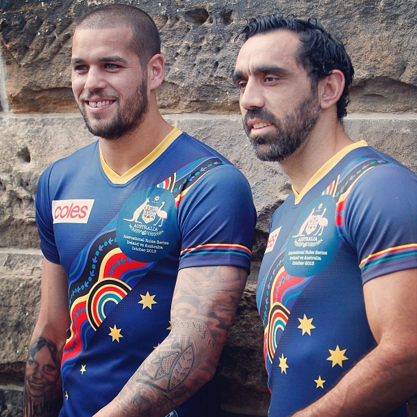
Why not just wear this and go the whole hog for wearing representative jumpers?
31167-australian-international-rules-2014-adults-guernsey-740.jpg

No - the above is not our colours but this is and it represents us 100%! : Crows controversial jumper.jpg
 
Like I said, if your standards are that low then you are always going to be pleased with what the club does.

If they had simply come out with the white design nobody would have been bothered, fake transparency is not transparency. The 'work' involved here is in the design and the voting system. The design is a copy, not a problem but no credit for that. The voting system is a joke, certainly no credit for that.

My standards aren't low, they're high. Traditional guernseys are the best and the club has finally put an end to the childish rubbish.

Have a look at the threads when the "murder of crows" or "flagpole" guernseys were announced. They were a god damn whingefest.

You're one of the few whinging this time around.
 
Not exactly on topic but still guernsey related...

I wonder if we'll ever see sleeved guernseys become the norm? And no, not long sleeves. Sleeves like:

ScreenShot2013-08-29at125755PM_zpsfe4126f4.png
 

(Log in to remove this ad.)

What is?

Edit: Okay, worked out what I think you mean:

Design A - ['Love it!' (23%) + 'Pretty good (16%) + Okay (16%)] - ['Not great' (18%) + Yuck!' (8%)] = 55% - 44% = Net Positive Score 11%. Check.

Design D - ['Love it!' (18%) + 'Pretty good (25%) + Okay (31%)] - ['Not great' (17%) + Yuck!' (26%)] = 74% - 25% = Net Positive Score 51%. Um, nope. That should be 49%.

Also, 'Okay' is positive? I would have thought most people would see that as neutral.
What were the voting parameters? I forgot to actually vote. Did you get one 'response' per guernsey?
 
God no. It looked ridiculous in the NBA.
I was going to say, the fact they started doing it in the NBA means I wouldn't be surprised to see them try it here. Mind you, I think a lot of the players wouldn't like it if it gives their opponents more guernsey to grab on to, like how most players don't play in long sleeve ones anymore.
 
No you got to vote for each option, from love it to yuck.

Sent from my SM-N915G using Tapatalk
That's what I meant.

The "net positive score" %'s add up to 119%. Maybe we're just thinking of new and creative ways to troll Port Adelaide. Keeping it fresh.
 
That's what I meant.

The "net positive score" %'s add up to 119%. Maybe we're just thinking of new and creative ways to troll Port Adelaide. Keeping it fresh.
I think the results have been creatively arranged to support the required outcome. At least they learned that much from the last time.
 
I think the results have been creatively arranged to support the required outcome. At least they learned that much from the last time.
Actually, having played around with the numbers (I can't pass on a good maths challenge), the "net positive score" is just the sum of "love it", "pretty good" and "okay" less the sum of "bad" and "hate".

If I were looking at these stats from a business perspective, I'd see that my quantifiable measuring stick tells me to go with Option D permanently as our clash. It's the "net positive". Now, they're obviously open to - and maybe even keen to - go with an alternative strip. Obviously not going to go with a similar one to that chosen (so that rules out B, D, and E anyway). I'd see that there's a massive push for A. It's polarising, obviously, but it fits a practical purpose AND it's the most "loved".

Not outside the realm of possibility. Maybe it's a little contrived, but what business decision isn't? We can't leave everything up to the masses...

EDIT: You've already worked this out. I am so very slow. It's possible someone just did the number crunching wrong. It's a trivial variance, anyway.
 
I'm surprised we (the BigFooty board) are so out of step with the rest of the supporter base. Almost 90% of posters on here voted for A or D yet the vote had B and E right up there for popularity. Who are these numpties?
 
I'm surprised we (the BigFooty board) are so out of step with the rest of the supporter base. Almost 90% of posters on here voted for A or D yet the vote had B and E right up there for popularity. Who are these numpties?

I'm surprised too. My wife immediately picked B.
 
Alright, been working on getting the fine details down pat tonight in regards to a two hooped version on a yellow base. How's something along the lines of this?

This is using the correct Pantone colours that are in the AFL Brand Book too, might appear lighter or darker depending on the display you are viewing it on (My MacBook screen is a bit more pale, but my external monitor is a nice gold). You get the jist anyway.

AFC%20Clash%202016.png

This would be a shut up and take my money purchase for me. Have you sent it to Fagan/the club? Looks a whole lot more polished than the one in the voting graphic.
 
Back
Top