Navigation
Install the app
How to install the app on iOS
Follow along with the video below to see how to install our site as a web app on your home screen.
Note: This feature may not be available in some browsers.
More options


You are using an out of date browser. It may not display this or other websites correctly.
You should upgrade or use an alternative browser.
You should upgrade or use an alternative browser.
Best AFL Logo
- Thread starter kaij10
- Start date
- Tagged users None
I think the old AFL logo was very clever, far more "clever" than the new one (it simply takes a slice of the national flag adds a small line to make the A and then adds a football).No Way, the old ALF logo is lame. The new one is very clever.
However, no matter how clever, the old logo was rubbish. The new AFL logo is far far better.
- Sep 15, 2007
- 15,607
- 15,036
- AFL Club
- Hawthorn
Richmond.
Best jumper too.
Best jumper too.
- Sep 15, 2007
- 15,607
- 15,036
- AFL Club
- Hawthorn

^Wreaks of awesomeness.
Haha. Awesome alright, sideways cap and all.
What was that used for?!
On that note, I'd like to give a shout out to all the swingers from 1958:
My newfound and favourite "CFC". Thanks Blueseum!
Well as much as I tend to dislike almost anything BlueFilth.... I have to admit, THAT ^^ is seriously awesome
swans16
Team Captain
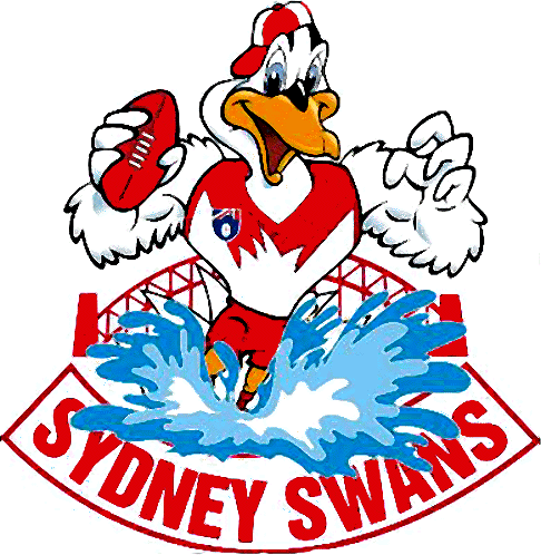
The Sydney Swans' logo is the greatest.
- Aug 17, 2006
- 23,308
- 21,607
- AFL Club
- Geelong
Looking at the results, I'd say the Bulldogs is the most underrated. I reckon it's a good one.
The cat silhouette on the breast of the jumper is a ripper, but the stupid big Cat's head one cancels it out. And then some. I really liked Hawthorn's previous one. Simple, unique and looked great on a polo shirt. Carlton's is good, Richmond, St Kilda etc...etc...
The cat silhouette on the breast of the jumper is a ripper, but the stupid big Cat's head one cancels it out. And then some. I really liked Hawthorn's previous one. Simple, unique and looked great on a polo shirt. Carlton's is good, Richmond, St Kilda etc...etc...
the crows new logo will grow on everyone.
lions new logo is pathetic and an embarrassment to fitzroy
carltons is boring and dull like there forward line
collingwoods is well theres not much colour to work with
essendons is getting out of date. better than the mosquito thing they used to have
fremantle enough said
geelongs would have to be a top one
hawthorns is up there
melbournes is pretty dull
north melbourne im pretty happy with
port needs a change
richmond is out of date
st kilda is traditional, not much more ya can really do with there name
swans is getting on
west coast always have a great logo for there time. next one will be amazing
bulldogs s pretty dull. theve had some shockers over the years
ExTasDeeMan
Cancelled
My favourite Dee one.
- Sep 15, 2007
- 15,607
- 15,036
- AFL Club
- Hawthorn

As I write this the poll puts the new Brisbane logo last, with Adelaide and and Gold Coast just ahead. All with less than 1%. I agree - they are the 3 worst logos. The new Brisbane logo and lion treatment is trash. Considering Adelaide has substantial support you would expect a few more votes, but no, the logo is probably worse than the Brisbane one.
GC can be considered a development logo I suspect - expect a new one for the first AFL season in 2011 along with a re-launch and alot of hype.
Does West Sydney have a logo yet? They dont even have a mascott yet do they?
GC can be considered a development logo I suspect - expect a new one for the first AFL season in 2011 along with a re-launch and alot of hype.
Does West Sydney have a logo yet? They dont even have a mascott yet do they?
That guy is awesome, check out his Demons logo...
- Banned
- #114
The Port logo looks alright. However I cant say the same about the team.
any one but the current brisbane lions logo
PUMA PRIDE!!!
PUMA PRIDE!!!!
PUMA PRIDE!!!
PUMA PRIDE!!!!
Jeez that's good, it's basically the same old cleaned up and modernised. Not sure why the club couldn't have gone down that path as I doubt it would have upset people.
Hawks have got a good one.
I liked the Lions until the changed it. They Lion head idea is sound enogh but the actual graohic could be better... Not sure what is wrong. The lions eyes and mouth are ok but I think it is the out line which doesnt quite look right

- Oct 7, 2008
- 9,702
- 42
- AFL Club
- Adelaide
- Other Teams
- GWS, NA Roosters, ATL Falcons
- Banned
- #118
I love the Adelaide one but besides ours my two favourites and equal 2nd are the Bulldogs and Tigers logo
I liked the Lions until the changed it. They Lion head idea is sound enogh but the actual graohic could be better... Not sure what is wrong. The lions eyes and mouth are ok but I think it is the out line which doesnt quite look right
They made it look bored, or slightly put out at best...

The centenary logo would have to our best to date
The centenary logo would have to our best to date
Agree, its better than the current logo,replace the "Centenary" with "TIGERS" and it would be an improvement. (The current one is much better than most anyway, but this does look good).
Unofficial, but I love it...
http://www.costasportslogos.com/content/brisbane-lions-new-logo-afl
Brisbane Lions F.C had it staring at them in the face...
http://www.costasportslogos.com/content/brisbane-lions-new-logo-afl
Brisbane Lions F.C had it staring at them in the face...
That redesigned Lion by itself looks frickin awesome.
Not as keen on the shield or font though I must say.
Not as keen on the shield or font though I must say.
Edward Teach
Team Captain
Carlton.
It's blue, simple. classic.
Only one logo is better
It's blue, simple. classic.
Only one logo is better
- Oct 21, 2009
- 4,984
- 33
- AFL Club
- Sydney
- Other Teams
- SD, Liverpool, Patriots, SA Spurs
- Banned
- #125
The old lions logo was clearly the best and they changed it to that paddle pop lion...
Like the Tiges too.
Like the Tiges too.
Similar threads
- Replies
- 112
- Views
- 6K
- Replies
- 24
- Views
- 2K
- Poll
- Replies
- 0
- Views
- 506
- Replies
- 77
- Views
- 4K
