GreyFiveNine
Rookie
- Jun 28, 2023
- 47
- 138
- AFL Club
- Tasmania
- Other Teams
- New Orleans Saints, New Orleans Pelicans
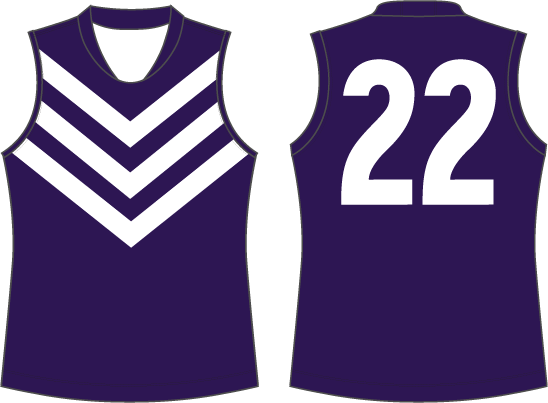
You'd have to go into the mind of the young girl that designed it to find out (rugby top);
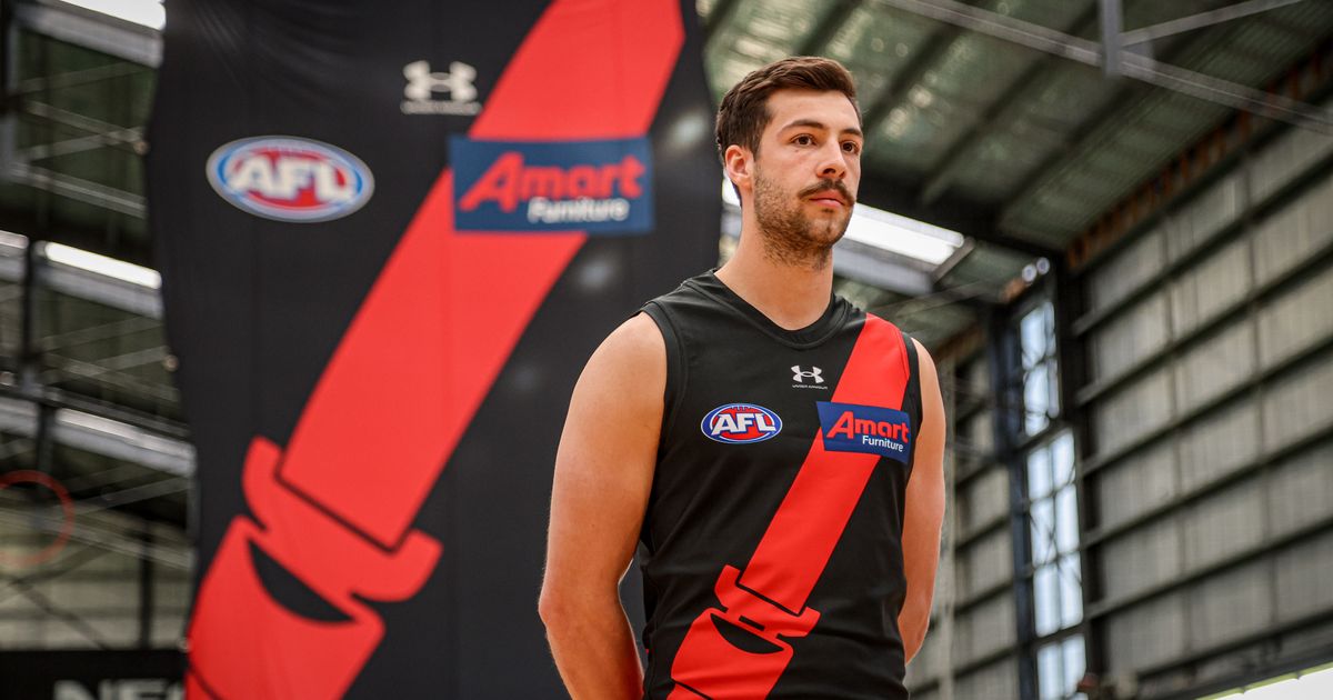
How Lucy’s drawing became big AFL news
It does make sense though. Crows get the state colours and Port get the state design. I'm sure that's not what was running through that girl's mind though.


.jpg")