Discussion Round 14, 2015 - Footy Jumper Discussion

Remove this Banner Ad

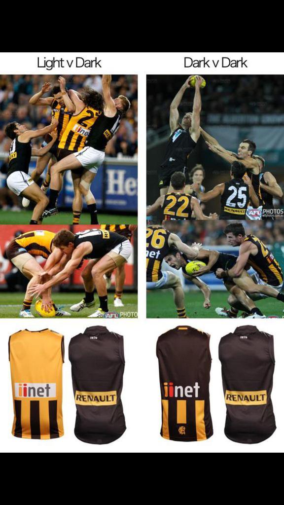
Hawks in a brown jumper and gold shorts can be trialed, I'm open to that (although I still think it will look terrible). However, Collingwood is the last team this should be done against. Pre-season against, maybe Geelong or Sydney, possibly. But Collingwood? You're having a laugh.

As for Collingwood's look, I think you mean to refer to the white jumper and black shorts. Far superior in every sense of the word.

I love both the classic collingwood white jumper black shorts and the newer black jumper white shorts. I think I just visually find the contrast of shorts that match the stripes of the jumper visually appealing. I like the light contrast against a darker kit. Loved the 70's dogs in red shorts or when we wear white away shorts with the home and Richmond's infamous yellow shorts. However these days it is much more practical to have two teams almost in solid contrasting colours. As we saw last night the top isn't the issue for this particular game the gold used creates enough of a contrast, it's more the addition of unnecessary white to the Hawks kit. TBH Hawks in home jumper (purely for the increased amount of yellow) and shorts would be fine for this fixture.
 
Dem sleeves

rPxnGtK.jpg
 

Log in to remove this ad.

So apparently our jumper clashes with GC but Carlton doesn't clash with Footscray

AFL Clash jumper policy.
Consistency tonight though. Both games have a navy team not clashing with a royal team.

They don't clash but I think there should be greater contrast, the same as not having red and maroon.
 
When the best contrast is between one team's jumper and the other team's shorts, you know there should be a contrast jumper in use :)
 
No, I don't agree at all.

Carlton should be in their white strip tonight, though. Sales must be strong, otherwise they'd feel inclined to expose it more often.
 
No, I don't agree at all.

Carlton should be in their white strip tonight, though. Sales must be strong, otherwise they'd feel inclined to expose it more often.
So you don't agree with my guideline but agree with the outcome that it produced? :p
 

(Log in to remove this ad.)

I just don't think your guideline is applicable to every circumstance.

However it is accurate in tonight's instance.
Hawthorn's white shorts contrasted against Collingwood's jumper more than the brown jumpers did.
In a world where Brisbane played away to GC and wore maroon jumper and white shorts, the shorts would contrast more against GC's red jumper than the maroon jumpers would.
Matches involving Collingwood, Carlton, Essendon, Richmond, the white shorts contrast against the home team's guernsey more than the away team's guernsey does.
 
The gold on the Hawks away guernsey is the main clash deterrent, not the white shorts. Stands out greatly and is particularly noticeable in person
 
The gold on the Hawks away guernsey is the main clash deterrent, not the white shorts. Stands out greatly and is particularly noticeable in person
Exception to the rule maybe.
CDbnieEVIAAVjFe.jpg

It was black jumper vs brown jumper last night, sure the stripes helped, so did the numbers, but the shorts were what stood out most.
 
neither on the right prove anything, you've chosen two pictures that don't show both guernseys fully.
It does show that it was a dark guernsey vs a dark guernsey.
I'm not trying to prove a clash, but a desire for greater contrast.
 
Hawthorn refuse to wear their clash cause even they know that it's dead set ugly.
They didn't need their clash jumper, they needed their main jumper. That's the stupidest part about the whole situation - they REDUCE contrast by wearing the brown jumper.
 
hitthepost I respect your stance and consider your argument to have serious weight behind it, but the still guernsey images aren't numbered/given a full 360 view.

The Port/Hawthorn unnumbered replicas would be almost indistinguishable from a distance; testament to the importance of the gold in the overall guernsey make up.
 

Remove this Banner Ad

Back
Top