


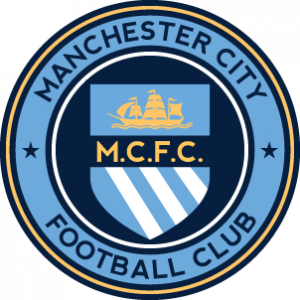
The Man City roundel is okay... as a logo that is, as a crest, it's so bland, or should I say, brand.
Navigation
Install the app
How to install the app on iOS
Follow along with the video below to see how to install our site as a web app on your home screen.
Note: This feature may not be available in some browsers.
More options
You are using an out of date browser. It may not display this or other websites correctly.
You should upgrade or use an alternative browser.
You should upgrade or use an alternative browser.
Discussion Soccer/Association Football New Kits
- Thread starter Silent Alarm
- Start date
- Tagged users None
- Status
- Not open for further replies.
Could barely get past the word Chelsea in this post (unlike the many other teams that have already got past them this season)
As if this crest borrows from other clubs in any way at all? I only piped up at your post because it's drawing such ridiculously long bows. It's directly inspired from our 90s logo
View attachment 203200
View attachment 203201
Yeah mate I understand that, and as I said I understand the symbolism in there.
Surely, you can't deny it's terrible execution though, it doesn't stand out as having any of it's own features, and borrows on arguably its three biggest rivals crests - which are identifiable now as well.
Too many circular/shield borders.
- Moderator
- #4,479
Yeah mate I understand that, and as I said I understand the symbolism in there.
Surely, you can't deny it's terrible execution though, it doesn't stand out as having any of it's own features, and borrows on arguably its three biggest rivals crests - which are identifiable now as well.
Yeah poor execution but I still don't agree it borrows from other clubsk
Yeah poor execution but I still don't agree it borrows from other clubsk
Fair enough, roundels are pretty universal and obviously a lot of their symbols have been shared with the other s**t half of the city for years.
- Jul 9, 2010
- 24,163
- 26,536
- AFL Club
- Fremantle
- Thread starter
- #4,481
This is good.
I'd get rid of the light yellow outer circle, that way you can really make the initials and ship really pop.
But the main thing I like is that it's really easy, a bold contrast, and it only looks like two colours despite the fact there's four. It's really simple and two-tone feeling, and not busy, whereas the actual one seems to be a bit all over the place.
http://www.90min.com/posts/2828722-...by-the-silhouettes-of-their-logos?a_aid=35260
18/20.
Stuffed up with 16 and 20.
18/20.
Stuffed up with 16 and 20.
Bacon Warrior
D10
11. Half of those clubs I hadn't even heard of before.http://www.90min.com/posts/2828722-...by-the-silhouettes-of-their-logos?a_aid=35260
18/20.
Stuffed up with 16 and 20.
Freight Train
Once hit the sign at the Mercantile Mutual Cup
- Moderator
- #4,485
Only got 14.
Some obscure ones in there, I tell you what.
Some obscure ones in there, I tell you what.
cannavo
LFG #16
All but No.12
Klim
Brownlow Medallist
- Sep 17, 2013
- 12,532
- 10,363
- AFL Club
- Sydney
It's starting to grow on me actually, a big step up from the previous logo.

Okay, that looks great. Was skeptical at first, but mmmIt's starting to grow on me actually, a big step up from the previous logo.
Fizzler
BBTB
- Dec 26, 2013
- 12,778
- 16,366
- AFL Club
- Port Adelaide
- Other Teams
- OKC, Coburg, Werribee, Storm, QPR
Lot's of people on Instagram are giving it s**t, which I was surprised at.
Spanna_
The secret ingredient is crime
Some people said the Royal wings looked s**t there in the comments. Proves some people have alternative tastes.Lot's of people on Instagram are giving it s**t, which I was surprised at.
The font might be the worst element, I think..
deanjrobinson
Rookie
The font might be the worst element, I think..
'City' really need to follow the curve of the circle, aside from that the predominantly white logo stands out really well once on the kit ... now I want to see the Melbourne City and NYC logos redone in this style to match ... maybe I'll do that in the week of holidays I've got left before I have to return to work.
- Aug 25, 2014
- 7,718
- 11,772
- AFL Club
- Richmond
I really like the Melbourne City logo. IMO
Cause it features a sheep on it. lol f*ck you Melbourne shitty you pricks
Cause it features a sheep on it. lol f*ck you Melbourne shitty you pricks
It's starting to grow on me actually, a big step up from the previous logo.
The new logo looks great. Yes the City should probably be curved, but somehow I still think the straight text works.
Also with people saying that the colours of each circle should match the other two clubs, I think the whole point of Melbourne City and NYC having the dark outer and Man City having the white (apart from the history of Man City logos) was to make the main club stand out over the other two. Should they all be the same, then Man City would not stand out in regards to the family of logos and could be seen as just being one of three clubs, rather than the owner of two clubs. It is really a great branding strategy.
Love the sheep and whale. Hate the fact it has MCFC on the cross just to clutter it up.I really like the Melbourne City logo. IMO
Cause it features a sheep on it. lol f*ck you Melbourne shitty you pricks
- Jun 12, 2012
- 20,536
- 65,314
- AFL Club
- Port Adelaide
Love the sheep and whale. Hate the fact it has MCFC on the cross just to clutter it up.
Yeah it really is a bit of a Homer's make-up gun special. I think it would look a lot cleaner if they removed the MCFC (it's redundant anyway as they've already got the name in the roundel), turned the four yellow icons into subtle watermarks and thickened up the red cross a bit.
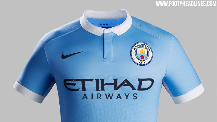
As for the Man City logo it's quite telling that it looks better from far away.
Jack Stevens
#2 Ticket Holder
Manchester City logo looks great on the shirt mockup, not so much on a blank computer screen. I thought their old one was pretty gaudy, though, so its an improvement for mine.
While Melbourne City are in the convo, I thought I would air an opinion and I'd love a discussion.
According to the foxtel commentary team City could be playing in an all sky blue kit next season.
I barrack for city because I was a heart fan after the Fury folded. I love the red and white, but stayed with the club post buy out because they became interesting. No other pro club in Australia is owned by a foreign club (that I know of).
I love that the away kit is still red and white, but I've fallen in love with the white home (again, no other club in the league starts in white, and keeps the club interesting).
I would hate to see city in sky blue not because they would affirm the idea that they are just a little Man C, but because that is such a boring, safe move.
Thoughts?
- Aug 25, 2014
- 7,718
- 11,772
- AFL Club
- Richmond
sky blue is poo, like Sydney FC.
Hope City keep their white base strip and red away strip.
Melbourne is already blue, get a different colour Shitty.
Hope City keep their white base strip and red away strip.
Melbourne is already blue, get a different colour Shitty.
- Status
- Not open for further replies.
Similar threads
- Replies
- 41
- Views
- 2K
- Replies
- 2
- Views
- 248
