Discussion AFLW 2022 (Season 7) - Photos and Discussion

Remove this Banner Ad

Jul 17, 2006
5,272
9,848
Victoria
AFL Club
Adelaide
Other Teams
Liverpool FC, Melbourne Victory
ROUND 3 (Indigenous Round)

Friday, September 9
Western Bulldogs v Fremantle (IKON) (T)

Saturday, September 10
Adelaide v North Melbourne (UO)
Sydney v Greater Western Sydney (SCG)
Geelong v Collingwood (GMHBA) (T)
Brisbane Lions v Gold Coast (G) (T)

Sunday, September 11
Carlton v Port Adelaide (IKON)
St Kilda v Melbourne (RESA)
Richmond v Hawthorn (SC) (T)
West Coast v Essendon (MRP) (N)

ROUND 1

Thursday, August 25

Carlton v Collingwood (IKON) (N)

Friday, August 26
Adelaide v Melbourne (ACH) (N)

Saturday, August 27
North Melbourne v Gold Coast (BA)
West Coast v Port Adelaide (MRP)
Sydney v St Kilda (NSO) (T)
Essendon v Hawthorn (MRVL) (N)

Sunday, August 28
Western Bulldogs v Greater Western Sydney (IKON)
Brisbane Lions v Fremantle (G)
Geelong v Richmond (GMHBA) (T)


ROUND 2

Friday, September 2

Melbourne v North Melbourne (MCG) (T)

Saturday, September 3
Richmond v Adelaide (SC)
Port Adelaide v Western Bulldogs (ALB)
Fremantle v Geelong (FCBO)

Sunday, September 4
Essendon v Carlton (ETU)
Collingwood v Sydney (VP)
Greater Western Sydney v Brisbane Lions (MO)
Hawthorn v St Kilda (BHCO) (T)
Gold Coast v West Coast (MS) (T)
 
Last edited:
Pride_G__79487.1642483933.png

Why's a Port player wearing that jumper?
 

Log in to remove this ad.

Personal bias but i love this. Being a trans girl myself I'd never thought I'd see the day where a team would make the trans colours front and centre

Yea the afl has a way to go with trans inclusion but hopefully this is a step forward
 

(Log in to remove this ad.)


This design could be seen as a bit basic but I give it top marks for the sleeve incorporation.

Unfortunately the Pies design is again a bit lazy. I have no doubt in my mind that the club has told the designer to stick to the black and white stripes as much as possible – it's why our Indigenous guernseys are, for the most part, fairly lacklustre too. I wish we were more adventurous in that regard.
 
I believe this marks the very first time an entire competition has worn special guernseys for a regular season round, and I am so grateful and happy it's for Pride.

I'll give my completely arbitrary rating of each teams strip:

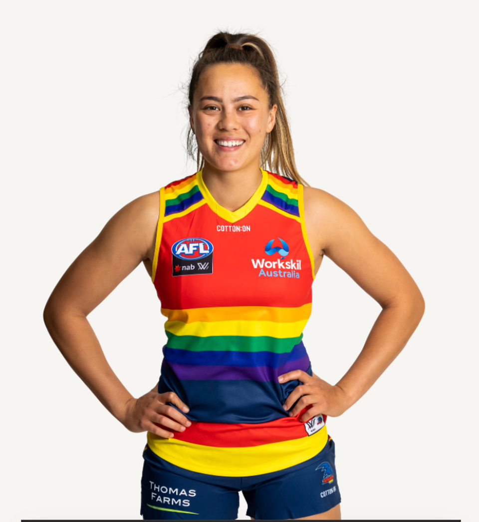
Adelaide: Rainbow is incorporated well, but dosen't really stand out 7/10
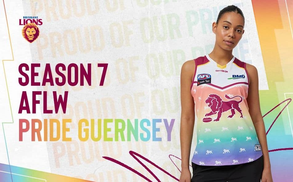
Brisbane: Gorgeous, I love the pastel take 9/10
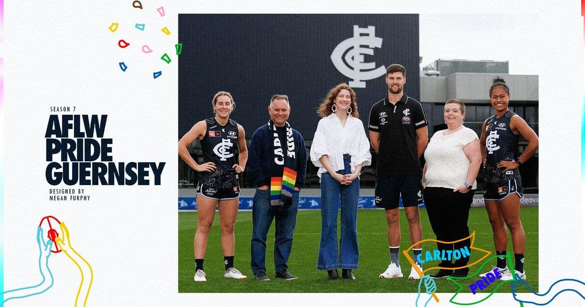
Carlton: I like the idea, but it's hidden away at the bottom of the jersey, limiting it's impact 4/10
Collingwood: Lazy 0/10
Essendon: Idea, execution and incorporation all class 8/10
Fremantle: Nothing wrong with it per se, but feels reductive. 5/10
Geelong: The design is fine, bonus points for long sleeve version, double bonus points for the logo. 7/10
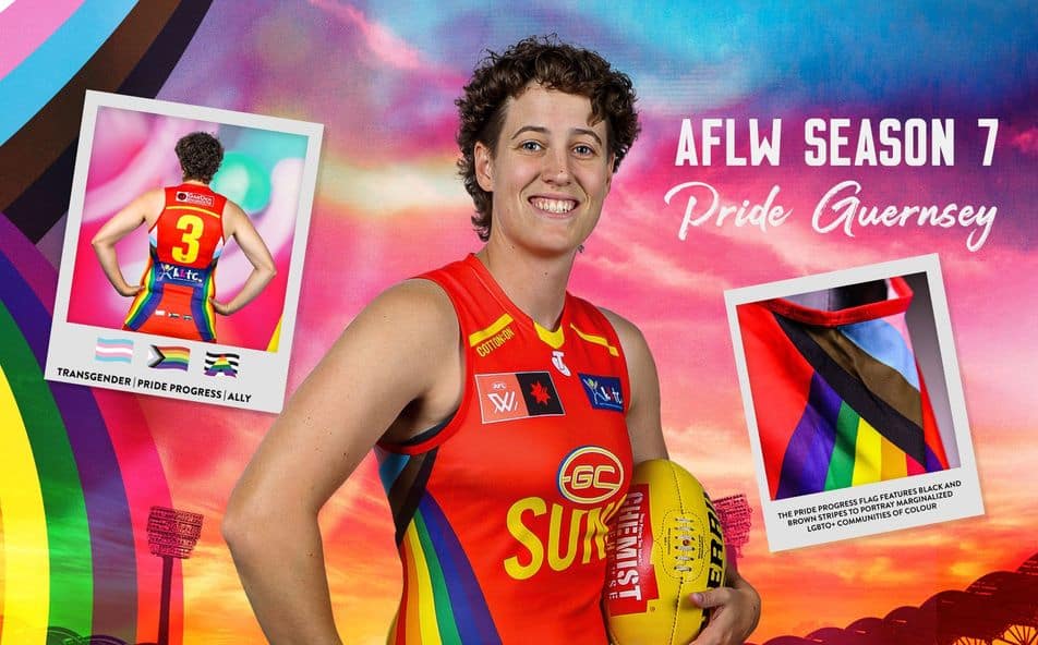
Gold Coast: It's also OK, but I'm not a fan of it being on the side. 5/10
GWS: Incorporation into the standard design is top notch, but the actual design hurts my eyes 3/10
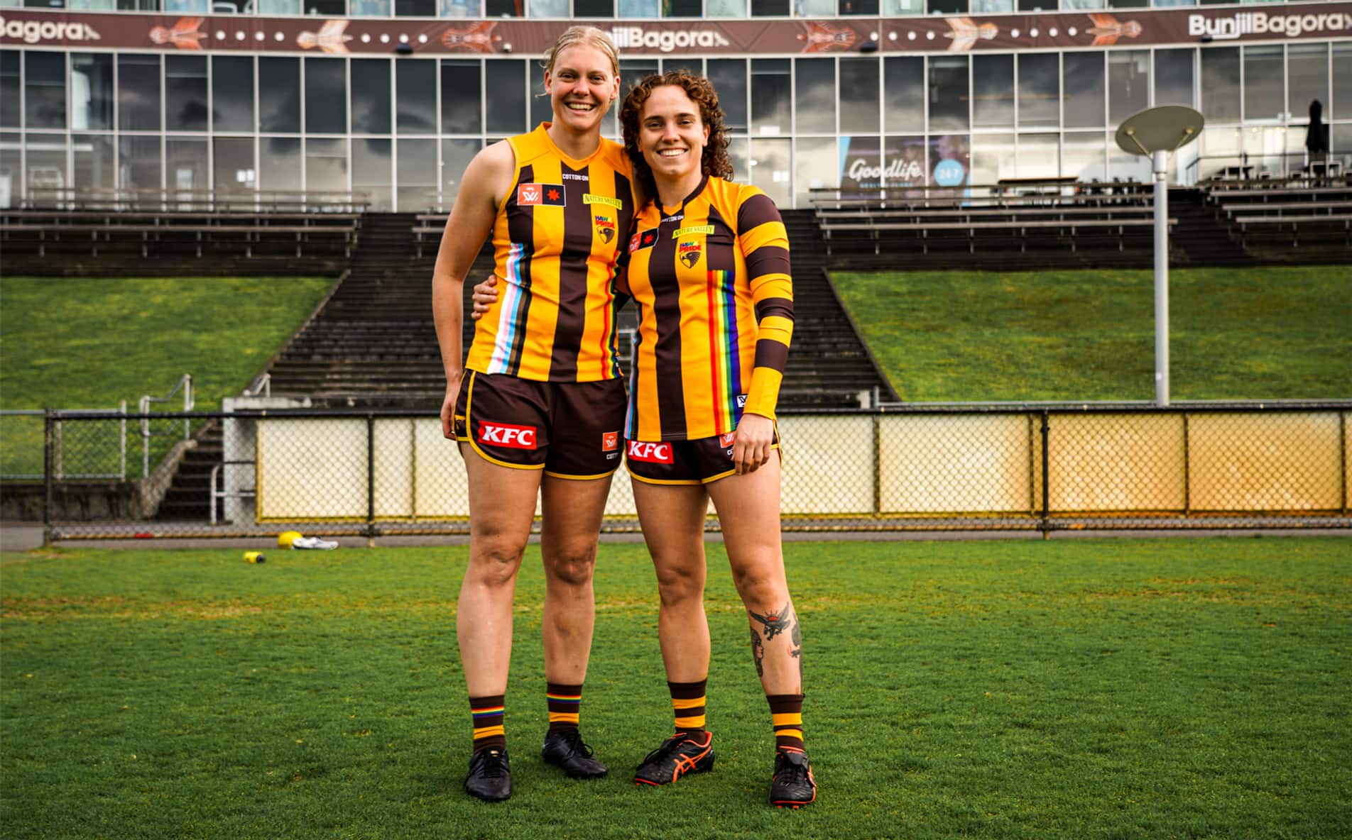
Hawthorn: More logo recolouring, which is nice. The actual design could be better, shoving all the rainbow stripes together on gold is a bit much 6/10
Melbourne: It does the job, integrated OK, but the actual design gives more circus than Pride. 6/10
North Melbourne: This is how you do it, the design is prominent and well executed. 9/10
Port Adelaide: This ones good too, reminds me of neon fairy lights. 7/10
Richmond: The graphic nature and neon colour is a plus, but putting swatches of colour on a black sash on a yellow base bothers me a bit. 7/10
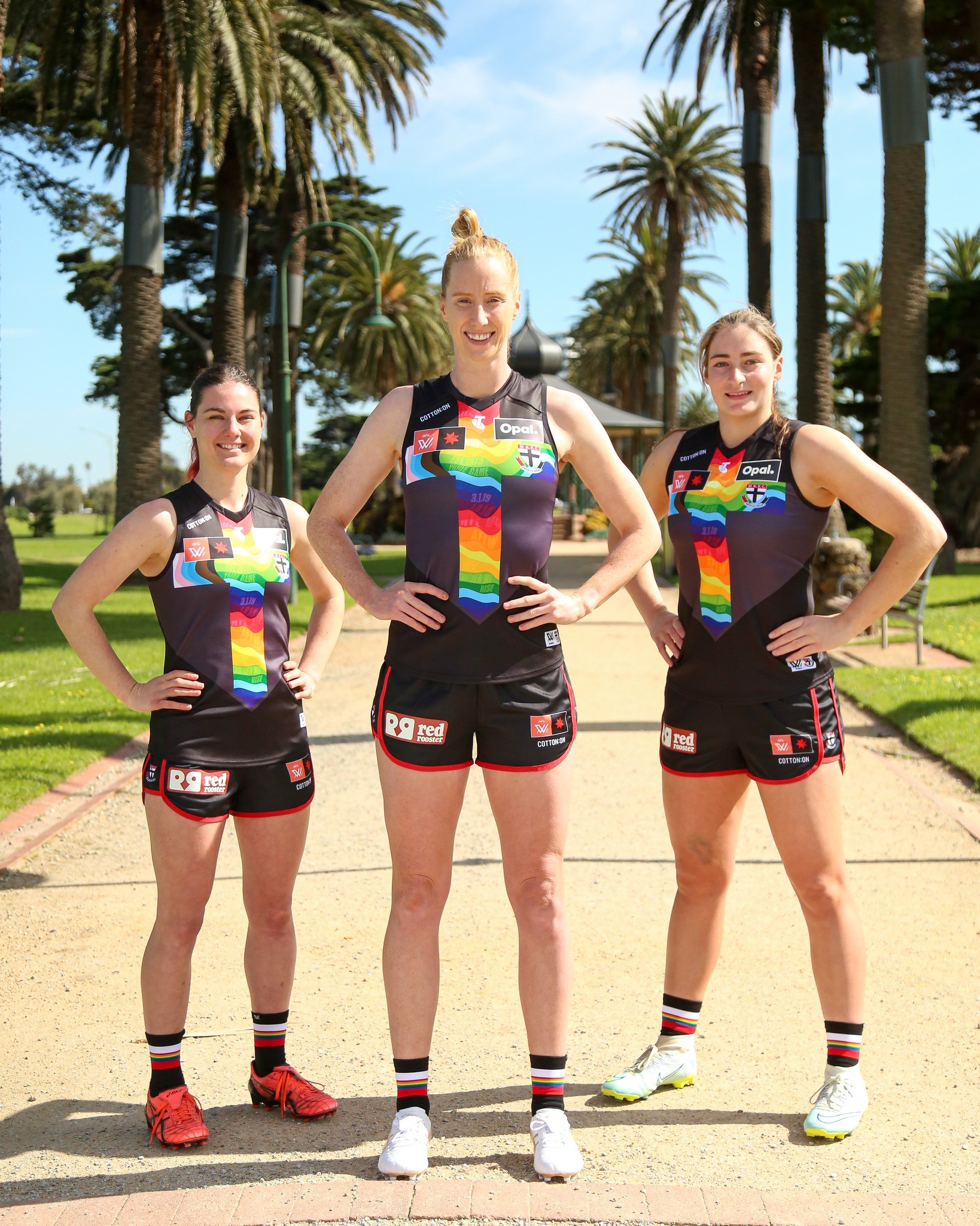
St Kilda: Incorporating rainbow into the cross on a black background is chefs kiss. The wave and extra colours gives stained glass, but the word marks are a distraction. 8/10
Sydney: Also lazy, but the size and placement make up for that. Almost. 3/10
West Coast: I'm a big fan of the design, it reminds me of a late 80s graphic tee, which is my era. 7/10
Western Bulldogs: I'm a huge fan of using the trans colours as the primary design, I'm sad because in execution it looks like someone bleached the regular jumper, it's too washed out. Still, a milestone 6/10

Come on man, 0/10 is just trolling Collingwood for the sake of it

It's no less lazy than Hawthorn's
 
Come on man, 0/10 is just trolling Collingwood for the sake of it

It's no less lazy than Hawthorn's
Hawthorn changed the logo to Hawks Pride and integrated the colours into the stripes on the front.

Collingwood made the absolute bare minimum effort, which is why I gave them a zero.

It's just my opinion, if Collingwood had done what Hawthorn did, they wouuld have got the same score from me, but the colours cover the least amount of guernsey and is not in a prominent position. And, if memory serves, they used it last year.
 

Remove this Banner Ad

Back
Top