Rubber Arm
Prestige 10 - Rank 70
- Oct 10, 2018
- 1,990
- 4,495
- AFL Club
- Geelong
- Other Teams
- Borussia VfL 1900 e.V. Mönchengladbach
Follow along with the video below to see how to install our site as a web app on your home screen.
Note: This feature may not be available in some browsers.

Due to a number of factors, support for the current BigFooty mobile app has been discontinued. Your BigFooty login will no longer work on the Tapatalk or the BigFooty App - which is based on Tapatalk.
Apologies for any inconvenience. We will try to find a replacement.
This is so clean!Asics x Ajax - Third Kit concept
View attachment 2370516View attachment 2370518View attachment 2370519
Log in to remove this Banner Ad
As a fellow hockey fan, it's nice seeing Ottawa look less boring, rate these uniforms!I think Ottawa have the most boring uniforms in the league.
Here's my attempt.
Home
View attachment 2492552
Away
View attachment 2492551
Alt
View attachment 2492550
Reverse Retro
View attachment 2492553
As a fellow hockey fan, it's nice seeing Ottawa look less boring, rate these uniforms!
I did some caps ones a few pages ago but I think I'll give them a refresh!Seconded! Would love to see your take on the Caps uniforms if you have any interest.
My favourite team since forever that I picked as a kid on NHL 99 with the screaming eagle logo and the blue/bronze/black colours, but nowadays probably the worst home/away uniform set in the league IMO.
Seconded! Would love to see your take on the Caps uniforms if you have any interest.
My favourite team since forever that I picked as a kid on NHL 99 with the screaming eagle logo and the blue/bronze/black colours, but nowadays probably the worst home/away uniform set in the league IMO.
I'd love to see your take on some Vegas uniforms. I like that we brought in the shiny gold, but it being the full home kit is too much of an eyesore at timesI did some caps ones a few pages ago but I think I'll give them a refresh!
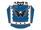
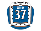
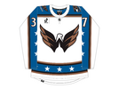
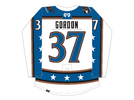
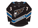
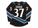
Freight Train Don't hate me for this. Probably the opposite of what you wanted to see, but here we go. Hopefully the alt makes up for it lol.
Home
View attachment 2493183
View attachment 2493182
Away
View attachment 2493181
View attachment 2493180
Alt
View attachment 2493179View attachment 2493178

I'd love to see your take on some Vegas uniforms. I like that we brought in the shiny gold, but it being the full home kit is too much of an eyesore at times
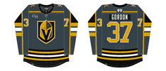
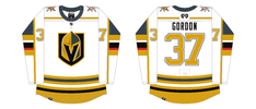
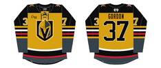
I personally think that honour goes to Columbus, who I think are probably the most irrelevant franchise in all of American professional sport. Would love to see what you could come up with for them.I think Ottawa have the most boring uniforms in the league.
Funnily enough, Columbus has some of my favorite uniforms.I personally think that honour goes to Columbus, who I think are probably the most irrelevant franchise in all of American professional sport. Would love to see what you could come up with for them.
It’s ludicrous to me though, because the alternates they’ve had with the cannon is one of the best looks in the NHL. I have zero idea why they won’t rebrand to that permanently.
San Diego Padres cough cough coughI personally think that honour goes to Columbus, who I think are probably the most irrelevant franchise in all of American professional sport. Would love to see what you could come up with for them.
It’s ludicrous to me though, because the alternates they’ve had with the cannon is one of the best looks in the NHL. I have zero idea why they won’t rebrand to that permanently.