
- Oct 5, 2017
- 1,218
- 1,008
- AFL Club
- Sydney
- Other Teams
- Port Melbourne, Norwood, St George
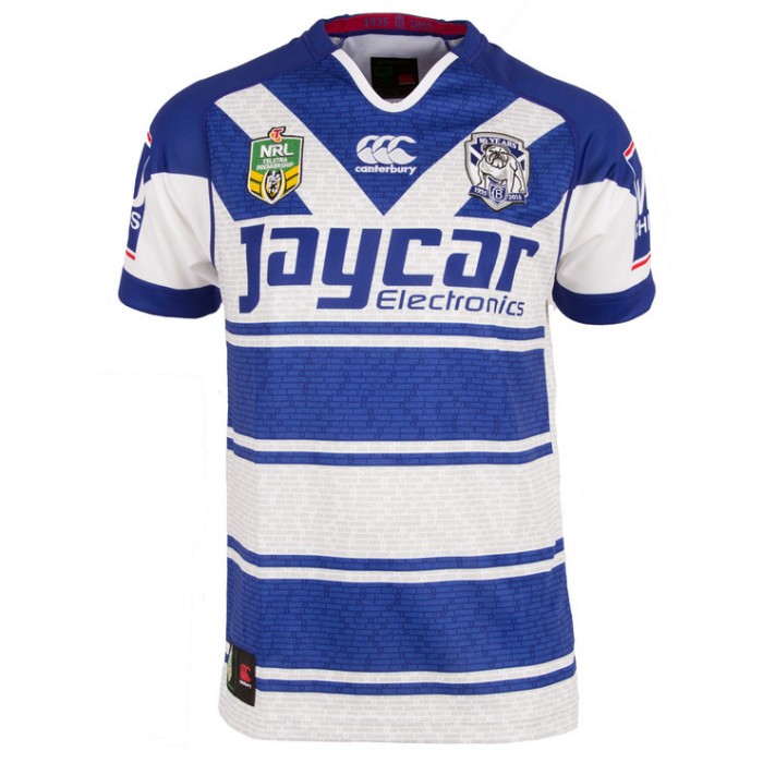
Worked for the NRL's Canterbury in 2015, can't see how it wouldn't work for Port apart from possible resistance from fans
Follow along with the video below to see how to install our site as a web app on your home screen.
Note: This feature may not be available in some browsers.
Worked for the NRL's Canterbury in 2015, can't see how it wouldn't work for Port apart from possible resistance from fans
2024 marks 20 years since something big at Port, the first time we wore the lightning jumper of course! Here’s a modern day version of it.
It looks terrible. I think they should have just changed the black for navy, and kept the white bars. Navy looks similar to black but it has a nice hue to it. Someone did a "mock" of it and I thought it looked great.I think that is a very simple solution. I'm not sure why Port supporters are so dead against it.

It looks terrible. I think they should have just changed the black for navy, and kept the white bars. Navy looks similar to black but it has a nice hue to it. Someone did a "mock" of it and I thought it looked great.
View attachment 1763825
It sure would. Be hard to protest navy when 2 other clubs wear the same colours.that would mean 3 navy and white teams

spent a lot of time on this crows indigenous concept
(if offensive I'll delete)
View attachment 1764493


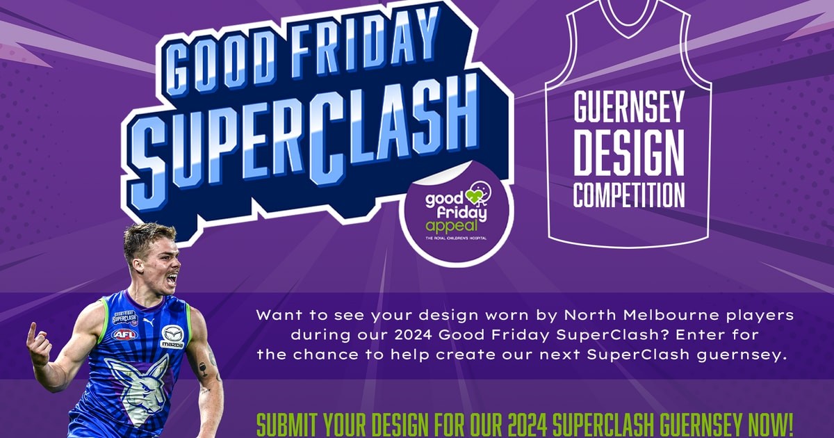
Can we do a community one where we make the most putrid design and enter it?North running a design comp for ‘24 Good Friday superclash jumper for anyone interested.
Your chance to help create our next SuperClash guernsey
Want to see your design worn by North Melbourne players during our 2024 Good Friday SuperClash?www.nmfc.com.au
its already up there.Can we do a community one where we make the most putrid design and enter it?

Needs more green, i also love that Zayd Gray (the submitter) didn't even cut the obvious source outits already up there.
View attachment 1769174
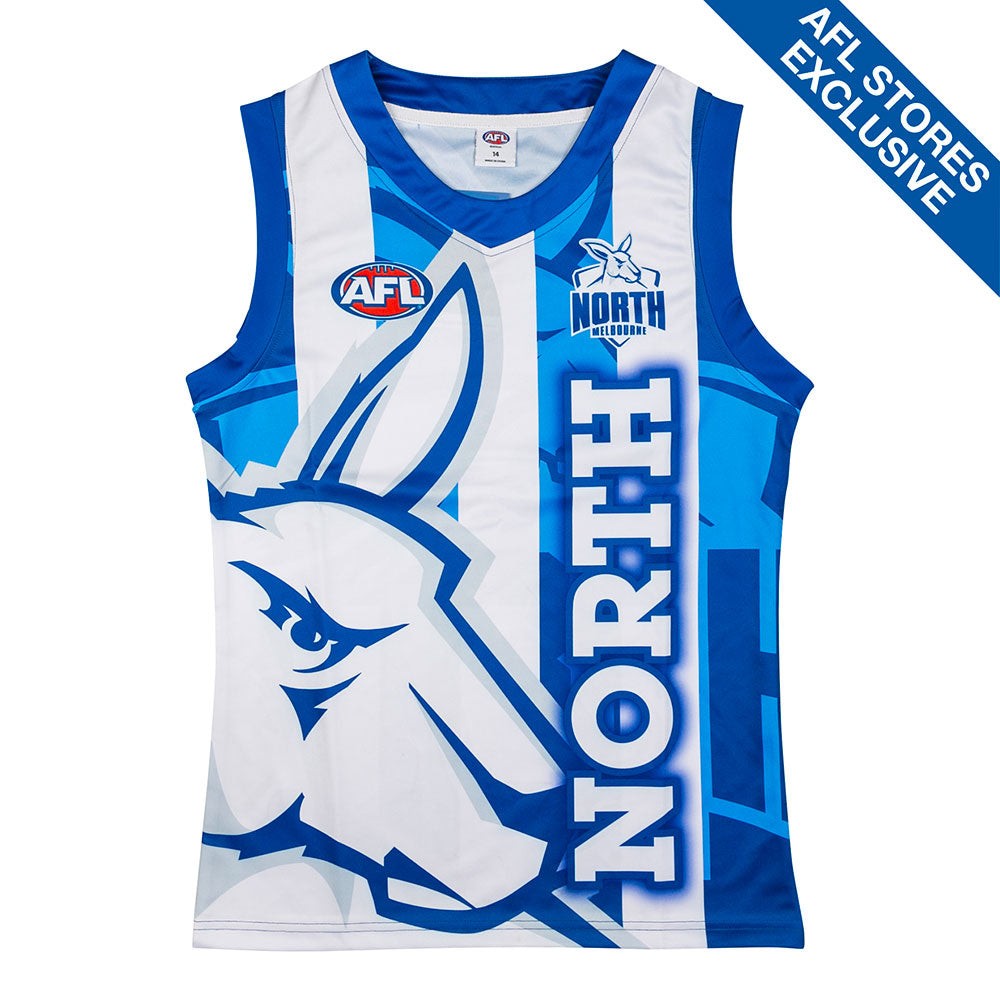
 www.theaflstore.com.au
uranium_death have at it?I actually reckon it would be pretty cool if they picked one of hand drawn ones and just put it on the jumper as is, with crooked lines and inconsistent colouring. May not be the best seller of all time but would fit the theme of the match well.


.jpg")
Scuffed Bulldogs jerseyPort wore a pre match t-shirt similar to their current home guernsey in 2004. Maybe bring it back for retro round 2024.
View attachment 1772011
 p.s. this jumper is truely shocking
I don't hate it.Put an entry up for the North thing the other day, maybe someone could help and give us a cheeky vote?
View attachment 1779768
I doI don't hate it.
you are definitely not the only one who doesI do

I vommed. Have an upvote.Put an entry up for the North thing the other day, maybe someone could help and give us a cheeky vote?
View attachment 1779768
I like the concept, but gawd those colours suck lol (as in the colours they make you use).I too threw my hat into the ring
View attachment 1780353
I noticed my entry moved its way up the list from the bottom to 3rd, probably due to votes which I'm absolutely buzzing about
Could BigFooty be home to yet another designer with an AFL Club sanctioned jumper?
