
thylacine60
Post-Human
- Banned
- #76
is it wrong I don't think his stuff is that bad and had he been accepted into that conservatory or what-have-you things might have panned out differently?
Follow along with the video below to see how to install our site as a web app on your home screen.
Note: This feature may not be available in some browsers.

Due to a number of factors, support for the current BigFooty mobile app has been discontinued. Your BigFooty login will no longer work on the Tapatalk or the BigFooty App - which is based on Tapatalk.
Apologies for any inconvenience. We will try to find a replacement.

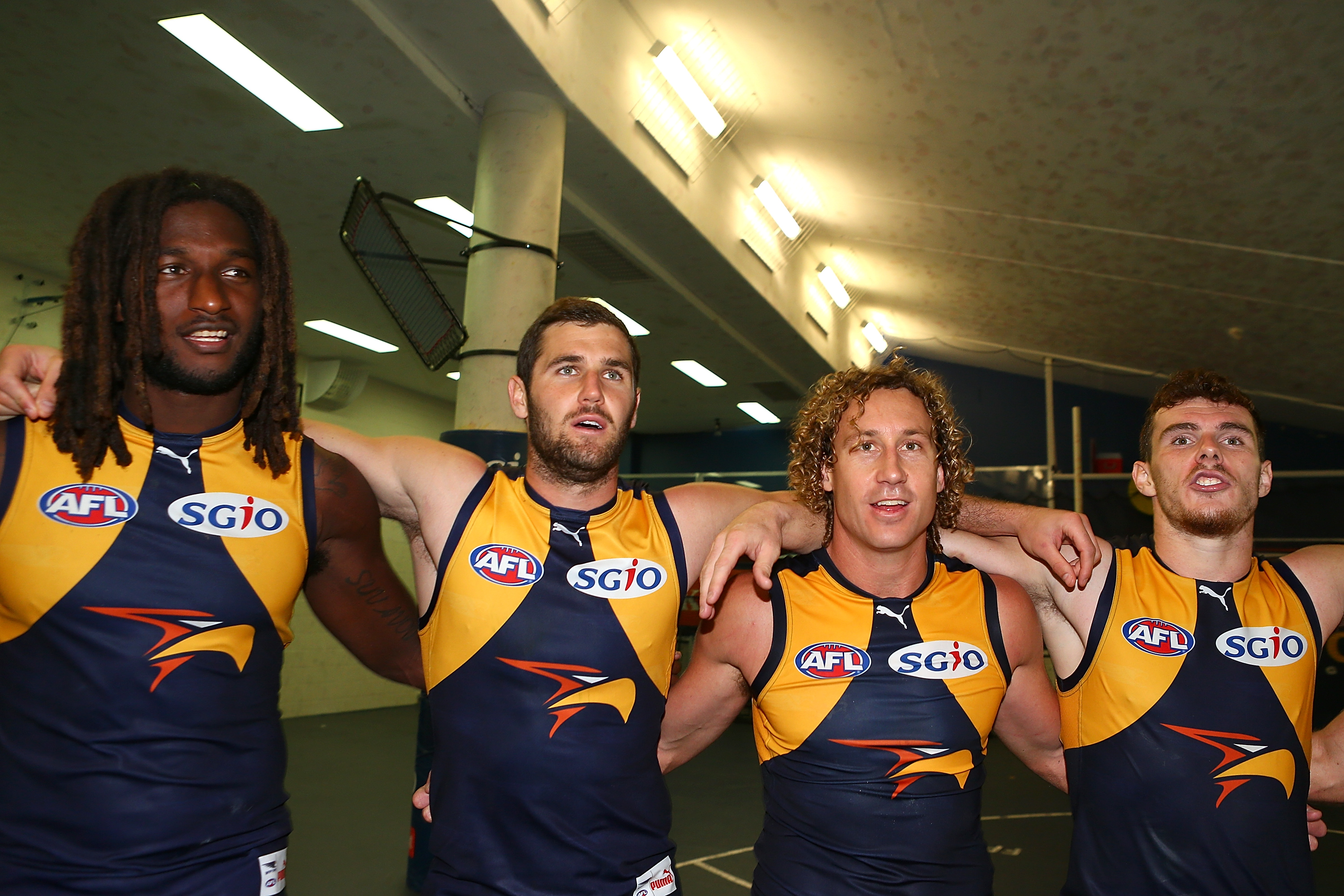
We are the old DARK Navy BluesHopefully our polo's will be more navy and less black blue. They are way too dark.

Log in to remove this Banner Ad
I picked a good time to start working in the sporting industry....

Lets see if Puma can actually make something to be Oxford Blue, instead of Near Black like Nike has been doing for years.

I picked a good time to start working in the sporting industry....

I actually love our jumper as it is. Don't want it to change under Puma.
I actually love our jumper as it is. Don't want it to change under Puma.
I just want the raised monogram back
You're not going to get it the way it used to be (sewn on individually), but I don't know why they've taken away the stitching as it's all so one dimensional now.
No lift, no relief.........just flat and dull.
This.Nike stopped caring a few years ago. Good riddance.
I actually love our jumper as it is. Don't want it to change under Puma.
The dark navy jumper. Don't want it lighter or different shade of blue.Which one??? The away strip leaves HEAPS to be desired.

 "Goddess"