Remove this Banner Ad

Roast Error in 20yr book

🥰 Love BigFooty? Join now for free.

clivenator26

Premiership Player
Joined
Jun 17, 2009
Posts
3,807
Reaction score
8,399
Location
Latex Condo
AFL Club
Fremantle
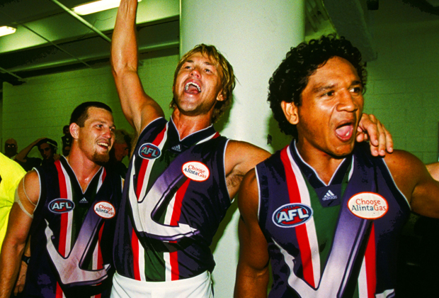
Check the jumper history out on page 70, the jumper dubbed "straight and narrow" is non existent, it is similar to the one we wore in 01-04 but not quite the same colour scheme and enough of a difference for me to spot right away.

I checked in with footyjumpers.com and reflected back to old year books just to make sure.

Pretty average effort. But not a bad looking jumper anyway!
image.jpg image.jpg
 

Log in to remove this Banner Ad

That away jumper from 1998-2000 was by far the worst.

I think the straight anchor one that came after it was much worse (the real one, not the made up one in the book).

At least most of the 98 jumper was a nice shade of purple, the one after that was just a garish mess.
 
Got home from work and what do I see sitting on the kitchen table ?

image.jpg

Wifey saw it while she was in Dymocks and thought I might want it. She's not a bad old girl. She's always giving me things. All I give her is grief apparently .
 
I pre ordered this off the website and wont be seeing it until "After August 1st."

Bastards. If the posty bends it or rips a corner, my mrs cat is not going to be happy.
 
The only book you need is Way To Go, not this official, sanitised, PR pamphlet.
Yeah, but Way to Go was written in mid 2003, there's a lot of stories to be told since then, need to cover the next decade. It's such bullshit that Matt Price succumbs to a brain tumour, just very unfair that good writers disappear and aren't around long enough, just like Grybas with commentary. God is a prick sometimes. I have no doubt Price would have been keen on another belter of a novel in the wake of the 20th season and maiden GF appearance.

Les isn't in the same class, and reading it so far definitely would do with some Price, but he is a decent enough candidate for a book like this given the options available.
 
I think the straight anchor one that came after it was much worse (the real one, not the made up one in the book).

At least most of the 98 jumper was a nice shade of purple, the one after that was just a garish mess.
I was never a fan of any of the gradient designs that were all the rage in the late 90s and early 00s when synthetic materials started being used.
 

Remove this Banner Ad

On another look, wtf is with the shield design on the back?

Fremantle-3.gif


I stand by my assertion that this is Freo's worst ever jumper and probably top five worst in AFL history (only West Coast's ochre and Hawthorn's jockey design definitely worse).

Edit: and the drop shadow!

eslp_ag_620px.jpg


Designed by Satan himself.
 
MY EYES!

Man, our re-design and re-branding is slick by comparison to other clubs - let alone by comparison to the rainbow-vomit anchor combos we used to wear

FWIW I liked the purple haze and white with purple anchor jumpers - but the 3 V's just scream sexiness
 
MY EYES!

Man, our re-design and re-branding is slick by comparison to other clubs - let alone by comparison to the rainbow-vomit anchor combos we used to wear

FWIW I liked the purple haze and white with purple anchor jumpers - but the 3 V's just scream sexiness
Actually, the 3 Vs scream blandly going where everybody has gone before. It's a nice safe compromise for people who aren't fully committed to the club, effectively nothing more than a marketing ploy.
 
Actually, the 3 Vs scream blandly going where everybody has gone before. It's a nice safe compromise for people who aren't fully committed to the club, effectively nothing more than a marketing ploy.

Each to their own, but the 3 V's at least are in part, a tribute to the original FFC and the Purple is representative of the combination of East/South Freo

Like I said, I loved the Purple and White versions of our original anchor jumpers, but the 3 V's is quite classy in comparison - pretty sure we've had this same argument before (when the original change was outlined) and we agreed to disagree, so let's just leave it at that :thumbsu:
 

🥰 Love BigFooty? Join now for free.

The Chevrons are a stylised version of a Fremantle based footy club's strip dreamed up for the heritage round in 05! Jeff Farmer modelled them in the survey to members as which strip was preferred, this has been absolutely denied by the current administration, doesn't suit the current approved historical chronology of events!

Personally I prefer the purple haze jumper, & think this was also proved as the most popular that lead to the chevrons!

The current "colour" is better than last years, or some batches, or whatever, but it's main claim to fame is, it's controversy (is it, isn't it), & the fact that it's current hue requires us to wear our away strip in our first GF, and now having set that precedent, with the Blues, who previously wore sky blue when on "our" turf!

Another change imminent perhaps? Nah, surely not!;)
 
It's a pity ochre and drop shadowed gradient anchor with shield on the back never faced off in an actual game.
 

Remove this Banner Ad

Remove this Banner Ad

🥰 Love BigFooty? Join now for free.

Back
Top Bottom