- Sep 30, 2015
- 3,228
- 4,987
- AFL Club
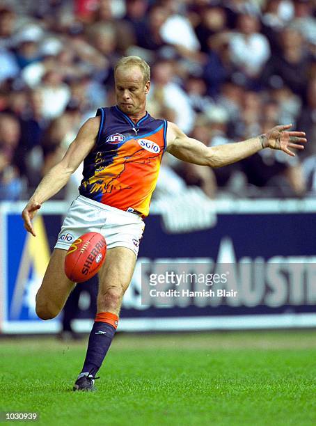
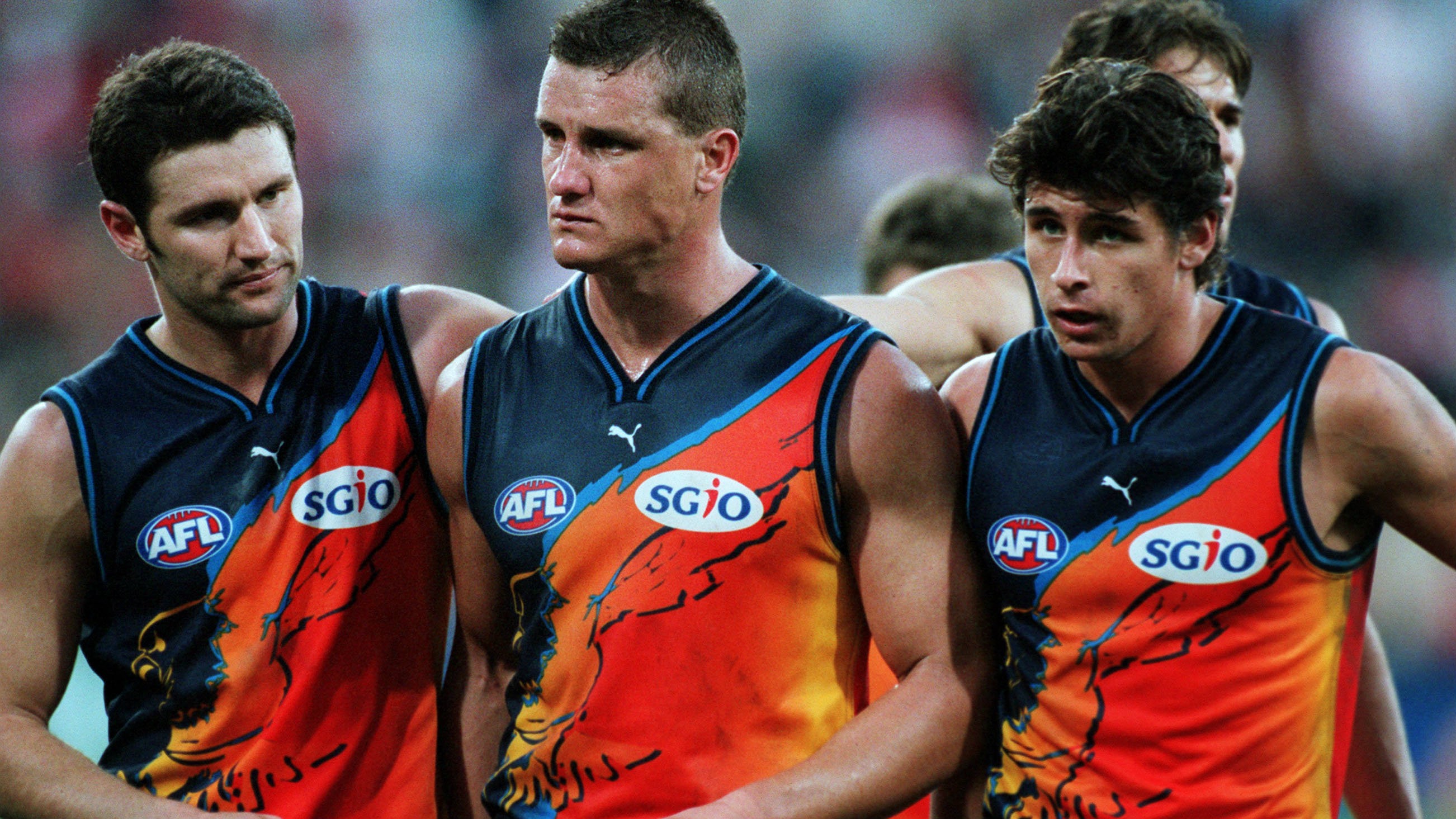
- West Coast
Was listening to footyjumper's podcast, where they were picking their favourite jumpers, it got me thinking, what's your favourite guernsey designs from each team? Here's mine.
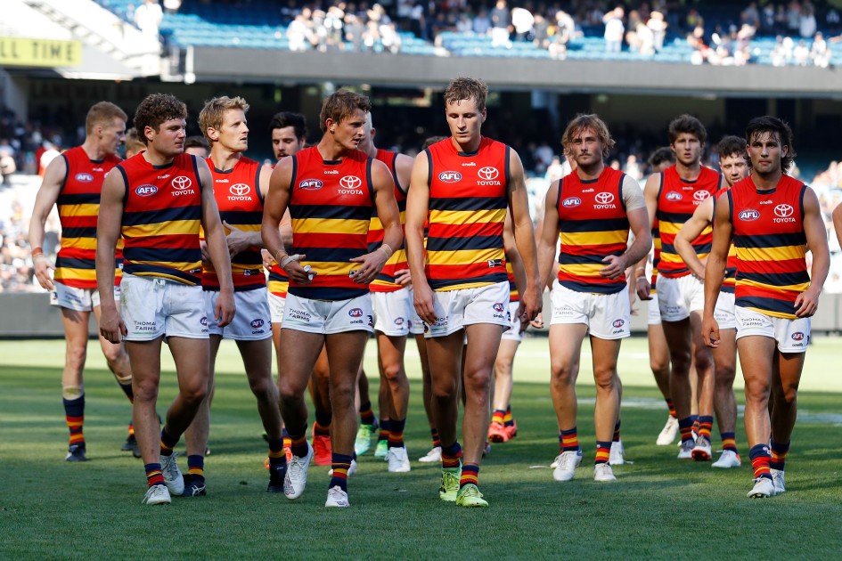
Adelaide:

Their first SANFL guernsey is the clear standout for me, at the least front. It's really hard for me to pick another guernsey design, because I'm not fond of the rest of their guernseys, too much use of primary colours all over.
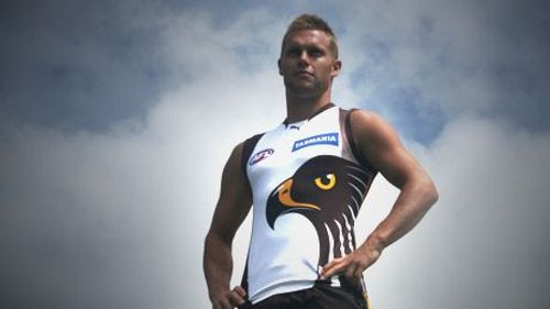
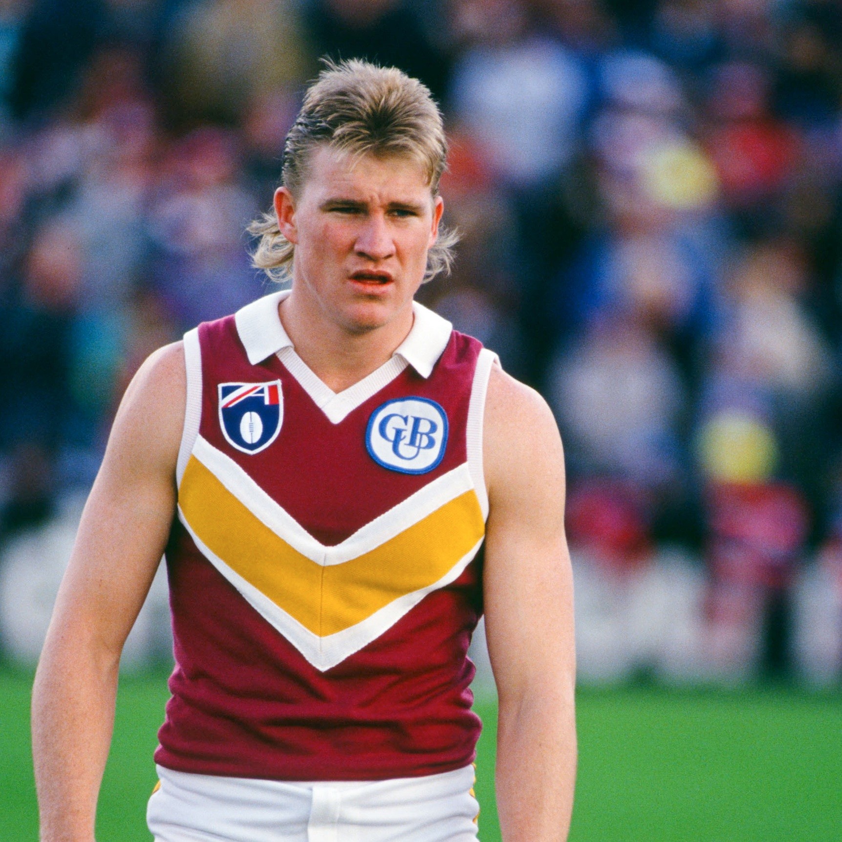
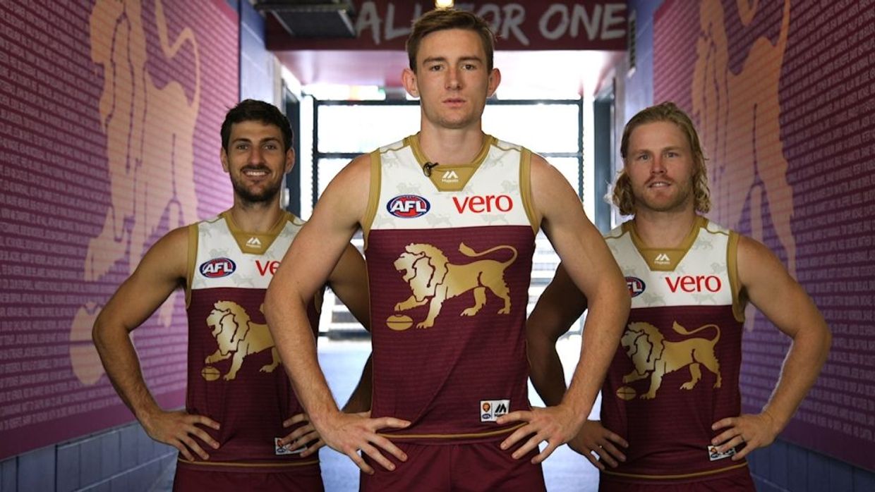
Brisbane:


These 2 are my favourite, hard to choose my number 1 here. Late 2000's home design is peak, with the blue yoke making up around 40% on the front and back of the uniform, with a nice collar. 2007 heritage Fitzroy guernsey is also the best variation I've seen of it at Brisbane, no newspaper text wrapped around it like the other ones.
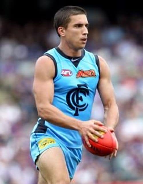
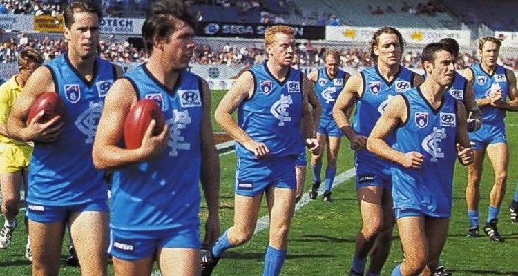
Carlton:


Their 2014 guernsey home design is peak, with the old monogram looking like it was stitched on or something and the nice premium looking Nike collar. The Nike collar would degrade the following years, looking more cheaper looking. 2014-17 was as premium as Carlton ever looked. Their 2017 clash guernsey is my favourite alternate guernsey of theirs, grey with white circles giving it a bit more a pop, along with the premium Nike collar, which would be its final year.
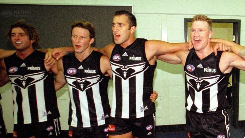
Collingwood:

2000 would be the last time Collingwood really nailed their home guernsey, before they moved to a more black based guernsey design. One of my favourite designs out of all AFL guernseys.
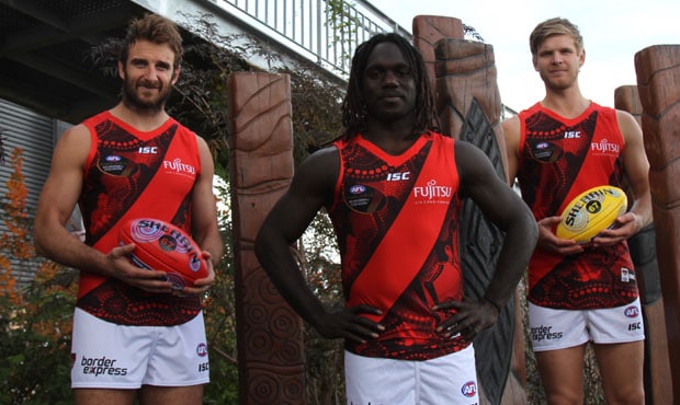
Essendon:

2008 is when Essendon nailed their design. The sash really does come across like a sash with a premium collar.
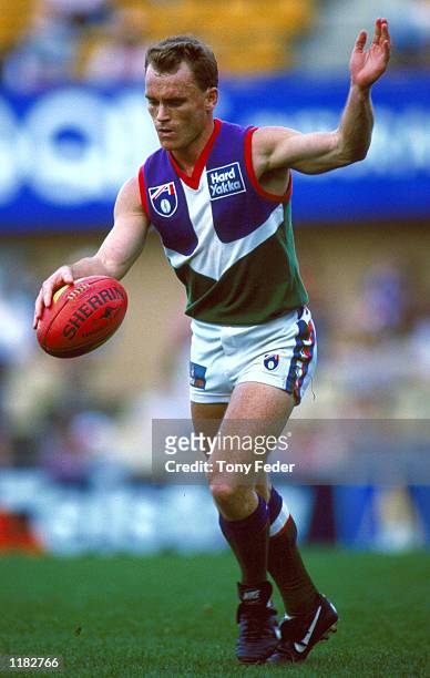
Fremantle:

Their all haze and white anchor guernsey was just so top tier, should be wearing it now.
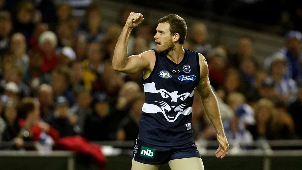
Geelong:
.jpg")
My favourite variation up until 1980 was this, with there being a white panel for the numbers.
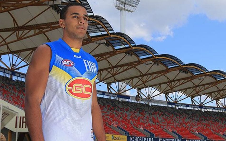
Gold Coast:
I'm not fond of any of their uniforms. I tried looking for any training or prototype designs, and they didn't look good, either.
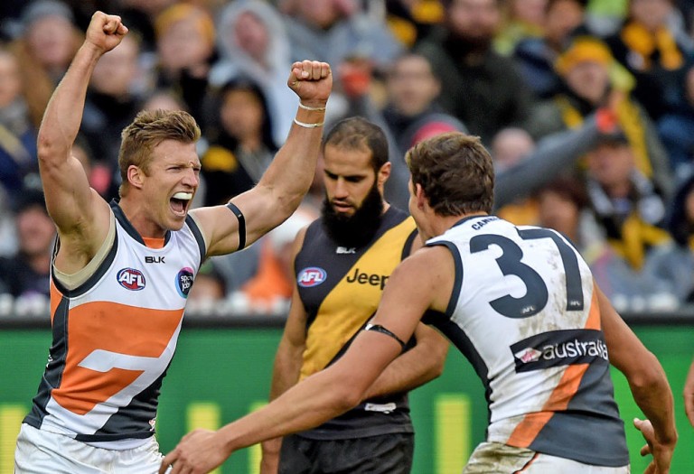
GWS:
.jpg")
A training guernsey which has an alternate blue colour really stands out as their best. Shocking they don't wear this and ditch the orange.
Hawthorn:


2000's Wizard/NAB cup guernsey looks really good, very clean. 2017 clash guernsey is the best clash design I think they've had, I think I'm a sucker for monograms on guernseys.
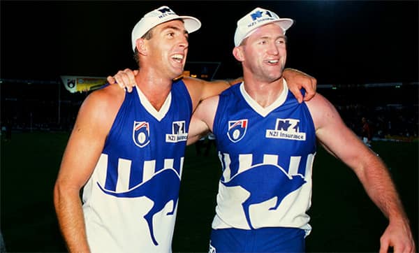
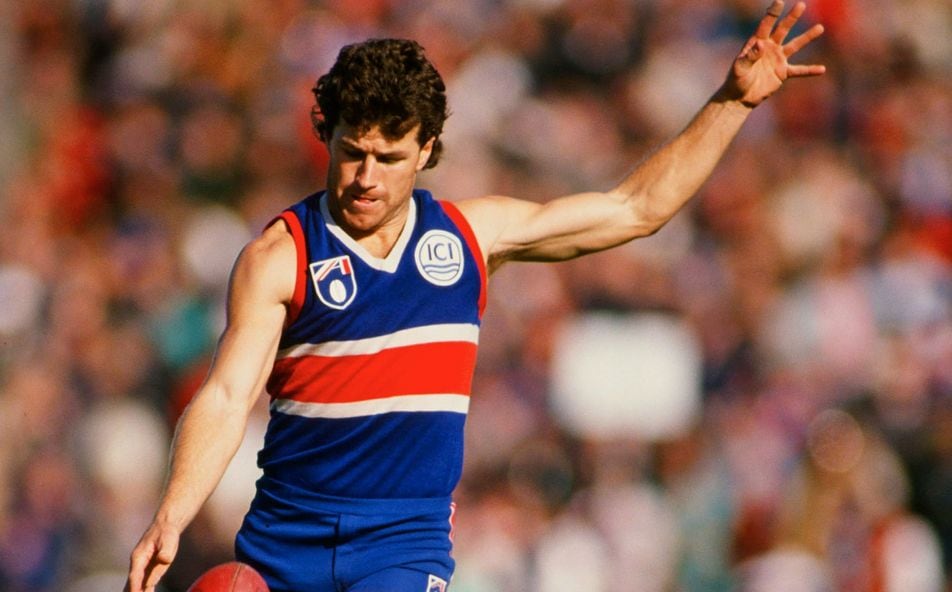
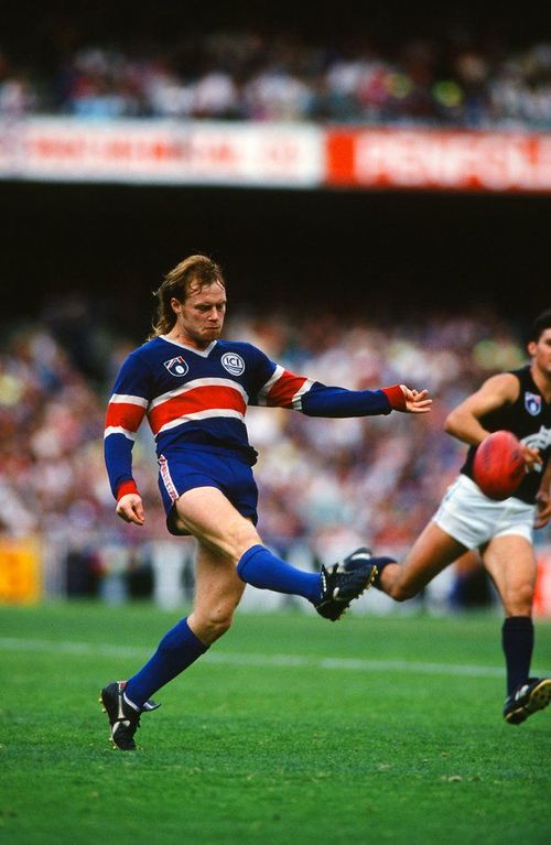
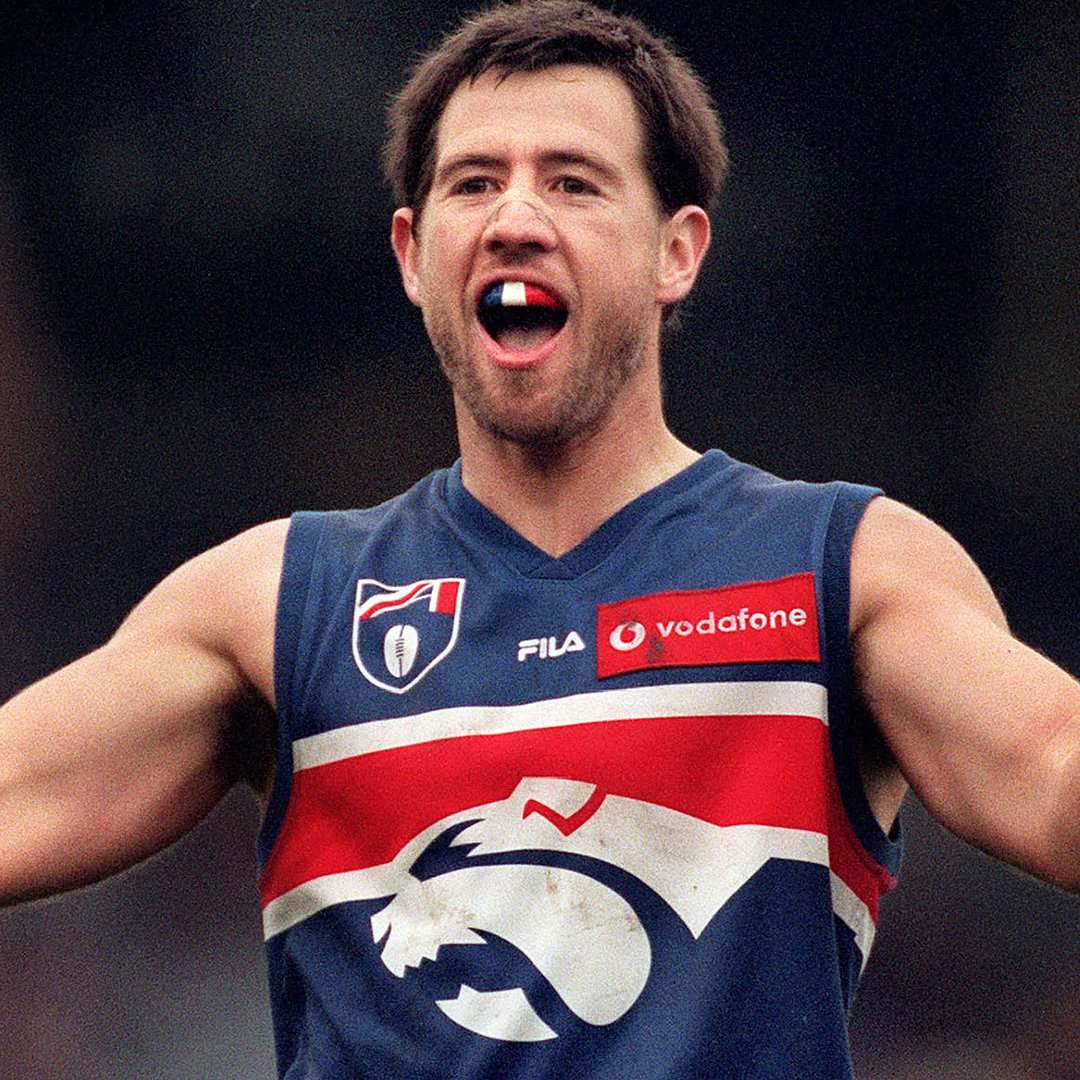
North Melbourne:
.jpg")
Their 2007-08 away guernsey is one of my favourite guernseys ever, it just looks so elite and strong to me, based on one of their earlier guernsey designs.
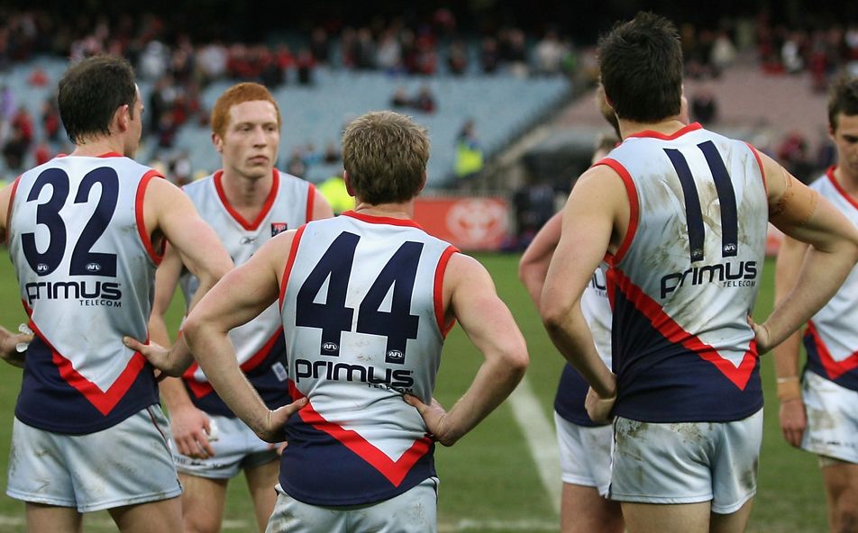
Melbourne:

There's something about their fire looking logo that looks strong and great on that navy base on the guernsey.
Port Adelaide:
.jpg")

Easily their first away guernsey is my favourite. My favourite variation of their prison bars would be their 2003 heritage, with it being more black and black and white striped socks.
Richmond:

Early 2000's with this Nike collar and no sash on the back/yellow numbers looks the best to me. This variation has The Tigers logo in place of Nike, looks better imo.
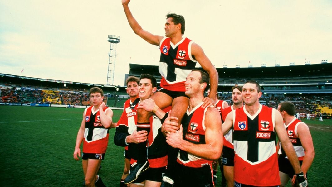
St Kilda:

2009 home guernsey looks strong with those stripes in the collar.
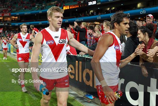
Sydney:
Sydney's late 2000's collar looks premium with their opera house design.
Adelaide:

Their first SANFL guernsey is the clear standout for me, at the least front. It's really hard for me to pick another guernsey design, because I'm not fond of the rest of their guernseys, too much use of primary colours all over.
Brisbane:


These 2 are my favourite, hard to choose my number 1 here. Late 2000's home design is peak, with the blue yoke making up around 40% on the front and back of the uniform, with a nice collar. 2007 heritage Fitzroy guernsey is also the best variation I've seen of it at Brisbane, no newspaper text wrapped around it like the other ones.
Carlton:


Their 2014 guernsey home design is peak, with the old monogram looking like it was stitched on or something and the nice premium looking Nike collar. The Nike collar would degrade the following years, looking more cheaper looking. 2014-17 was as premium as Carlton ever looked. Their 2017 clash guernsey is my favourite alternate guernsey of theirs, grey with white circles giving it a bit more a pop, along with the premium Nike collar, which would be its final year.
Collingwood:

2000 would be the last time Collingwood really nailed their home guernsey, before they moved to a more black based guernsey design. One of my favourite designs out of all AFL guernseys.
Essendon:

2008 is when Essendon nailed their design. The sash really does come across like a sash with a premium collar.
Fremantle:

Their all haze and white anchor guernsey was just so top tier, should be wearing it now.
Geelong:
.jpg")
My favourite variation up until 1980 was this, with there being a white panel for the numbers.
Gold Coast:
I'm not fond of any of their uniforms. I tried looking for any training or prototype designs, and they didn't look good, either.
GWS:
.jpg")
A training guernsey which has an alternate blue colour really stands out as their best. Shocking they don't wear this and ditch the orange.
Hawthorn:


2000's Wizard/NAB cup guernsey looks really good, very clean. 2017 clash guernsey is the best clash design I think they've had, I think I'm a sucker for monograms on guernseys.
North Melbourne:
.jpg")
Their 2007-08 away guernsey is one of my favourite guernseys ever, it just looks so elite and strong to me, based on one of their earlier guernsey designs.
Melbourne:

There's something about their fire looking logo that looks strong and great on that navy base on the guernsey.
Port Adelaide:
.jpg")

Easily their first away guernsey is my favourite. My favourite variation of their prison bars would be their 2003 heritage, with it being more black and black and white striped socks.
Richmond:

Early 2000's with this Nike collar and no sash on the back/yellow numbers looks the best to me. This variation has The Tigers logo in place of Nike, looks better imo.
St Kilda:

2009 home guernsey looks strong with those stripes in the collar.
Sydney:

Sydney's late 2000's collar looks premium with their opera house design.
Last edited:


.jpg")