Warner_Bros_FC
Cancelled
- Joined
- Aug 15, 2010
- Posts
- 582
- Reaction score
- 541
- AFL Club
- Western Bulldogs
Designed these a while ago. Thought I would post it here.
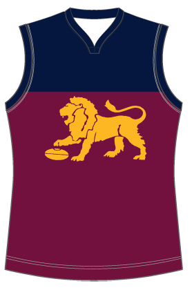
Basically the return of the old lion. Used navy/dark blue instead of royal blue and made the yoke higher with matching back. Which results in making the numbers stand out more. Blue cuffs. Overall more maroon less blue.
Home

Away

Victoria

Clash

Basically the return of the old lion. Used navy/dark blue instead of royal blue and made the yoke higher with matching back. Which results in making the numbers stand out more. Blue cuffs. Overall more maroon less blue.
Home
Away
Victoria
Clash