


- Joined
- Aug 5, 2008
- Posts
- 388
- Reaction score
- 621
- AFL Club
- Richmond
- Other Teams
- Knights
RFC appears to be looking at a rebrand.
I thought it might be a good idea to offer some advice/ideas/suggestions from the tiger faithful.
If you’re reading this STIG, then consider it free market research") .
.
If a new logo IS on the way I’m sure we all want it to be good, so please keep ideas constructive and helpful. If all that you have to offer the conversation is “Don’t change the old logo!” then start your own thread. As much as I love our current logo, I think a new logo for a new era isn’t a bad idea at all.
I have NO inside knowledge of the clubs intentions, so I’m just going to throw some ideas into the pot and if it helps RFC in some way or just gives them an idea/direction they wouldn’t have thought of otherwise then all’s good.
1. The yellow sash should feature somewhere in the logo. Its obviously a big part of our identity/history and distinguishes us from other ‘tiger’ clubs.
2. It’s a TIGER, it should look fierce! Don’t worry about scaring the kids (Richmond kids are tough ).
).
3. I’m a big fan of established dates on sports logos. Sometimes they don’t suit the design and that’s fine, but with a long proud history like ours why not celebrate it?
4. Logos don’t have to be simple. Sometimes the details are what make a good logo, and we live in the modern world with high quality printing/computerised embroidery/lazer etching etc. Don’t get me wrong, a good simple logo can be great (see NY Yankees) but it shouldn’t be a restriction either.
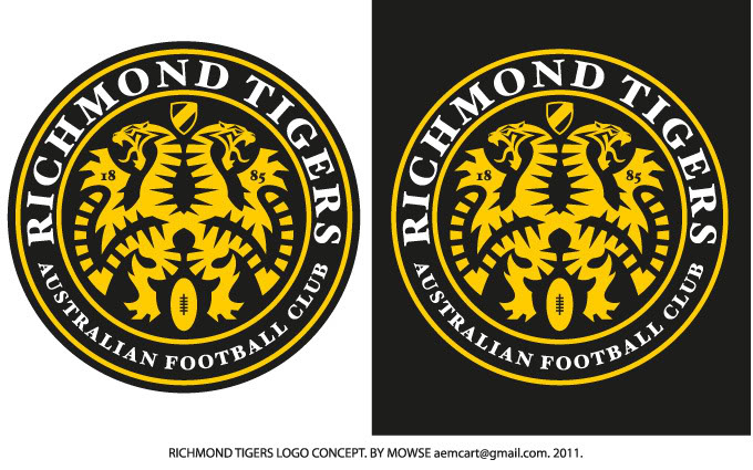
Anyways, here are two concepts I whipped up myself.
The first one is a very traditional crest style, and the second is more modern but with a traditional font (I just like serif fonts). Both incorporate the sash and established dates, and I tried to make the tigers look as angry as possible.
The second one is very detailed but I think it could work. I also like the idea of the tiger staring straight at you (like he’s locked onto his prey and there is no escape).

Well, thats all I’ve got for now. I’m working on one more idea that I’ll post later.
Throw your 2cents in.
mowse.
I thought it might be a good idea to offer some advice/ideas/suggestions from the tiger faithful.
If you’re reading this STIG, then consider it free market research
.If a new logo IS on the way I’m sure we all want it to be good, so please keep ideas constructive and helpful. If all that you have to offer the conversation is “Don’t change the old logo!” then start your own thread. As much as I love our current logo, I think a new logo for a new era isn’t a bad idea at all.
I have NO inside knowledge of the clubs intentions, so I’m just going to throw some ideas into the pot and if it helps RFC in some way or just gives them an idea/direction they wouldn’t have thought of otherwise then all’s good.
1. The yellow sash should feature somewhere in the logo. Its obviously a big part of our identity/history and distinguishes us from other ‘tiger’ clubs.
2. It’s a TIGER, it should look fierce! Don’t worry about scaring the kids (Richmond kids are tough
).3. I’m a big fan of established dates on sports logos. Sometimes they don’t suit the design and that’s fine, but with a long proud history like ours why not celebrate it?
4. Logos don’t have to be simple. Sometimes the details are what make a good logo, and we live in the modern world with high quality printing/computerised embroidery/lazer etching etc. Don’t get me wrong, a good simple logo can be great (see NY Yankees) but it shouldn’t be a restriction either.
Anyways, here are two concepts I whipped up myself.
The first one is a very traditional crest style, and the second is more modern but with a traditional font (I just like serif fonts). Both incorporate the sash and established dates, and I tried to make the tigers look as angry as possible.
The second one is very detailed but I think it could work. I also like the idea of the tiger staring straight at you (like he’s locked onto his prey and there is no escape).
Well, thats all I’ve got for now. I’m working on one more idea that I’ll post later.
Throw your 2cents in.
mowse.

")


