


What's wrong with that yellow one they have?
Navigation
Install the app
How to install the app on iOS
Follow along with the video below to see how to install our site as a web app on your home screen.
Note: This feature may not be available in some browsers.
More options
You are using an out of date browser. It may not display this or other websites correctly.
You should upgrade or use an alternative browser.
You should upgrade or use an alternative browser.
Moved Thread Please help the AFC produce a half-decent clash strip
- Thread starter pjcrows
- Start date
- Tagged users None
- Status
- Not open for further replies.
telsor
Hall of Famer
Hate to say it, but your 'usual' strip isn't exactly easy on the eye to start with, which makes finding a 'nice' alternative strip that relates back to it difficult.
Instructions were unclear, voted for C
They're all boring looking tbh... most white clash jumpers are
Needs to be a red or yellow dominated jumper for a clash
Needs to be a red or yellow dominated jumper for a clash
This ones pretty decentThe SANFL strip is killer, should just use that.

coniglio_number1
Norm Smith Medallist
There is certainly a severe lack of chevrons/yoke designs in the league ...This ones pretty decent
- Jul 9, 2010
- 24,163
- 26,536
- AFL Club
- Fremantle
Unfortunately none of them are half-decent.
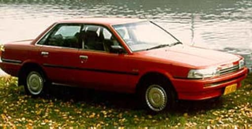
Bring back the classic ugly mid-2000s Crows clash strips. As much as the white Camry sponsor and the Jarmans sum up one era of the Adelaide Crows, things like these sum up guys like Ricciuto:
Bring back the classic ugly mid-2000s Crows clash strips. As much as the white Camry sponsor and the Jarmans sum up one era of the Adelaide Crows, things like these sum up guys like Ricciuto:
What's wrong with the current clash strip? Why roll out these ugly pieces of crap? Idiots.
- Aug 27, 2007
- 13,145
- 11,299
- AFL Club
- Fremantle
- Other Teams
- Everton_East Freo_Atalanta_Tranmere
All I'm ascertaining from the link is the mobile website is grabage
Closing the menu makes it go full width of the screen. It has the menu on the right? WTAF Adelaide
Closing the menu makes it go full width of the screen. It has the menu on the right? WTAF Adelaide
hellboy1975
All Australian
They need a new design in order to sell more.What's wrong with the current clash strip? Why roll out these ugly pieces of crap? Idiots.
- May 5, 2006
- 62,726
- 70,017
- AFL Club
- West Coast
Hate to say it, but your 'usual' strip isn't exactly easy on the eye to start with, which makes finding a 'nice' alternative strip that relates back to it difficult.
Agree the tri-colour horizontal strip design has a bit going on, but the whole concept of clash jumpers is really simple.
Aside from good taste, what does the Adelaide Crows jumper clash with? Let's say Carlton who wear predominantly navy. The solution while retaining the colours (because away colours aren't really a thing in the AFL) is to accentuate the gold, red or white - some combo of the 3.
I don't think this would clash with Carlton, particularly with red/white/gold shorts:

Shame how the ultimate symbol of a football club - its jumper - has become just another way to sell gimmicky rubbish. Frankly I think it's disgraceful, to cheapen the image of the club and make us look stupid on the field in order to flog a few thousand guernseys to bogans with no taste.They need a new design in order to sell more.
Voted B. Similar to the clash strip Carlton have had on and off over the years with navy blue down the sides. Could do with a CFC-style monogram or similar though, so the front's not just totally white.
telsor
Hall of Famer
Agree the tri-colour horizontal strip design has a bit going on, but the whole concept of clash jumpers is really simple.
Aside from good taste, what does the Adelaide Crows jumper clash with? Let's say Carlton who wear predominantly navy. The solution while retaining the colours (because away colours aren't really a thing in the AFL) is to accentuate the gold, red or white - some combo of the 3.
I don't think this would clash with Carlton, particularly with red/white/gold shorts:
Do like Collingwood should be forced to....widen/narrow particular coloured strips to suit the requirement. if you want a darker jumper, make the yellow a 'just' thin line, less blue? (as per your example...thick red and yellow strips, with a thin band of blue....OK, might require 3 clash strips, but is there really a massive drama with running off a few more?
There's a real chance they might end up having to wear whatever that choice is in finals and possibly a Grand Final. As GUMBLETRON said, the SANFL jumper is great, and it's bold and why the hell would they use any of those awful poll options.
I actually think A looks the best, so voted A.
- May 5, 2006
- 62,726
- 70,017
- AFL Club
- West Coast
There's a real chance they might end up having to wear whatever that choice is in finals and possibly a Grand Final. As GUMBLETRON said, the SANFL jumper is great, and it's bold and why the hell would they use any of those awful poll options.
The SANFL jumper employs chevrons. Do we really need another chevron team to go with Port and Freo?
- May 5, 2006
- 62,726
- 70,017
- AFL Club
- West Coast
Do like Collingwood should be forced to....widen/narrow particular coloured strips to suit the requirement. if you want a darker jumper, make the yellow a 'just' thin line, less blue? (as per your example...thick red and yellow strips, with a thin band of blue....OK, might require 3 clash strips, but is there really a massive drama with running off a few more?
I think Collingwood missed a trick not looking at pinstripes.
The Crows should really just follow our lead and have 3 combos of the same jumper with different dominant colours.
These are all hideous. I voted for C but I'm looking forward to seeing Adelaide run out in E next year
Power Raid
We Exist To Win Premierships
A or B for me
ScottalotaPower
Debutant
Another vote for E. You can thank me later
X3
They're all horrid. And due to the logo the Raptor looks like it has a wart on its beak
- Status
- Not open for further replies.
Similar threads
- Poll
- Replies
- 1
- Views
- 430
- Replies
- 42
- Views
- 2K
