Remove this Banner Ad

The Crows Logo Thread

What should be done regarding our logo?


  • Total voters
    235

🥰 Love BigFooty? Join now for free.

Joined
May 23, 2013
Posts
2,204
Reaction score
3,447
AFL Club
Adelaide
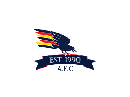
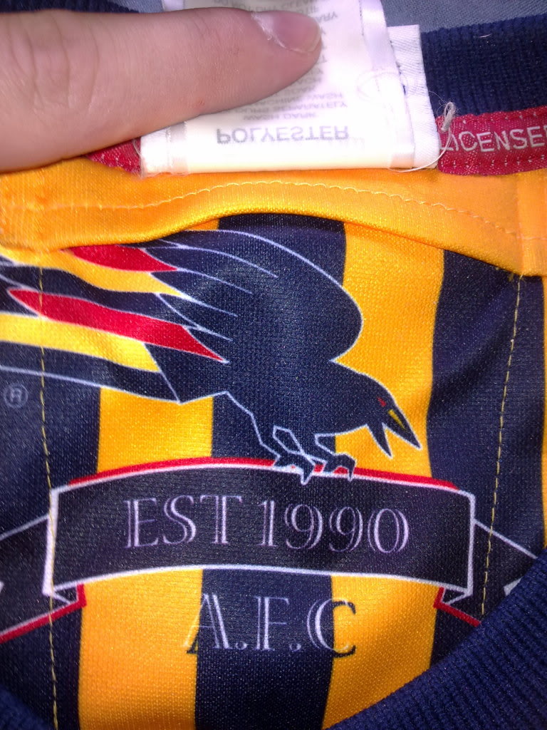
It's been discussed a lot on here, but a fresh poll about our logo would be interesting (to me at least).

After all the recent change at the club it could be on the cards.


Adelaide_Crows_logo.png


adelaidecrows_3450.jpg


Adelaide-crows-logo2.gif
 
Last edited:
I actually don't mind the new logo but the old one brings back so many great memories. Should update it a bit to make it more modern, but keep the core design
 

Log in to remove this Banner Ad

Must get rid of that eyesore from the Trigg era. Several years on and we all still hate it. The justification at the time was that it's more kid friendly, but it really isn't particularly great there either.

What we have now is a half-arsed attempt to sit somewhere in the middle. It doesn't really do much for kids, and I've yet to meet an adult who likes it.

Have a proper logo AND have a cartoony kids version, based on claude the crow, for kids merch and junior membership marketing.
 
I like the more realistic type logos like the hawks one for instance. Ours is like it was drawn by a school kid
 

Remove this Banner Ad

New beginning , new logo. I like both above
 
86545_9bc26401d3921f446d841e14a0c8545a.jpg


I'm a massive fan of this from the other thread, made by 23_fan

I love this so much.

Another one of my favourites here. I don't like the text, but the logo is pretty damn menacing IMO.

Adelaide-Crows alternate logo.jpg
 
Here's an example of an update of the old logo:

n0toHMt.png

(Courtesy of lmach, who made a copy of the logo found on the GPS patch of our Adidas guernseys, as shown below)

H5GaFCo.jpg
 

🥰 Love BigFooty? Join now for free.

I really liked the indigenous round interpretation of the logo from last year. I just had a quick look for it on the web and couldn't find it :(
 
I think some of the artwork here is really good, I especially like the one with the red ball but not sure how well they would work as a logo. I think its best to have much of the image contained to the centre, some of the ones with the wings out for example would get really tiny when having to make them small enough for things like the header of the AFL site. Maybe if they were on a shield or something it would add some balance.
 
Here's an example of an update of the old logo:

n0toHMt.png

(Courtesy of lmach, who made a copy of the logo found on the GPS patch of our Adidas guernseys, as shown below)

H5GaFCo.jpg

I'm mad keen on a return to this logo sans 90s shield :thumbsu:

Not sure about the EST 1990 ribbon though, that has to go.
 

Remove this Banner Ad

🥰 Love BigFooty? Join now for free.

Back
Top