Updating the Swoopy Boy

Remove this Banner Ad

May 9, 2011
920
2,337
VIC
AFL Club
St Kilda
Other Teams
San Francisco Giants
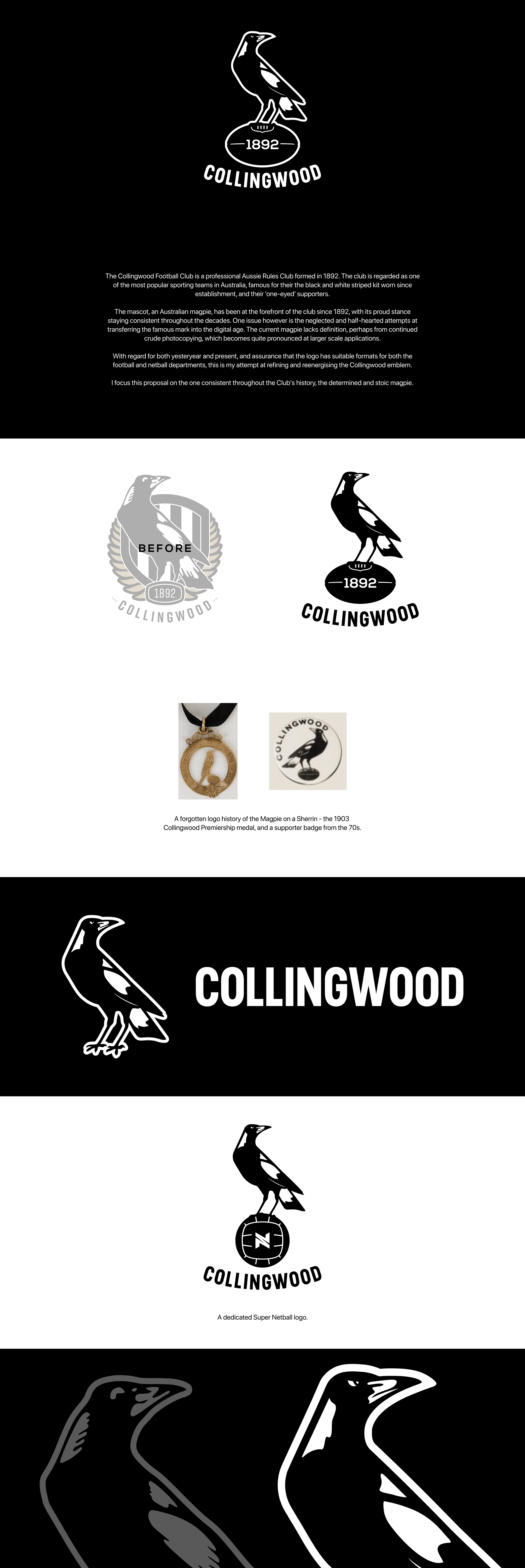
I come in relative peace. Below is my attempt to update the Collingwood logo and bring a bit of definition back to the magpie. You guys probably already know about the recent logo change the club has had, as it was used as yet another reason for changing and updating merch ($$). What struck me though as a very anal design nerd was Collingwood's choice in not updating the weird beaked magpie. So, swallowing my pride, I've decided to have a go at bringing some modernity and menace to the magpie whilst retaining its historical base. Feedback welcome.
a006b1123186691.61d014a8de60e.png
 

Log in to remove this ad.

I come in relative peace. Below is my attempt to update the Collingwood logo and bring a bit of definition back to the magpie. You guys probably already know about the recent logo change the club has had, as it was used as yet another reason for changing and updating merch ($$). What struck me though as a very anal design nerd was Collingwood's choice in not updating the weird beaked magpie. So, swallowing my pride, I've decided to have a go at bringing some modernity and menace to the magpie whilst retaining its historical base. Feedback welcome.

Looks great 👍.

My specific feedback (IMO) …

- I’d ditch the “1892” for now. Collingwood have gone through a mountain of change in the last 6 months / 18 months / 5 years. It is a dynamic and vibrant club today. Yes, we are proud of our heritage, but specifically referring to it in the logo doesn’t really capture where the club is at. (If that change was contentious, then maybe retain it so as not alienate those who want to define the club by its heritage, but I don‘t think that’s the case). If it’s that contentious and the “1892” needs to stay, then maybe in fine font underneath the Collingwood.

- I wonder if ditching the 1892, allowing the ball lace to be moved to the middle, would allow the logo to have some detail around the talon, adding to the aggressiveness of the magpie yet further? Also maybe make more detail around the talons in the picture of the magpie with “Collingwood” To add to the aggressiveness

- I don‘t think the curved Collingwood works now that you’ve taken out the laurel wreath, the curve just looks like it’s floating in no-man’s land for no reason. I wonder if a straight Collingwood would look better?

- I love how you’ve changed the shape of the eye, but you’ve also made it quite a bit smaller. I wonder if it needs to be slightly larger, so that attention is drawn to it?

- The angles of the eye and the beak (and maybe the size of the eye) all contribute to feel like the magpie is looking at the 2 o’clock position (or maybe between the 2 and 3 o’clock position). IMO that magpie’s gaze needs to be exactly at 3 o’clock.

- I prefer the ’before‘ font. They’re similar, but the ‘before’ font is more square and feels a little more modern.
 
Last edited:
Looks great 👍.

My specific feedback (IMO) …

- I’d ditch the “1892” for now. Collingwood have gone through a mountain of change in the last 6 months / 18 months / 5 years. It is a dynamic and vibrant club today. Yes, we are proud of our heritage, but specifically referring to it in the logo doesn’t really capture where the club is at. (If that change was contentious, then maybe retain it so as not alienate those who want to define the club by its heritage, but I don‘t think that’s the case). If it’s that contentious and the “1892” needs to stay, then maybe in fine font underneath the Collingwood.

- I wonder if ditching the 1892, allowing the ball lace to be moved to the middle, would allow the logo to have some detail around the talon, adding to the aggressiveness of the magpie yet further? Also maybe make more detail around the talons in the picture of the magpie with “Collingwood” To add to the aggressiveness

- I don‘t think the curved Collingwood works now that you’ve taken out the laurel wreath, the curve just looks like it’s floating in no-man’s land for no reason. I wonder if a straight Collingwood would look better?

- I love how you’ve changed the shape of the eye, but you’ve also made it quite a bit smaller. I wonder if it needs to be slightly larger, so that attention is drawn to it?

- The angles of the eye and the beak (and maybe the size of the eye) all contribute to feel like the magpie is looking at the 2 o’clock position (or maybe between the 2 and 3 o’clock position). IMO that magpie’s gaze needs to be exactly at 3 o’clock.

- I prefer the ’before‘ font. They’re similar, but the ‘before’ font is more square and feels a little more modern.

there is something very nerd about that post...
 

Remove this Banner Ad

Back
Top