Navigation
Install the app
How to install the app on iOS
Follow along with the video below to see how to install our site as a web app on your home screen.
Note: This feature may not be available in some browsers.
More options


You are using an out of date browser. It may not display this or other websites correctly.
You should upgrade or use an alternative browser.
You should upgrade or use an alternative browser.
Resource www.footyjumpers.com
- Thread starter Mero
- Start date
- Tagged users None
- Moderator
- #5,377
The way I see it is that someone's gotta do it (correct the little errors, that is).
It just looks pedantic because it's all being done at one time and quite quickly in succession. There's nothing actually wrong with doing it.
I remember Mero once saying that he'd rather it be a true and correct representation than claim it is, but have these little errors up on the site
Trent Hentschel, what a player.


Mero Don't touch the Russell Athletic logos for both teams, it's clear that they have a white outline around the text.
Actually he is right that the Russell Athletic logos are wrong, but he's not entirely right about how they should look.
For both Adelaide and Brisbane:
2004-05 jumper was this logo with white text:
2004 shorts logo is correct (vertically stacked version) but needs a white square background.
2005 shorts logo is same version as jumper, with white text.
For Brisbane only:
2006 jumper was this logo with coloured text and a white outline, but stacked horizontally and using the R from the logo for the word "Russell".


2006 shorts appear to still use the same, older logo from 2005, as does the locker patch.
TheLoungeLizard
The world's most handsome man
Also the APPT in the box has curved edges (2002-2003 era) and on Mero's it has square edges I think.
Klim
Brownlow Medallist
- Sep 17, 2013
- 12,532
- 10,363
- AFL Club
- Sydney
MKMatty
Busy Vibin’
I never said there was anything wrong with it. I would do the same thing if I had the time.The way I see it is that someone's gotta do it (correct the little errors, that is).
It just looks pedantic because it's all being done at one time and quite quickly in succession. There's nothing actually wrong with doing it.
I remember Mero once saying that he'd rather it be a true and correct representation than claim it is, but have these little errors up on the site
And shorter shorts by the looks :-|

MKMatty
Busy Vibin’
It's funny how things went from well fitting in the 90s, to baggy in the early 2000s, then progressively tighter again into in 10s.And shorter shorts by the looks :-|
FWIW I wouldn't be surprised to see the shorts get smaller like that again.
MKMatty
Busy Vibin’
It looks to me like the yoke on Meros recreation could be extended down slightly. As the afl logo and cub logo are further into the yoke than Mero has them as well.1998. Puma logo needs to be placed on the yoke.

Maybe even put the example photos in spoilers, just as a way to make the posts a bit smaller for each of them.Also Klim, great pick ups with all these little logo anomalies. Maybe just do a couple of clubs at a time and let Mero catch up though so that none of them get lost?
Klim
Brownlow Medallist
- Sep 17, 2013
- 12,532
- 10,363
- AFL Club
- Sydney
I'll definitely format my posts so they don't take up space.Maybe even put the example photos in spoilers, just as a way to make the posts a bit smaller for each of them.
Mero
Norm Smith Medallist
- Thread starter
- #5,389
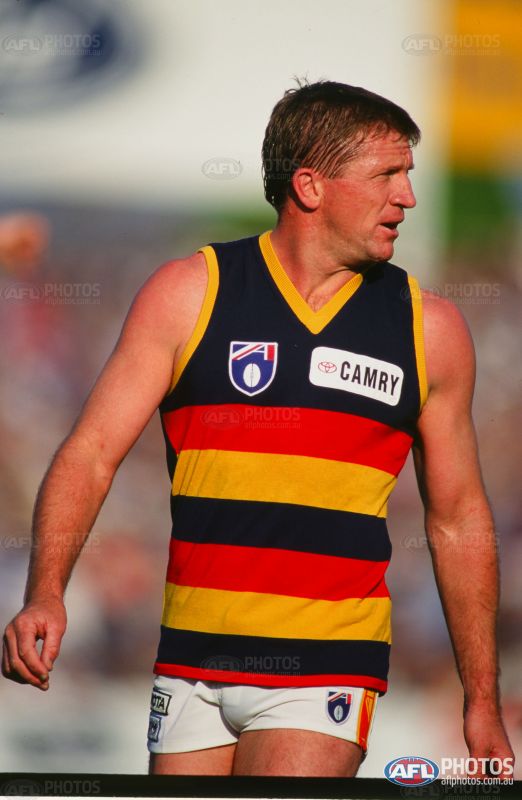
Adelaide.
2005 - White outline increased around Blue Russell text. It's not White.
2004 - Same
2002 - White box added around Russell onfield logo
2001 - Same
2000 - Increased outline of the White background
1994 - Neck removed from Collar
1991 - Same
These might not update for a few hours on the website.
I am struggling to connect to the bomberblitz server where the website is hosted.
Something tells me it's going to be a busy day for bomberblitz.
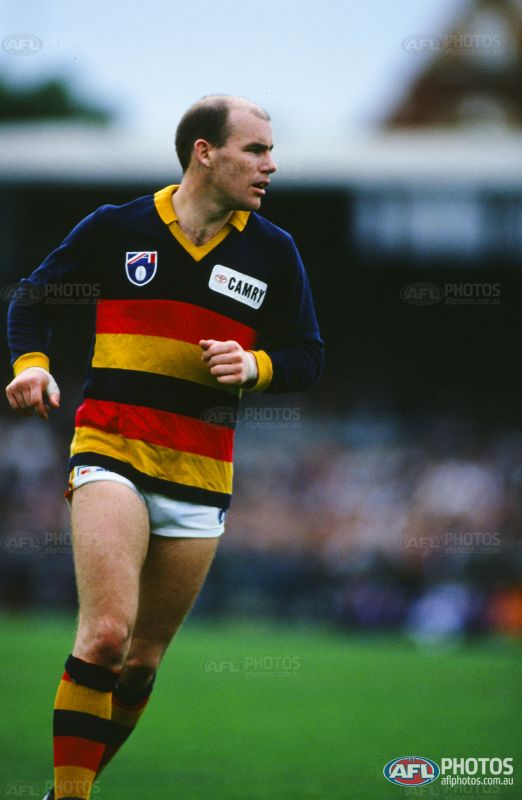
Nah the 04-05 Russell logo definitely had white text. This is my 2004 jumper. It was only the 06 version which Brisbane were the only team to have which was the newer logo/font with coloured text and a white outline, as seen on that 06 heritage a few posts back.


Nah the 04-05 Russell logo definitely had white text. This is my 2004 jumper. It was only the 06 version which Brisbane were the only team to have which was the newer logo/font with coloured text and a white outline, as seen on that 06 heritage a few posts back.
View attachment 205992
Sorry Klim . I swear my Adelaide away guernsey from around that time had blue text with white outlines..
And it definitely didn't.
Sorry Klim . I swear my Adelaide away guernsey from around that time had blue text with white outlines..
Klim
Brownlow Medallist
- Sep 17, 2013
- 12,532
- 10,363
- AFL Club
- Sydney
Brisbane and Carlton have been fixed.
Klim
Brownlow Medallist
- Sep 17, 2013
- 12,532
- 10,363
- AFL Club
- Sydney
Essendon all uniforms is updated. Just waiting on Mero to upload the images.
Klim
Brownlow Medallist
- Sep 17, 2013
- 12,532
- 10,363
- AFL Club
- Sydney
Fitzroy has been updated.
Klim
Brownlow Medallist
- Sep 17, 2013
- 12,532
- 10,363
- AFL Club
- Sydney
Fremantle has been updated.
Klim
Brownlow Medallist
- Sep 17, 2013
- 12,532
- 10,363
- AFL Club
- Sydney
Geelong has been updated.
Klim
Brownlow Medallist
- Sep 17, 2013
- 12,532
- 10,363
- AFL Club
- Sydney
GWS and GC have been updated.
