Resource www.footyjumpers.com

Remove this Banner Ad

This is what the 2022 uniforms page looks like
Any edits required?


For a closer look, right click and open image in a new tab
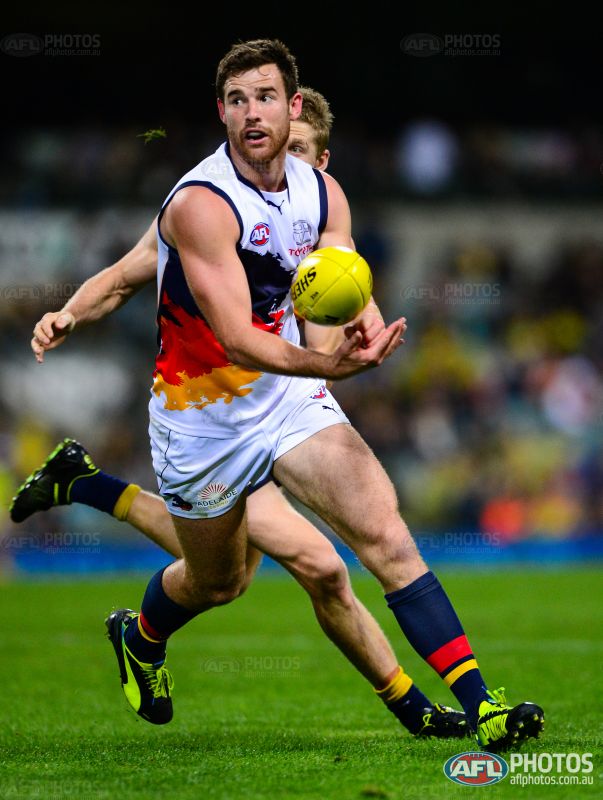
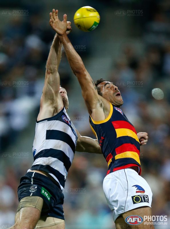
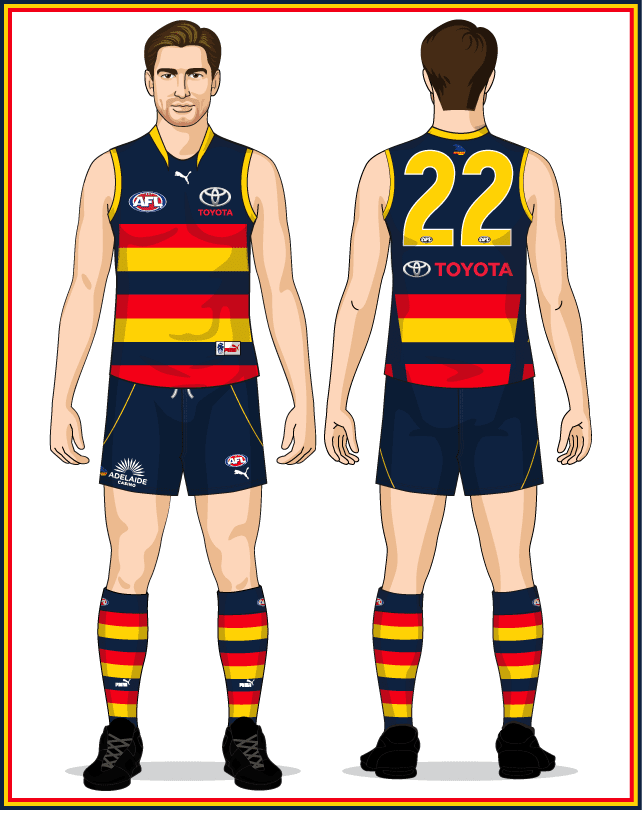
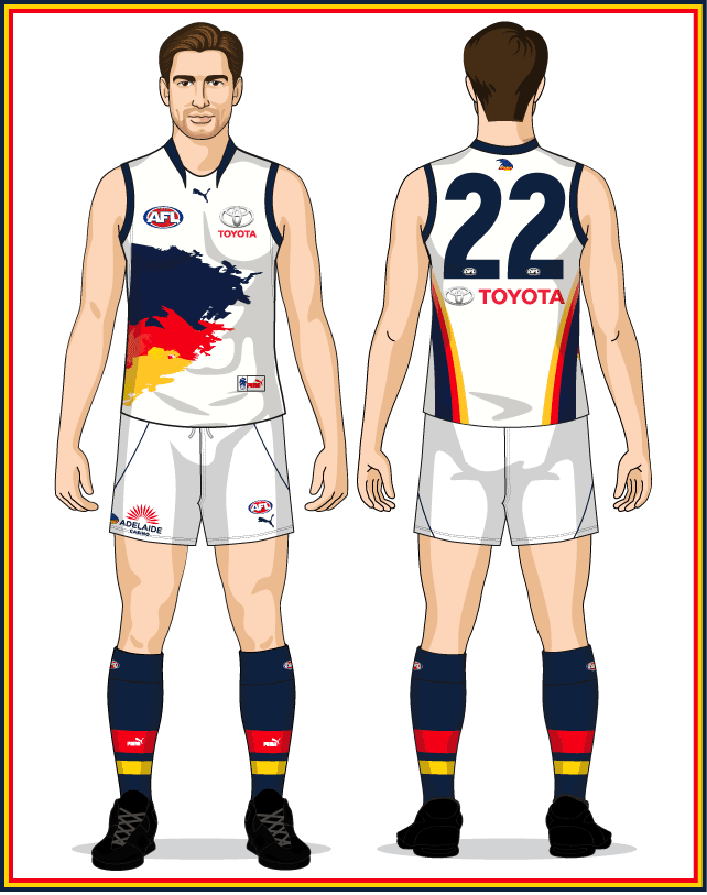
North needs "Shinboner" on the outer stripe
 
Mero so far, these jumpers have been worn during the Pre Season
912440.jpg

911852.jpg

911524.jpg

912165.jpg

912364.jpg
 

Log in to remove this ad.

Mero so far, these jumpers have been worn during the Pre Season
912440.jpg

911852.jpg

911524.jpg

912165.jpg

912364.jpg
Pre-Season comp is regarded as an Official game.
Practice matches are not.
As an example, Essendon played two players who were not on their list against the Bulldogs.
(After which they were both told they would be offered a place on their list)

So whatever they wear from here on is documented.
 
Last edited:
I don't know how concerned you are with getting the exact shade of each colour correct, mero. but North's royal blue is noticably much brighter this year than it was last year and beforehand, this isn't accurate:
1646610788604.png
if you'd like, i can post a side by side of my 2019 bounding roo and my 2022 puma home jumper, to give a of point of comparison.
 
View attachment 1339968
1603630995649-png.995241

Need to remove stitching effect on the 2013 Crows guernseys. The side panels were fake so there was no stitching around them, unlike 2014.
View attachment 1339970
View attachment 1339972
Numbers and especially the Toyota logo need to go higher.
View attachment 1339974
View attachment 1339975
Need to update to have left white side panel cut into the murder of crows design. Side panel wasn't printed on
Fixed 2014 shorts, 2013 Home jumper stitching on Uniforms and Jumper pages, 2013 Clash White panel on Uniforms and Jumper pages.
 
I don't know how concerned you are with getting the exact shade of each colour correct, mero. but North's royal blue is noticably much brighter this year than it was last year and beforehand, this isn't accurate:
View attachment 1340077
if you'd like, i can post a side by side of my 2019 bounding roo and my 2022 puma home jumper, to give a of point of comparison.
Both are RGB 0,51,160
Optical illusion is the only explanation
 
Both are RGB 0,51,160
Optical illusion is the only explanation
if you say so. maybe the printed versions they give out to supporters are different or the fabric behaves differently in the light, because there's a very distinct difference when you put them side by side
 
Fixed 2014 shorts, 2013 Home jumper stitching on Uniforms and Jumper pages, 2013 Clash White panel on Uniforms and Jumper pages.
No Crows logo on the back of the 2013 home
1646701985438.png
295860.jpg


The white side panel thing still needs to be done to the 2014 clash, not the 2013 clash. Remove the side panel from the 2013 clash.
1646703160608.gif
301612.jpg

As you can see theres no fake side panel, unlike on the 2013 Crows home.

You already have the 2014 clash right, but just on the top render.
Bottom render needs to be like top render with the white side panel cutting in.

1646702134992.gif
1646702222144.png

And for those shorts the Crows logo wasn't aligned to the left of the shorts like usually, instead it was aligned to go directly centre above the OTR logo.
317478.jpg

So should go from this
1646703587252.png
To this (also fixed number and sponsor placement)
1646704152127.jpeg
 
Last edited:
if you say so. maybe the printed versions they give out to supporters are different or the fabric behaves differently in the light, because there's a very distinct difference when you put them side by side
Sorry, I think k misunderstood. Are you saying actual Puma Blue is different to CCC Blue? Or the Blue in my images?
 

(Log in to remove this ad.)

Sorry, I think k misunderstood. Are you saying actual Puma Blue is different to CCC Blue? Or the Blue in my images?
i think the puma blue is different to the canterbury blue. this is my 2019 bounding roo guernsey next to the puma strip i bought a couple of months ago:
1646720570669.png
 
i think the puma blue is different to the canterbury blue. this is my 2019 bounding roo guernsey next to the puma strip i bought a couple of months ago:
View attachment 1340878
puma are known to use more vibrant colours so I'd assume it's a different blue
 
No Crows logo on the back of the 2013 home
View attachment 1340687
295860.jpg


The white side panel thing still needs to be done to the 2014 clash, not the 2013 clash. Remove the side panel from the 2013 clash.
View attachment 1340701
301612.jpg

As you can see theres no fake side panel, unlike on the 2013 Crows home.

You already have the 2014 clash right, but just on the top render.
Bottom render needs to be like top render with the white side panel cutting in.

View attachment 1340690
View attachment 1340692

And for those shorts the Crows logo wasn't aligned to the left of the shorts like usually, instead it was aligned to go directly centre above the OTR logo.
317478.jpg

So should go from this
View attachment 1340705
To this (also fixed number and sponsor placement)
View attachment 1340715
How about what they look like now?
 
Shorts perfect

Crows logo on the back still needs to go on the 2013 home, and so does that side panel on the 2013 clash. Looks like you accidentally deleted the side panel from the 2014 clash instead.
Adelaide-Uniform2013Back.png

Adelaide-Uniform2013C-Back.png


Noticed when looking at that Adidas logo here has disappeared
Hawthorn-Uniform2014C-Back.png
OK, so this time I think I'm good.
Crows Home jumpers don't have the club logo, Clash jumper has side panels in 2014 only.
Hawthorn jumper adidas logo in Brown
 
another detail i've noticed on the new north strip, and it's a difference between the ones they sell online and the player issue. the word "shinboner" on the stripe isn't just the word there in the versions worn by the players, that's where they list the player number. i've noticed that you listed the player number as "Shinboner 1234" when it was on the back, so I thought you might want this one to display the same way.
1646963055061.png
it also appears like you've got the word running from bottom to top, rather than top to bottom (though it's hard to tell at the lower resolution)
 
another detail i've noticed on the new north strip, and it's a difference between the ones they sell online and the player issue. the word "shinboner" on the stripe isn't just the word there in the versions worn by the players, that's where they list the player number. i've noticed that you listed the player number as "Shinboner 1234" when it was on the back, so I thought you might want this one to display the same way.
View attachment 1342490
it also appears like you've got the word running from bottom to top, rather than top to bottom (though it's hard to tell at the lower resolution)
Added to the Uniforms and the Home jumper pages
 
you have West Coast with the castore collar on the 2022 page
West-Coast-Uniform2022.png
However in the preseason match against freo they still had the sekem collar
917023.jpg
 
Also
1647139929991.png
ISC missing and premiers text on AFL logo needs to go. Seems to be on almost all the ISC Eagles jumpers when it should just be for 2019.

1647140046926.png
AFL logo on the shorts is quite wayward should go right above oneills logo

1647140191184.png
On this the striping on the shorts turn gold on the back when they should be blue like the front
 

Remove this Banner Ad

Back
Top