Groupie_
time to return the traditional Richmond yellow
looks like isc's collar before their 2013-15 one tbh
Follow along with the video below to see how to install our site as a web app on your home screen.
Note: This feature may not be available in some browsers.
looks like isc's collar before their 2013-15 one tbh
It pretty much is, just a more modern version.looks like isc's collar before their 2013-15 one tbh
on topic / 10Today while I was working I saw a ~12 year old running around pointing to peoples feet and screaming 'WHAT ARE THOSE!?' so whatever Fizzler , keep being you... the people that give you s**t on here are probably like 16 anyway, and if they're not, are just very sad people.
Cody chill.on topic / 10
You don't like it? shoulders just look like any other?Collar is nice, but what it does to the shoulders sucks.
You don't like it? shoulders just look like any other?

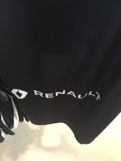
That white Renault box is going to annoy. But at least it's a white box and not a yellow one.
Yes its true grey is in the logo. I don't think its listed as an official colour of the club thoughGrey IS in your logo, so it is sort of a club colour now.
I am liking the gear. The colours look great.
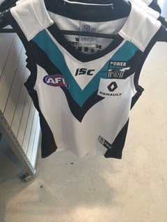
The port logo ruins this guernsey. Just far too much going on
A club logo can't ruin a Guernsey, the logo should be worn with pride. On the port jumper it fits in the chevrons nicely.The port logo ruins this guernsey. Just far too much going on
Don't know why I didn't post it in here.

Get your hand off it mateA club logo can't ruin a Guernsey, the logo should be worn with pride. On the port jumper it fits in the chevrons nicely.
No change.It might be the angle of the picture but don't Port's chevrons usually join at the shoulder?
Or have you intentionally redesigned it for 2016?
Nope. This is what Meagle was talking about hereThe collar as well looks different - is it usually black and then cut off by white?
Collar is nice, but what it does to the shoulders sucks.
Well there's no such thing as perfect quality control, I guess...
I don't think Ports Vs have ever met at the shoulder actually. They've been very close, back in 2010 thanks to Reebok, but as I've seen on footyjumpers.com, they haven't.It might be the angle of the picture but don't Port's chevrons usually join at the shoulder?
Or have you intentionally redesigned it for 2016?
it's normally entirely black. But a new collar has been brought in by ISC this year, that's why it looks very oddThe collar as well looks different - is it usually black and then cut off by white?