- Nov 15, 2010
- 2,409
- 2,157
- AFL Club
- Fremantle
- Other Teams
- WACA, Western Force, Arsenal, Glory
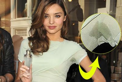
Underarm blobs just don't do it for me, sorry")
Ha ha haaa, not even Miranda?!
Follow along with the video below to see how to install our site as a web app on your home screen.
Note: This feature may not be available in some browsers.
Underarm blobs just don't do it for me, sorry

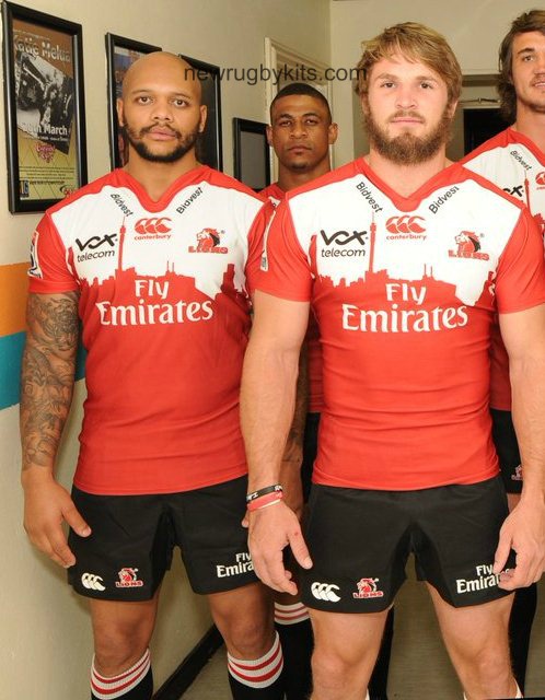
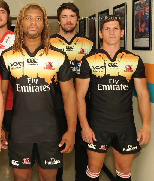
Been scrolling our Sydney concepts I thinkGolden Lions Super Rugby 2016 kits.


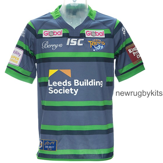
Leeds 2016 away jersey. The shirt takes inspiration from the terracotta and green uniform worn by the club in 1895 before they adopted their now famous blue and amber colours.
The terracotta is quite clearly observable in the major sponsor logo.Needs moar logos!
(and how is grey/black "terracotta"?)
thats it. god damn it nike I hate you.

.jpg")
.jpg")
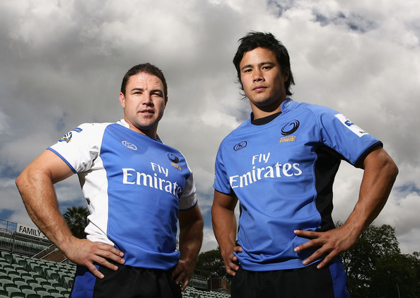
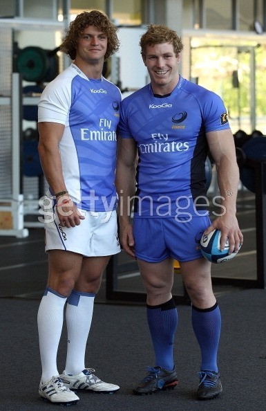
Reminds me of this.A couple of pics of the new Force jersey. Not sure about the white sleeve, makes it look a bit too much like an away kit; probably should have been blue like the rest of the jersey, or possibly even black. Will be interesting if they go for white shorts, making the home kit predominantly blue'n'white; then I could understand the white sleeve.
View attachment 198194 View attachment 198195
View attachment 198198
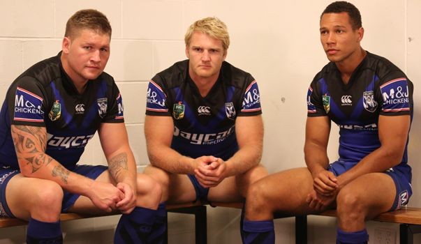
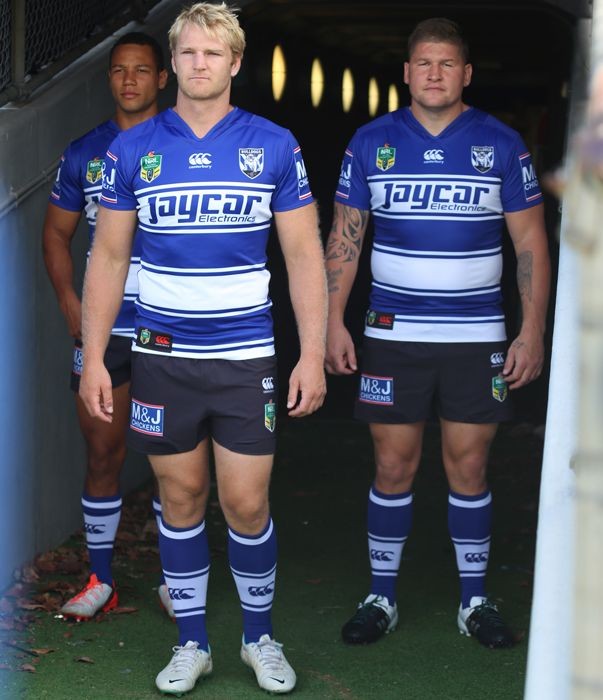
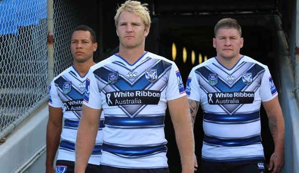
That's the best the Heritage, Home and Nines have looked in yearsBulldogs 2016 jerseys in the flesh.
Home
Away
Heritage
Nines


Um maybe because they are force jerseys?Reminds me of this.
So why didn't they use terracotta instead of steel blue?Leeds 2016 away jersey. The shirt takes inspiration from the terracotta and green uniform worn by the club in 1895 before they adopted their now famous blue and amber colours.
Bigger image and different angles
Thought it looked ok until I saw the maroon side panels and collar.
....... If you have something to say on-topic then post it otherwise don't because its just rubbish.Um maybe because they are force jerseys?
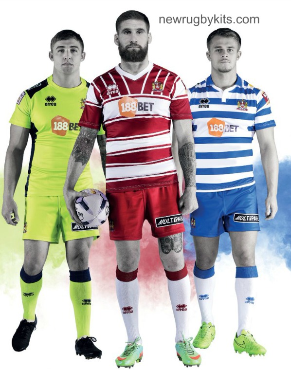
Wigan Warriors 2016 kits.
That's a cute little butterfly tattooWigan Warriors 2016 kits.