Design a Jumper Competition: 17th Team - Gold Coast **See Now Version 2**

Remove this Banner Ad

Status
Not open for further replies.
Re: Design a Jumper Competition: 17th Team - Gold Coast

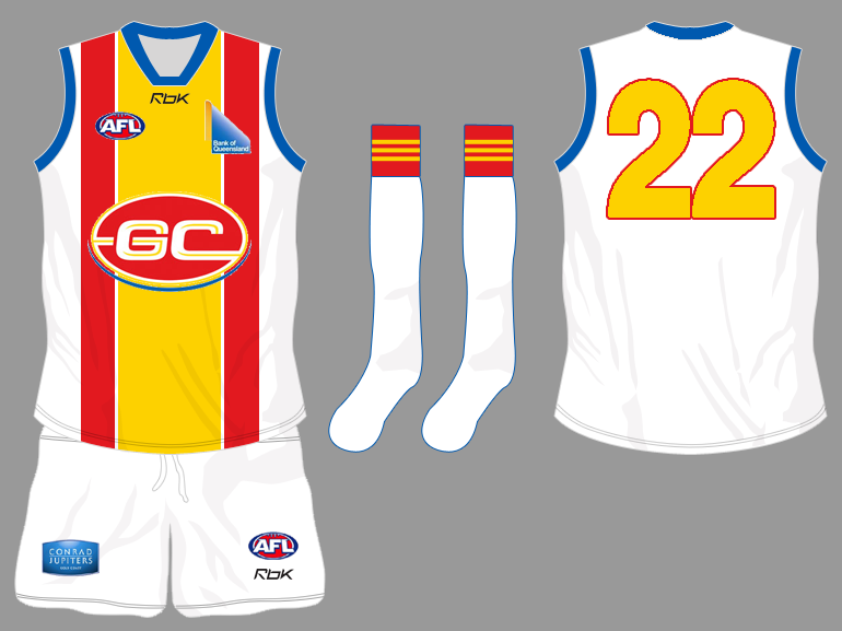
I like the all yellow they wore against southport, and that wouldn't clash with anyone...so wouldn't need a clash jumper......as I've said before, anything that is completely different, and reflects the GC, doesn't really matter what colour as long as not the Lions colours (or anyone elses for that matter)

Be original, be bold in colour!
 
Re: Design a Jumper Competition: 17th Team - Gold Coast

Not ignored it, but looking at it from a purview sense. Walking thru a store in Broadbeach and seeing a sea of light blue tops, supporter tees, caps, etc. The AFL brand doesnt stand out from the others.


GloryandFame's guernsey imo is a great one....but it's a predominant red (not maroon either) and yellow top. Lifesaving cap. No blue at all. That would be better at least, as it would stand out in stores and on the streets. People would say/know, "ah that's a GC17 top, that's an AFL brand, should buy me one of those, they look spiff". The blue in that cap design would not be needed to signify 'sea'. The lifesaving cap in itself would sufficiently highlight that already.


That's what Im emphasizing as good marketing/merchandise/brand strategy. It becomes globally recognized too. And the New England region's regional colors are red/white/blue, as the Pats have embraced. Yet, as you observe, the Boston Celtics have a globally identified brand. The GC itself has a very international exposure already. So having a very unique brand/color (whatever it is) would only be good for GC17 itself. It also has relation to the nickname you use. Boston Celtics therefore would look to emphasize green. NE Patriots would look to emphasize red/blue. So GC17's nickname would have a good say in the colors. GC Savers....red/yellow. GC Gladiators....gold/red. GC Dolphins....orange/teal. It seems to me GC17 erred in choosing the colors before choosing the nickname. Or, havent thought thru what nickname to use for those colors. Imo, yellow/red = Savers. Red/Gold = Gladiators. Either would better than having any blue whatsoever in the team brand.


Not saying it's meaningful, but just that it's not absurd. Gold itself and Gold Coast is a very strong pointer there. It's in the very name! You cant ask for more brand advantage than that! The black is just a proposed color that would suit gold. But red and gold would work, in gloryandfame's design, made gold tho than yellow. Golden sands dont have to = bright yellow.


Never worry about this. I have the thickest skin in the known universe, and i love to debate, and also i know all you guys from the Bomber board as well, and as I stated before, Essendon fans are often the coolest and most down to earth and amicable bunch around. So it's all good. Just bring the heat to the kitchen in debates/arguments and I'll always respect that.

It's the Coast. A store is the only place you'd find a sea of light blue tops on any given day, except for game day. Even then, as I've said, those red and yellow stripes dominate the front of the guernsey and differentiate it from the others.

I agree that GCFC should be trying to build on and use the international exposure that GC already has. In these terms, the colours you propose make no sense. That's why red and yellow as the dominant colours of the guernsey will help construct the Gold Coast's identity. Light blue is a logical addition.

The Gold Coast Bulletin's banner colours are irrelevant, and thus absurd.

We should demand more brand advantage than a simple play on 'gold'. You make the point of referring to people from overseas... are they only to recognise that the team has something to do with gold? ...like Las Vegas perhaps? or mining? ...again you've missed the point. These colours (red, yellow, blue and white) are reminiscent of what locals enjoy about the lifestyle on the Coast. They represent aspects of Coast life that we sell to tourists internationally already.

That black is just a proposed colour that would suit gold makes its choice superficial and without any real meaning.

You missed my point on the Celtics. Boston was a place where many Irish migrants settled, hence the team's name and colours. The connection is deeper and the marketing more meaningful. The Pistons are so named because of the motor vehicle manufacturing industry Detroit is famous for. You know this, which is why your argument for a meaningless club strip perplexes me. Come on GG, get real.
 
Re: Design a Jumper Competition: 17th Team - Gold Coast

What Im alluding to is that GC17 itself, not the Gold Coast, is what one would be aiming to emphasize, and create a unique brand. The Gold Coast region itself is already internationally famous, you're not trying to promote and advertize the Gold Coast, but the football club, the brand of that club.

Golden sands does not have to mean bright yellow. In my marketing eyes, if I were given the job of creating the whole GC17 brand, the first thing I would do is pencil in the color Gold as the first and predominant color. The name and the sand relates. From here, I would then decide on a second color, and such that the both of them truly stood out among all other AFL teams and other code teams.

So, I'd propose two:-
1. GC Savers....Gold (or yellow) and bright red as the colors. Red not maroon either. The guernsey then all red and gold (gloryandfame) and no blue whatsoever. But really I'd have avoided using lifesaving as a motif of the club, mascot etc. I only propose "savers" because they've already gone ahead with the mascot. Instead, I'd have probably pushed....

2. GC Gladiators....Gold and wine red (roman). It's the TEAM brand remember, not the GC itself that's being uniquely branded.

Savers is kinda daft. Same with the mascot. Gladiators symbolizes that courage as well, whilst also being unique name/brand. It doesnt "have to" signify the region. It CAN, of course, and if the GC17 were starting up BEFORE Titans/Blaze/etc I'd have nailed that team brand first before anyone else did----light blue, yellow, orange. Dolphins maybe a name if it werent outlawed. But seeing as it's coming on the back-end of other codes, then I'd look to differ markedly.

Only reason black got mentioned was because black works well with gold. And looks kinda bad-ass. But dull gold works well with red (either wine red or bright red).

The problems currently is that GC17's red is actually maroon. So the whole lifesaver thing is kinda off, cos the mascot is bright red/yellow, but the uniform looks maroon. And do they really need to have maroon to emphasize it's a QLD team?? That's just bone-headed on the back of the Lions already. And we already see an absence of blue in the uniform and logo really. Seems they're going for a predominant yellow/maroon look. You're ok with that, it seems. Not pushing the blue. Saying the yellow does in the end stand it out. But why does it have to be yellow and not gold? And, there's no blue really. So if they go ahead with that, in your opinion, you're saying that's somehow weak as a brand because it doesnt represent the Coast's color (blue). However, even that current guernsey is really good in truly promoting GC17 as a unique brand. Which is the intention---promoting/branding the club itself, not the region.
 

Log in to remove this ad.

Re: Design a Jumper Competition: 17th Team - Gold Coast

to me thats still a bit too "fitzroy" but i tried it for you

it's not exactly what you asked for and i can get rid of the gradients but i hope it captured what you wanted

Get rid of the wave, then it would resemble the flag.

I see it being a yellow top, red shorts, matching the lifesavers uniform. Then we will see a little bit of blue stylizing on the guernsey.
 
Re: Design a Jumper Competition: 17th Team - Gold Coast

...But you've completely ignored the dominance of the wide red stripe down the middle of the guernsey.

As for marketing, GCFC are right to try to establish a deeper connection with Gold Coast residents. The reference the guernsey gives to surf lifesaving and therefore our perceptions of 'courage' is intelligent. Blue representing the surf and yellow the sand is also intelligent, and if that blue is lightened to appeal to NSW residents as well, we'll definitely have a winner. This is why it's a Coast jumper. It reflects life on the Coast.

The examples you mention in your post, far from being global, are simply American for a start. I don't know why the Yankees or the Patriots have the colours they do, but GCFC is approaching their marketing in a similar way by linking the identity of the team to the region. The Detroit Pistons are another example. The Boston Celtics made great choices with their strip and marketing and are now one of the most recognised sport brands in the world. Others, like the Chicago Bulls, seem to be straight up capitalist - here's a name and some colours. Sell it. Who in Australia had heard of the Chicago Bulls before Jordan.

Again, there is no real meaningful link with the strip you suggest and the identity of Coast fans with the place they represent. I hardly think having the same colours as the Gold Coast Bulletin's banner is a meaningful connection.

Don't get me wrong GG, I'm not taking a shot at you personally, I just don't think the black gold and white idea is very well considered.


WTF:eek:

Get over this whole red strip thing mate. GG and others are talking about the general colours of GC17. Doesn't matter what shade of blue it is, it's still blue, the red isn't that far off maroon like the lions and the yellow is the same. And same as the Titans and Blaze, they are basically the same colours!

The fact that your trying to appeal to NSW people for a QLD side is a joke to start with buddy. Wouldn't it make more sense to leave the powder blue out of the GC17 and leave it to WS18 to perhaps appeal to NSW people or would you rather West Sydney wear Maroon to appeal to QLD residents?:D

What we are saying is NO MORE of these surfy/ocean/sandy/sunny colours because it's been done to death and it's not that attractive.:thumbsdown:

WE want new colours in the AFL eg;

Shiny Gold- GC17

Powder blue- WS

Green- Tassie

Orange- Canberra/Darwin/Nth QLD etc


This is what Port and Fremantle did well when they came into the AFL. They created a unique identity that made them stand out. Port wouldn't have been stupid enough to wear the same colours as the crows even if the blue was a little lighter which is exactly what you are implying.
 
Re: Design a Jumper Competition: 17th Team - Gold Coast

Can't say the safety vest excited me-there are plenty of better options on this thread.
 
Re: Design a Jumper Competition: 17th Team - Gold Coast

This is what Port and Fremantle did well when they came into the AFL. They created a unique identity that made them stand out. Port wouldn't have been stupid enough to wear the same colours as the crows even if the blue was a little lighter which is exactly what you are implying.

This is a great example. If you look also at both WA teams, neither wears black-yellow either. Both very distinct colors/brands that stand far apart. Blue-Yellow vs Purple-Green-Red. This is what is needed in two-team cities. And it's very poor marketing strategy by the GCFC/AFL to brand the club in maroon-yellow, or red-blue-yellow. Or, if they went for a dominant light blue and yellow "Coast" look.

The more I think about it, the more GC Gladiators would be a great name and brand. Shiny dull gold and wine red, maybe a little black trim, a la Roman Legion. The crowd could all come in gladiator gear, have gladiator-like chants, the "thumbs down" cheersquad etc.

And there are some pretty good google images of "gladiator" logos that could be used.
 
Re: Design a Jumper Competition: 17th Team - Gold Coast

Like this...

Glads_logo.gif
 
Re: Design a Jumper Competition: 17th Team - Gold Coast

gcfc_a10.png


This looks TERRIBLE!

Where do I start. It's plain, boring and ugly. You couldn't have tried any harder to pick the 3 most Original boring colours out there and slap them on a white Guernsey!

That is So boring............zzzzzzzzzzzzzzzzzzzzzzz

GCFC53.gif


Brisbane-Away-2008.gif

Brisbane-Clash-2008.gif


Oh look its the Brisbane Lions!:D

Is there any room for common sense any more?:rolleyes:
 
Re: Design a Jumper Competition: 17th Team - Gold Coast

Sorry Ghostdog but you have clearly lost all sense of reality if you can't see what the rest of us see.:(
 
Re: Design a Jumper Competition: 17th Team - Gold Coast

Is this a sign they are slowly weeding out the blue all together?

and who is this guy on the right?


comparison-1.jpg
 
Re: Design a Jumper Competition: 17th Team - Gold Coast

WTF:eek:

Get over this whole red strip thing mate. GG and others are talking about the general colours of GC17. Doesn't matter what shade of blue it is, it's still blue, the red isn't that far off maroon like the lions and the yellow is the same. And same as the Titans and Blaze, they are basically the same colours!

The fact that your trying to appeal to NSW people for a QLD side is a joke to start with buddy. Wouldn't it make more sense to leave the powder blue out of the GC17 and leave it to WS18 to perhaps appeal to NSW people or would you rather West Sydney wear Maroon to appeal to QLD residents?:D

What we are saying is NO MORE of these surfy/ocean/sandy/sunny colours because it's been done to death and it's not that attractive.:thumbsdown:

WE want new colours in the AFL eg;

Shiny Gold- GC17

Powder blue- WS

Green- Tassie

Orange- Canberra/Darwin/Nth QLD etc


This is what Port and Fremantle did well when they came into the AFL. They created a unique identity that made them stand out. Port wouldn't have been stupid enough to wear the same colours as the crows even if the blue was a little lighter which is exactly what you are implying.


You should re-read your post. Perhaps with some thought you'd realise how dopey it sounds.

Of course it matters what shade of blue it is. Based on your line of (non)thought Carlton and Port wear the same coloured guernsey. Sorry GG, GC17's red is red, certainly not maroon, and the two are not the same. Jackmac, if you can't acknowledge the difference between the two guernseys if either Brisbane or GC were wearing a clash strip, then there's something wrong with you.

The yellow is the same. So? it's not a dominating colour on the guernsey I favour anyway.

The fact that you draw the line of popular appeal at the Queensland border is what is truly laughable. As if people in northern NSW have a different currency or something. I see that your details have you located in Melbourne which probably indicates how well informed your opinion of Coast life is. If you ran a business on the Gold Coast and decided not to try and expand your customer base south of the border, you'd make sweet jack-all compared to those businesses who realise that the folks in Murwillumbah, Tweed Heads, Grafton, Lismore, Ballina etc share the same currency and the same culture. Certainly moreso than people in Western Sydney, which is a world away by comparison.

You're right that the consortium representing WS18 would be wise to go for light blue (though by your colour rationale they should stay away from it, because 'blue' is taken) but business is business chum. If GC17 get it first, more power to them. So, no. It wouldn't make more sense at all. It would be senseless.

I understand what you are saying in terms of the colours for the side. What I am saying is that the reasons for your choices are based on nothing more than how pretty they are. Your reasons themselves are largely superficial.

I couldn't give a stuff about what colours Tasmania, WS18 or any other potential entry into the comp choose (yet).

You don't develop a meaningful identity based on prettiness. That's pettiness, and following the lead of Americans in the way they promote their game I hope isn't what Aussie football's all about.

Thanks buddy.
 
Re: Design a Jumper Competition: 17th Team - Gold Coast

jackmac7....

No idea who that is.
And id say the blue will be very minimally used as the logo suggests. In that real pic, just a little blue sock stripe.

But if you think about it....a Lions vs GC game, the crowd would be jammed with maroon, yellow and blue scarves, flags, streamers, and supporter wear. Couldnt tell the difference, etc.

Should really aim for more distinction.
 

(Log in to remove this ad.)

Re: Design a Jumper Competition: 17th Team - Gold Coast

But if you think about it....a Lions vs GC game, the crowd would be jammed with maroon, yellow and blue scarves, flags, streamers, and supporter wear. Couldnt tell the difference, etc.

Should really aim for more distinction.

This is the most sensible thing to come out of all of this so far. I reckon GG that we might end up with something predominantly yellow, with red and (I hope, light) blue.
 
Re: Design a Jumper Competition: 17th Team - Gold Coast

Ghostdog...

Tho the current guernsey is fluro yellow (yuck), the top so far stands out from the Lions and titans/blaze. Creates a distinct brand. I just dont think yellow is good, because there's already enough of it in the AFL, and the leap from yellow to gold is not absurd (sand and "gold" coast). And it'd be a unique color in the AFL as well. That dull gold. Especially predominant.

So, if they ended up with something like that, all gold top with red trim like i have shown in black in that doctored photo), then it would be okay imo. Tho, you're still going to get a crowd/merchandise clash (maroon/yellow vs yellow/maroon or yellow/red). This is why either gold/black/white or gold/red/black would create further distinction (and would fit in with the Gladiator theme).

From there, it's a matter of a team nickname. They already have Gazza which imo they should probably avoid (even if it's already been chosen). Probably not good to attach Lifesaving and Football together like that at all. Tho it's applicable, it's like InCase said once before, having a team called the Gold Coast Cricketers.

Im now really liking the GC Gladiators concept.

You were the main spokesman for the surf "rider" name and board logo :confused:

Anyways, I do think yellow and red is far enough away from the lions maroon and minimal gold, as long as they keep the blue to a bare minimum, much like they have in the training guernsey, and socks.

Now I need to go make the Reebok collar.
 
Re: Design a Jumper Competition: 17th Team - Gold Coast

This is the most sensible thing to come out of all of this so far. I reckon GG that we might end up with something predominantly yellow, with red and (I hope, light) blue.

...over Vlad's dead body

The AFL has said RED has to be the predominant colour (out of the red/yellow/blue combination), as it is now classified as DARK. They're not gonna change that policy within the space of 3 years.


GG:
I think i speak for everyone on this forum when I say black/gold is better than red/yellow/blue (for many reasons outlined in the last 5000 posts). Some of you guys have sent emails, thats great. Other than making an online petition, there's not much else you guys can do about it. And that includes rambling on for page upon page on how s**t the current situation is. So please, let it be :thumbsu:
 
Re: Design a Jumper Competition: 17th Team - Gold Coast

We could add a section to a website, GG knows what i'm on about.

Pleas to the clubs, have a section dedicated to the Gold Coast guernsey, identity and logo. Flood the gold coast webite and email with a simple link.
 
Re: Design a Jumper Competition: 17th Team - Gold Coast

...over Vlad's dead body

The AFL has said RED has to be the predominant colour (out of the red/yellow/blue combination), as it is now classified as DARK. They're not gonna change that policy within the space of 3 years.

GG:
I think i speak for everyone on this forum when I say black/gold is better than red/yellow/blue (for many reasons outlined in the last 5000 posts). Some of you guys have sent emails, thats great. Other than making an online petition, there's not much else you guys can do about it. And that includes rambling on for page upon page on how s**t the current situation is. So please, let it be :thumbsu:

Yeah, the reality is the decisions have been made. Unfortunately.

But I sent another one today about the Gladiators idea + attachment of that logo for pointers. But you never know, if the club gets enough complaints and unanimous appeal for certain things (gold, gladiators, whatever), then maybe there's leeway for change. Refuse to give in for now lol.
 
Re: Design a Jumper Competition: 17th Team - Gold Coast

We could add a section to a website, GG knows what i'm on about.

Pleas to the clubs, have a section dedicated to the Gold Coast guernsey, identity and logo. Flood the gold coast webite and email with a simple link.


Good ideas. Id back that. Also...Vox populi FTW.

Also, smeagle's online petition idea is a good one too.
 
Re: Design a Jumper Competition: 17th Team - Gold Coast

Gladiators imo is a bit too similar to the titans. I also think that red blue yellow, depending on the shading, should be different enough to Adelaide, and Brisbane have maroon and I am guessing again that the blue shading will be different enough for their not to be a problem.
 
Status
Not open for further replies.

Remove this Banner Ad

Back
Top