Design a Jumper Competition: 17th Team - Gold Coast **See Now Version 2**

Remove this Banner Ad

Status
Not open for further replies.
Re: Design a Jumper Competition: 17th Team - Gold Coast

Here's two versions, one with a blue trim as well, one without...

gc-onfield-2.jpg
 
Re: Design a Jumper Competition: 17th Team - Gold Coast

I dont accept the colors, just saying if they've already decided it would seem unlikely to change their minds---not impossible tho!! Ie, online petitions and barrage of emails.

Like jackmac7 re-iterated.....it's just pointless having yellow/red/blue anyway, even if we try different combos (pred. blue, pred.red, pred.yellow) cos it's always still gonna directly clash with the Lions, crowd flags, beanies, caps, tops, etc.

GC17 should be totally different colors, but "shoulda/woulda".
 

Log in to remove this ad.

Re: Design a Jumper Competition: 17th Team - Gold Coast

All your designs in y/r/b, and all the others seen in this thread from mr crow, incase, aneale, etc etc, and mine, are all ok. There's a lot of good designs. But they're all still bad color combos for all the reasons stated many times.

All the designs themselves we've all done, using different color combos, would look great. It's just the colors theyve chosen.

Also, like you said, there's a point where the yellow/red looks like ronald mcdonald outfits. So GC17 has really painted themselves into a bad corner imo. Gotta be GOLD upfront for sure, then choose one or two more different colors and it would be so much better. GRRRR. Why, GC17? Why?!
 
Re: Design a Jumper Competition: 17th Team - Gold Coast

Yeah, first one is much better. If blue has to be in there maybe the numbers can change from the red.
 
Re: Design a Jumper Competition: 17th Team - Gold Coast

How long before the Brisbane lions take some sort of action against GC17?

They need to get attention on the Gold Coast. And they won't get to much attention with those colours I can tell you now. Because people associate those colours with the Lions or the Blaze or the Titans. Red's, Blue's, Yellow's however you see it, SEQ's are probably sick of those colours for sporting teams. Any SHADE!

Something more stylish and sleek rather than something too bright and awkward. RED, BLUE, YELLOW and WHITE is Sooooooooo Boring........:thumbsdown:

And it will take to about round 4 or 5 in 2011 for people to start questioning Why on EARTH these colours (even before a SEQ derby)? And I'll be at home shaking my head saying I told you so!:D

If the AFL are smart enough they'll step in and tell GC17 to go back to the drawing board.
 

(Log in to remove this ad.)

Re: Design a Jumper Competition: 17th Team - Gold Coast

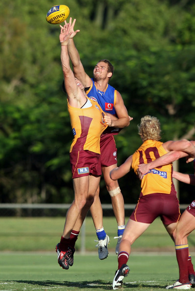
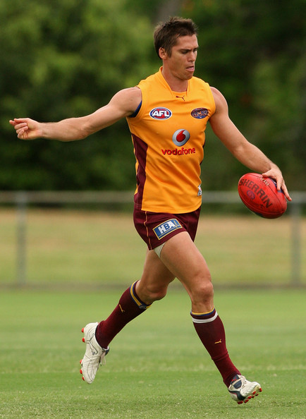
That's just a training top, but it is still a joke how close it is to the GC17 one. They probably got a discounted rate from the supplier :p.
 
Re: Design a Jumper Competition: 17th Team - Gold Coast

The lions would probably have to complain like collingwood did, can only hope.
 
Re: Design a Jumper Competition: 17th Team - Gold Coast


Nah, no good. Sorry for mentioning it. :)

Two colours are the way to go I reckon, seems to make the design much easier (whatever the design and colours are going to be).
 
Re: Design a Jumper Competition: 17th Team - Gold Coast

im not sure if it's just a training top because i heard they have that exact look for their new clash strip. Looks pretty legit. An internal trial where teams wear their home/clash strips.

Also, im gonna do a limey-rich green/black version to show how much cooler that'd look.

Lime green sport team? I think youre losing your mind :p
 
Re: Design a Jumper Competition: 17th Team - Gold Coast

The only reason I say it's a training top is because of the Vodafone advertising on the front, they don't let you have that do they?
 
Re: Design a Jumper Competition: 17th Team - Gold Coast

Looking at their website and this canary yellow top they wore recently it definately looks like they have gone for mostly the canary yellow on top of red with splashes of royal blue here and there.:eek:

Looks a little weak or gay if you know what I mean..............They come across a bit flimsy. Not far off BAYWATCH actually!

baywatch_22_0308_430x.jpg.jpg


13355__baywatch1_l.jpg


GC17 really nailed the whole 'life saver' theme I guess, now we just need to call them the guards to put the icing on the cake of this proud new AFL football club full of tough brut strength men........:rolleyes:
 
Re: Design a Jumper Competition: 17th Team - Gold Coast

The only reason I say it's a training top is because of the Vodafone advertising on the front, they don't let you have that do they?

You are probably right (vodaphone on front like that does = training top).
But, their 2009 clash strip from what ive heard is exactly that look.
That might be kinda "pending what GC17 officially reveal", in terms of adding more or less to it.
 
Status
Not open for further replies.

Remove this Banner Ad

Back
Top