messing around with gradients haha


Follow along with the video below to see how to install our site as a web app on your home screen.
Note: This feature may not be available in some browsers.
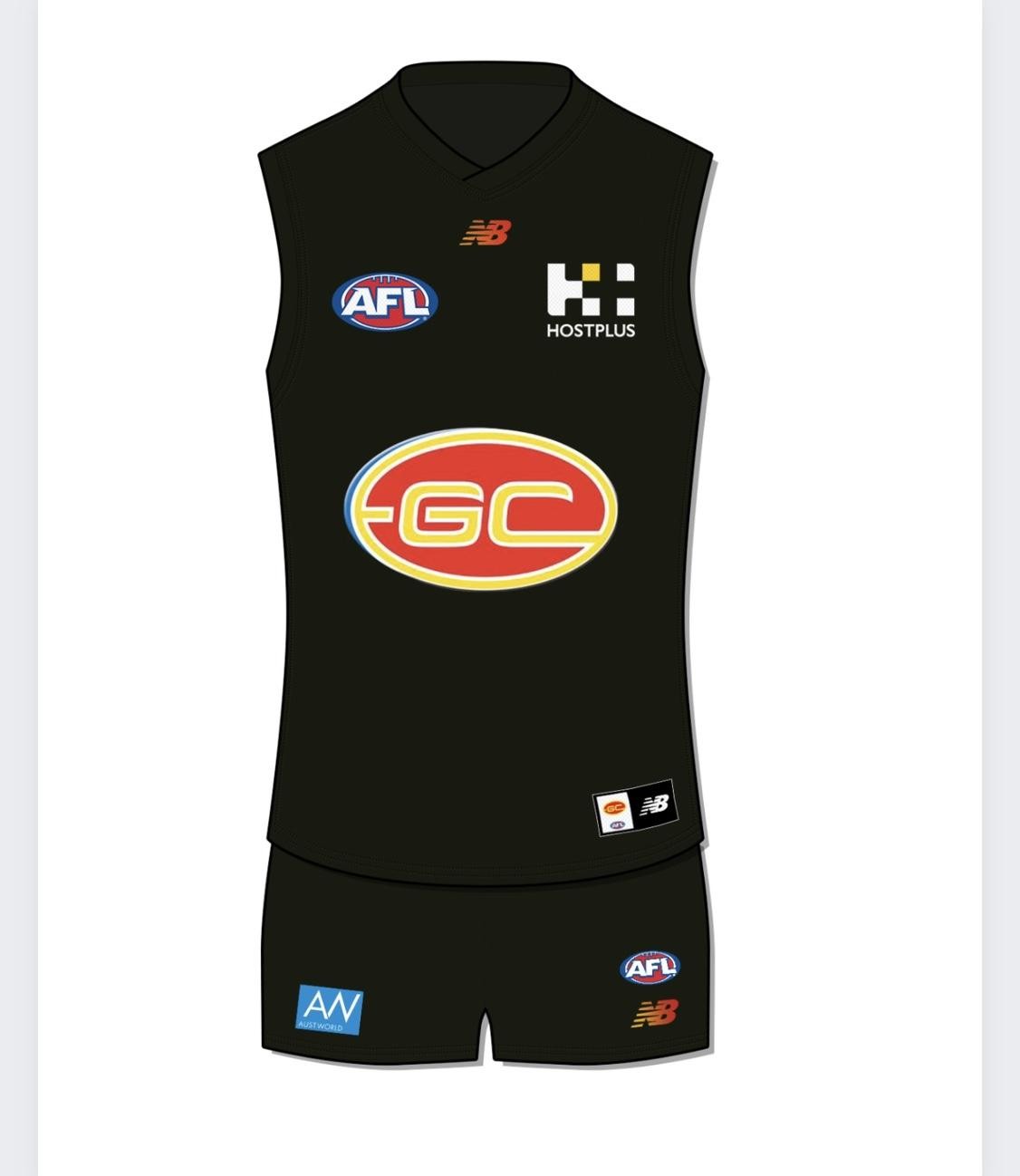
I really vibe with that Black strip - The AFL would never let us do it but that should be our "Primetime" kit.
I really vibe with that Black strip - The AFL would never let us do it but that should be our "Primetime" kit.
The top right Red number is a goer too, All we need to do is simplify the logo and it comes out alright


The Solar Eclipse Guernsey. This is pure sex and a marketing dream
50% correct. would be with white shorts because 'away'
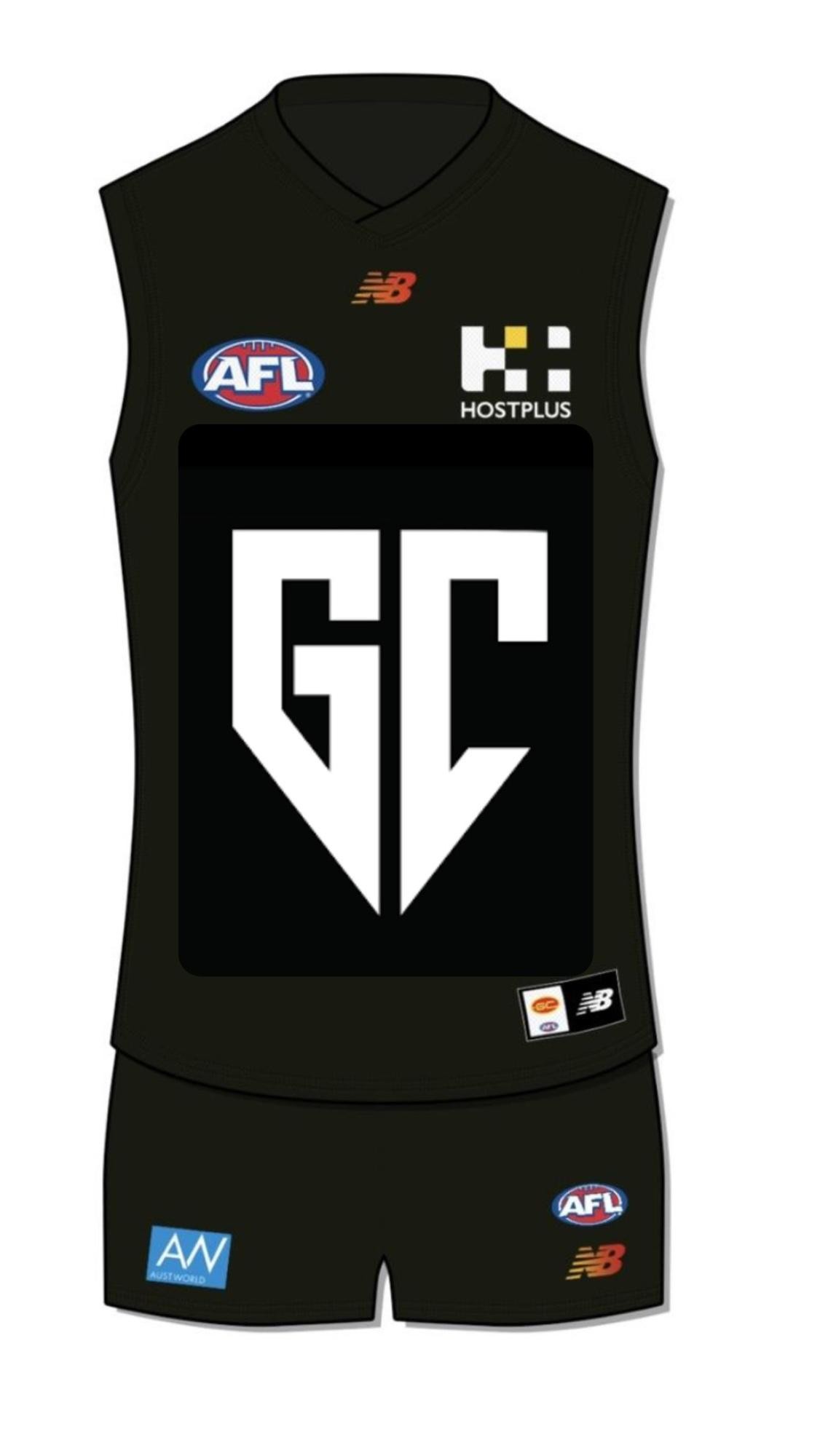
This I what we would end up with…
Sent from my iPhone using BigFooty.com
they should bring it out once every few years when it coincides with an actual solar eclipse hahahThe Solar Eclipse Guernsey. This is pure sex and a marketing dream
This I what we would end up with…
Sent from my iPhone using BigFooty.com
Something like this
I don't love it but goes to show our design works, we just need a better logoBit to “giants” for me but I was curious
View attachment 1867788View attachment 1867789
Sent from my iPhone using BigFooty.com
Bit to “giants” for me but I was curious
View attachment 1867788View attachment 1867789
Sent from my iPhone using BigFooty.com
And Tassies guernsey is terribleTassie already have a better guernsey and logo than us
Nah can't agree.Tassie already have a better guernsey and logo than us
Tassie already have a better guernsey and logo than us
I don`t think your jumper is the worst at all, as I believe the Giants are by far the worst!!! To me your jumper should have more gold down the front as you are the Gold Coast not the red coast after all, and perhaps a St Kilda type jumper except that the middle division would be gold with red on both sides of that.....Also if you actually have blue as one of your colours why not make it slightly more prominent with blue trim around the neck and arms. I absolutely detest the Giants colours as orange is a beach/summer colour and reminds me of sickly sweet fanta,I mean, at least it’s genuinely questionable whether we have the worst guernseys in the league now as opposed to clear worst.
Don’t rate their logo either. Looks straight out of a ‘build a team’ franchise game mode.
But if a fizzer of a reveal for me really. Still exciting though.
and if you are going to have orange then make the grey black so it at least stands out more, but get rid of that white "G" as that looks a bloody afterthought!!! As the Giants often do when they play away they wear an almost black look with an orange G and when in all orange a black G and to me they both look better than their normal piece of rubbish!!!.........we know why they chose those colours of course, as just take a look at the NRL tigers colours and they are in the same area are they not?!!Tassie already have a better guernsey and logo than us
It's a terrible version of it and it makes no sense for an AFL club to use a State of Origin jersey. Be like the Crows using the croweater jersey.For those old enough to remember the Tasmanian Guernsey it’s a replica of their state of origin strip, so it makes sense for them to use it. Designed for the state to unite behind. However, having said that it does look s**t
Change now, those are great. If can’t do black, then maybe the blue for the ocean. No white shorts either.These were the best ones by far in my opinion. I've sent them to the club multiple times too.
View attachment 1864481