Just got this email from Suns 4:05pm. Did you get it? If not contact Suns about your email.yep never got and not in spam.
do better !
"Opening Round Pre-Sale Dates Confirmed!"
Follow along with the video below to see how to install our site as a web app on your home screen.
Note: This feature may not be available in some browsers.
Just got this email from Suns 4:05pm. Did you get it? If not contact Suns about your email.yep never got and not in spam.
do better !
yeh got that one just now tooJust got this email from Suns 4:05pm. Did you get it? If not contact Suns about your email.
"Opening Round Pre-Sale Dates Confirmed!"
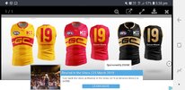
Not sure how everyone else feels, but I don’t hate the yellow training kit they’re rocking. Maybe we should do more with Gold/Yellow, possibly as an away kit.
It could also just be because the GC logo doesn’t contrast as much…
I like the yellow, my local club features yellow as the main colour. You get used to itNot sure how everyone else feels, but I don’t hate the yellow training kit they’re rocking. Maybe we should do more with Gold/Yellow, possibly as an away kit.
It could also just be because the GC logo doesn’t contrast as much…
Bringing this back up. This needs to happen.
Not sure how everyone else feels, but I don’t hate the yellow training kit they’re rocking. Maybe we should do more with Gold/Yellow, possibly as an away kit.
It could also just be because the GC logo doesn’t contrast as much…
Not sure how everyone else feels, but I don’t hate the yellow training kit they’re rocking. Maybe we should do more with Gold/Yellow, possibly as an away kit.
It could also just be because the GC logo doesn’t contrast as much…
Besides the wavethe best designs I’ve seen on this thread are:
Billy ray ’s
View attachment 1864449
lommy ’s
View attachment 1864452
exile ‘s
View attachment 1864453
And robo_1 ’s
View attachment 1864456
All of these look clean and could swap with yellow being the primary colour instead of red.

Those areThese were the best ones by far in my opinion. I've sent them to the club multiple times too.
View attachment 1864481
 damn!
damn!These were the best ones by far in my opinion. I've sent them to the club multiple times too.
View attachment 1864481
i liked the idea but the stretched/distorted logo looks a bit off imoThese were the best ones by far in my opinion. I've sent them to the club multiple times too.
View attachment 1864481
That black and gold is sick. Full rebrand around that. Song, guernseys everythingThese were the best ones by far in my opinion. I've sent them to the club multiple times too.
View attachment 1864481
Agree, it looks awesome, you could just use a super dark blue like the crows do that way the song doesn’t need to change. Can’t see it happening though, as I reckon Port Adelaide and the Maggies would have a problem with it.That black and gold is sick. Full rebrand around that. Song, guernseys everything
