Scotty_222
Norm Smith Medallist
What about our current clash jersey in home colours?
Follow along with the video below to see how to install our site as a web app on your home screen.
Note: This feature may not be available in some browsers.
What about our current clash jersey in home colours?
Yeah not as good as I imagined, the freo looking one is pretty sweet thoughCheck back on page 5. Do you mean like those ones? I like the look of those,
What about our current clash jersey in home colours?
Hi guys, sorry for the interruption. I love your clash strip. It looks like as trip for the moniker of "Suns". So I had an idea for the entire uniforms to be based around it. Not my best, but here you go.
Home-Top
Away-Middle
Clash-Bottom
View attachment 38648
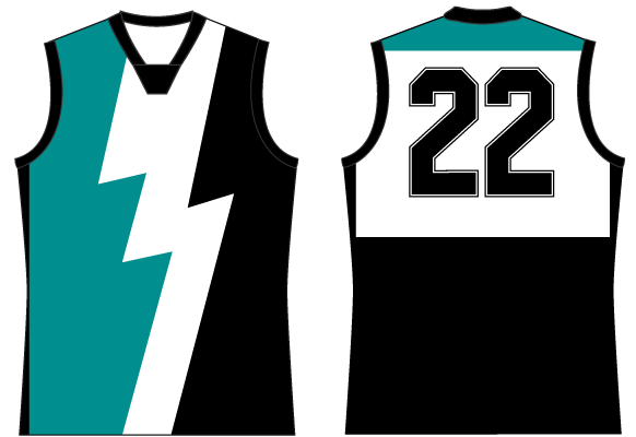
Id like to see this in GC colours as well. looks pretty cool...Someone whip this up in Suns colors? It's my favorite design, and I'd love to see the Suns adopt it with a logo change to something that fits. Basically the Geelong jumper with a stripe removed and a logo thrown in its place.

Here it isId like to see this in GC colours as well. looks pretty cool...
Great work. Agree also on the blue, also, how would it look with red stripes and yellow backing?
I love the effort you have put in but if we wore this we would be the laughing stock of the league (with the exception of Essendon of course) I could see it working with Blue instead of the red and maybe keeping the yellow collar.
Looks great! Maybe blue around the collar and/or sleeves?
That's why youre a butcher...I love the effort you have put in but if we wore this we would be the laughing stock of the league (with the exception of Essendon of course) I could see it working with Blue instead of the red and maybe keeping the yellow collar.
That's why youre a butcher...
Its ok. Im a rocket scientist. So neither of us know much about Guernsey designs.....Ummmmmm ok
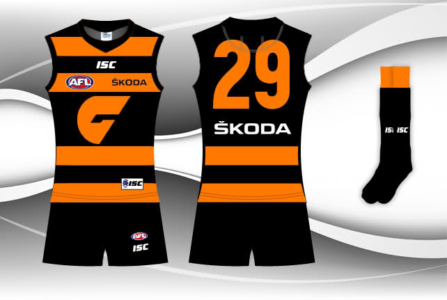
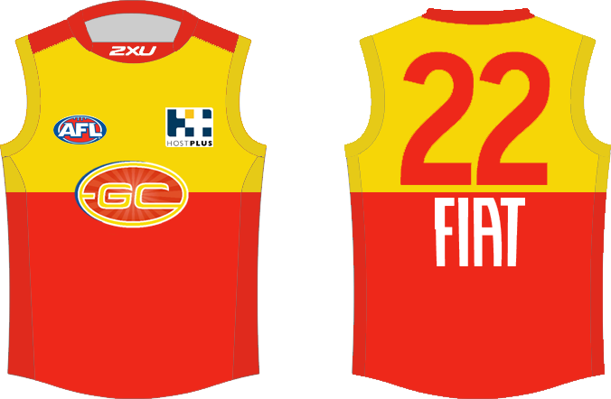
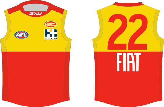
What about the guernsey being half red half yellow with no massive logo, just a small logo above the host plus logo
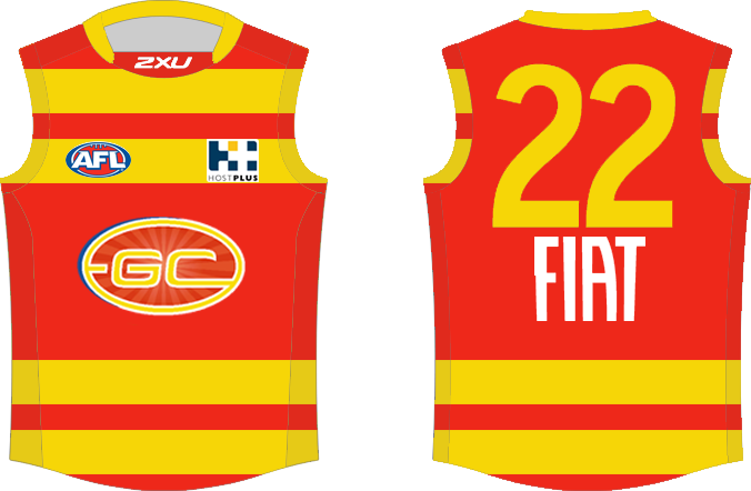
Great work. Agree also on the blue, also, how would it look with red stripes and yellow backing?
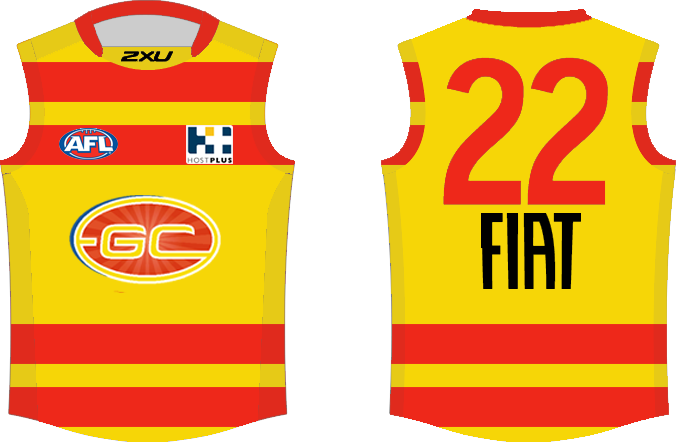
Great work again as usual. But I think the 1st attempt with the red backing and yellow stripes looks better.

thats awesome work..
Did they thank you?i actually did send off an email to the club with the designs i did from a few pages ago, and got a reply today. in their reply, they stated "our designs for 2015 have already been locked in". so make of that what you will haha.
 [URL='http://www.bomberblitz.com/mero/portaway.htm']
 [/URL]
yeah they did. they also said they'd pass on the designs to their manager for future reference.Did they thank you?
I hope they are filing them away, after all a 8 yo girl did a better job of designing the Port jumper than all the "professional" arts teams prior, check out these monstrosity's .
Totally agree, I think it would be good for the club to try a few designs while it is young. Soccer do it all the time and I would love to see a all black or Crows dark blue with the GC logo. The first ever members cards in 2009 had this and it looked wicked.yeah they did. they also said they'd pass on the designs to their manager for future reference.
similcity really does work well on most sports guernseys. freo and port's design change over the past few years really highlights that.