Freight Train
Once hit the sign at the Mercantile Mutual Cup
- Moderator
- #1,476
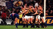
rigged it so they could use that jumper to also celebrate the 1994 premiership
They didn’t wear it in 1994 though…
Follow along with the video below to see how to install our site as a web app on your home screen.
Note: This feature may not be available in some browsers.
rigged it so they could use that jumper to also celebrate the 1994 premiership
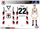
not as a main colour but I wouldnt mind a navy kit unsure if would slove clashes or could be used regularlyJust as long as the club isn't trying to sneak navy back in!
ah its the navy kit, my bad don't hate it but the Ocarhe was the better option, clearly riggedThey didn’t wear it in 1994 though…
Navy isn’t going to solve any clashes, when they already have a yellow strip.not as a main colour but I wouldnt mind a navy kit unsure if would slove clashes or could be used regularly
fair point did think that, made a navy version and it looks clean tho, but unessaceryNavy isn’t going to solve any clashes, when they already have a yellow strip.
 www.bigfooty.com

HOW DID THE OCHRE JUMPER LOSE THE VOTE
Maybe celebrating the year they were reigning premiersThey didn’t wear it in 1994 though…
Rather navy as a clash over the gold clash.Just as long as the club isn't trying to sneak navy back in!
I understand the gold as a call back to your first kit but would be nice to see something new and differntRather navy as a clash over the gold clash.
Rather navy as a clash over the gold clash.
I reckon there's a fair bit of truth to this, West Coast always feel very corporate and safe. Frankly surprised we're getting any retro jumper at allYeah I don’t believe for a second that the ochre didn’t win that vote, I’ve been saying for a while that west coast take themselves too seriously to wear a “bad” retro kit like Freo did with the 3D anchor.
Gold looks terrible as the base colour, navy is a stronger base colour. I would like to see a variation of the current Eagle logo with a navy base used as the alternative uniform.but why tho.
It's good as an alternative clash colour like they wore in the mid to late 90's, but I prefer royal blue as the home and main guernsey.Hot take here, I think the Eagles had the right idea when they moved to navy from royal blue. The problem is they botched the designs when they did it - both tripanels were far inferior to the wings, and the navy wings are nice but it'd look a lot nicer in the same arrangement as the original home jumper. The OG wings (either colourway) and the current wings are the best home jumpers the eagles have had but if they were navy that extra contrast would be elite. But even more importantly, the off field merch would look so much better in navy than royal it's not even funny.
.......Rather navy as a clash over the gold clash.
Wearing the colour gold with a gold Eagle is better than wearing navy with a gold Eagle? Surprised that's a controversial take, Hawthorn I thought were considered to have a bad uniform because they wear a gold coloured uniform........
I have no words
Disagree, I’d even like to see West Coast wear the gold jumper with blue shorts for one home game a year.Gold looks terrible as the base colour, navy is a stronger base colour. I would like to see a variation of the current Eagle logo with a navy base used as the alternative uniform.
It looks better with blue shorts, and they should change the Eagle to be royal blue on the gold clash uniform. But with white shorts, I would prefer a navy base uniform, similar to Melbourne's primary blue clash/navy home uniforms.Disagree, I’d even like to see West Coast wear the gold jumper with blue shorts for one home game a year.
But the navy wings should be in their set in some capacity (royal, gold and navy), I don’t know what purpose it would serve but it looks good.


I use to see that uniform on a lot of "worst guernseys ever" lists, so I'm not sure why people think it was a shoe in to win. It'd be like expecting the Power Rangers Hawthorn guernsey to win a popular vote against other uniforms.I reckon there's a fair bit of truth to this, West Coast always feel very corporate and safe. Frankly surprised we're getting any retro jumper at all
That's why I used Melbourne as an example, who only wear 2 variants of blue for both their home and clash uniforms.can I ask if you know how a clash jumper works? Ahahah
Realistically Melbourne should have a third red kit because the royal blue still clashes at times or at least isn’t the best possible lookThat's why I used Melbourne as an example, who only wear 2 variants of blue for both their home and clash uniforms.
