


Plus reminiscent of the great look from the 04 gfI agree for Freo, but I really like our black guernsey with white shorts as a look. Only when we're playing away and it's suitable
I know that's an odd opinion, given that i'm usually totally against the white shorts rule, but I think it works for us.
Navigation
Install the app
How to install the app on iOS
Follow along with the video below to see how to install our site as a web app on your home screen.
Note: This feature may not be available in some browsers.
More options
You are using an out of date browser. It may not display this or other websites correctly.
You should upgrade or use an alternative browser.
You should upgrade or use an alternative browser.
Discussion Question and Answer Thread
- Thread starter Gibbsy
- Start date
- Tagged users None
E92_
Premium Platinum
I hate how the freo jumper looked with white shorts. Glad they do the solid look now.
- Thread starter
- Moderator
- #2,303
You could also try PSe?
I wouldn't recommend PSe simply because they don't have layer sets (i.e. folders)
Still cheaper than CC. SortaI wouldn't recommend PSe simply because they don't have layer sets (i.e. folders)
The Half Back
BC Approved
Just got a 30 day free trial.
I have grown quite fond of paintbrush though....
I have grown quite fond of paintbrush though....
Greater Gattsby
♛ All Class ♛
- Oct 6, 2011
- 8,865
- 11,421
- AFL Club
- North Melbourne
- Other Teams
- Melbourne Victory | West Ham United
Make the most of it! Check out some tutorials and stuff on youtube, so you can really get a hold of why it's the best series of design software available.Just got a 30 day free trial.
I have grown quite fond of paintbrush though....
MKMatty
Busy Vibin’
I agree for Freo, but I really like our black guernsey with white shorts as a look. Only when we're playing away and it's suitable
I know that's an odd opinion, given that i'm usually totally against the white shorts rule, but I think it works for us.
I hate how the freo jumper looked with white shorts. Glad they do the solid look now.
I liked Freo in the home with white shorts, but for their colour set the solid look is better visually. Where as Port looks more menacing in their home jumper over their clash, so it works regardless of shorts colour.
Hey guys I updated the logo for my team and the Lion in the logo was quite small and I was wondering if there was a way to kind of make him less blurry as I expand him?
I've attached the logo and as you can see the Lion is blurry.
I mainly use paint.net also have Adobe CS6 (New to both)
I've attached the logo and as you can see the Lion is blurry.
I mainly use paint.net also have Adobe CS6 (New to both)
Attachments

The best thing to try would be vectorising the image. Try search for "vectorize bitmap" or a site called Vector Magic. Or, if you have CS6 and Illustrator, try tracing the image using the pen tool.Hey guys I updated the logo for my team and the Lion in the logo was quite small and I was wondering if there was a way to kind of make him less blurry as I expand him?
I've attached the logo and as you can see the Lion is blurry.
I mainly use paint.net also have Adobe CS6 (New to both)
Hi nolabah,Hey guys I updated the logo for my team and the Lion in the logo was quite small and I was wondering if there was a way to kind of make him less blurry as I expand him?
I've attached the logo and as you can see the Lion is blurry.
I mainly use paint.net also have Adobe CS6 (New to both)
The image of the lion you used is just a regular image, ala a 'raster' which is made up of pixels. Stretching this out will just stretch the pixels and you can't really enlarge it. What you can do is get a 'vector' image file of the lion (I'm sure someone uploaded the Fitzroy lion vector somewhere here... Stewart2Austin ?) and open it with Adobe Illustrator, if you have it with CS6. These can be enlarged to your hearts content and exported as high resolution are you like.
Mero
Norm Smith Medallist
Hey guys I updated the logo for my team and the Lion in the logo was quite small and I was wondering if there was a way to kind of make him less blurry as I expand him?
I've attached the logo and as you can see the Lion is blurry.
I mainly use paint.net also have Adobe CS6 (New to both)

What size do you need it?
E92_
Premium Platinum
Looks like a training jumper to me.
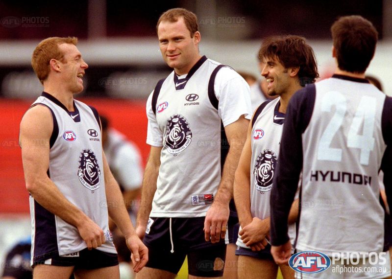
Perfect clash guernsey for them.Anyone know what year Carlton wore this ? Guessing it's a training Guernsey
- Thread starter
- Moderator
- #2,317
Here is said jumper from 2000, I can't find a picture from 2001 though – perhaps the Mayne logos were stitched on by the club but the guernseys were never used in training? Note the white numbers on a silver back; that'd be hard to read from a distance!

Does anyone have any experience with the Render Video export option in PS? I have made an animation in the timeline which I'd like with a transparent background exported in QuickTime MOV format, but when an alpha channel is added the objects come out jaggy.
Long shot, I guess.
Long shot, I guess.
MKMatty
Busy Vibin’
Whattaya reckon they're talking about? How big their contracts are?Here is said jumper from 2000, I can't find a picture from 2001 though – perhaps the Mayne logos were stitched on by the club but the guernseys were never used in training? Note the white numbers on a silver back; that'd be hard to read from a distance!
"I got a bigger under the table payment than you!!"
Fizzler
BBTB
- Dec 26, 2013
- 12,772
- 16,362
- AFL Club
- Port Adelaide
- Other Teams
- OKC, Coburg, Werribee, Storm, QPR
Klim and rabbitoh21 may know this
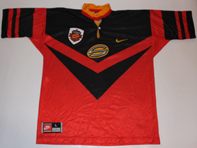
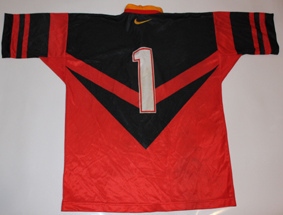
What did the back of the Perth reds jersey look like in 1997 (Superleague)
What did the back of the Perth reds jersey look like in 1997 (Superleague)
Klim
Brownlow Medallist
- Sep 17, 2013
- 12,532
- 10,363
- AFL Club
- Sydney
This may help.Klim and rabbitoh21 may know this
What did the back of the Perth reds jersey look like in 1997 (Superleague)
Klim and rabbitoh21 may know this
What did the back of the Perth reds jersey look like in 1997 (Superleague)
This may help.
Yep, the designs were the same on the front and back for all the teams.
Most of the SL jerseys were somewhat identical back to front. Any of the 1998 NRL jerseys of the clubs would reflect this somewhat.Klim and rabbitoh21 may know this
What did the back of the Perth reds jersey look like in 1997 (Superleague)
Dynamo MN BoldHey guys, not sure if this is the right thread but does anyone know what font is used for the old west coast 'EAGLES' logo and wording on the 90's wings jumper?
http://www.fontpalace.com/font-details/Dynamo+MN+Bold/
Similar threads
- Replies
- 48
- Views
- 2K
- Replies
- 61
- Views
- 3K
- Replies
- 2
- Views
- 247
