Discussion Soccer/Association Football New Kits

Remove this Banner Ad

Status
Not open for further replies.
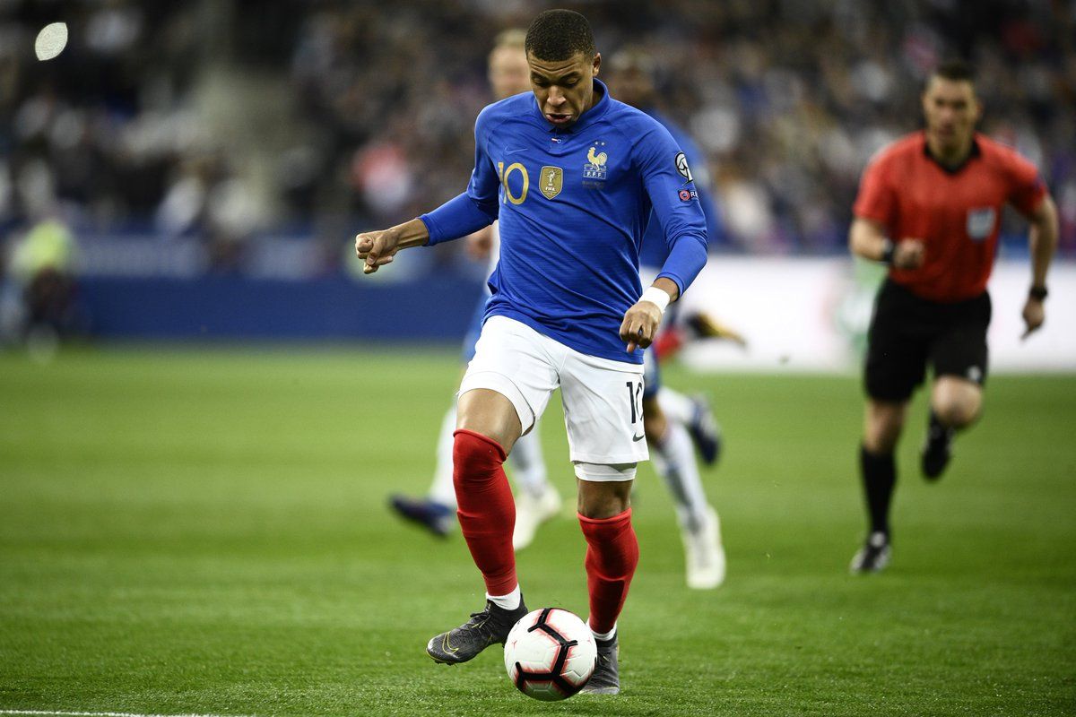
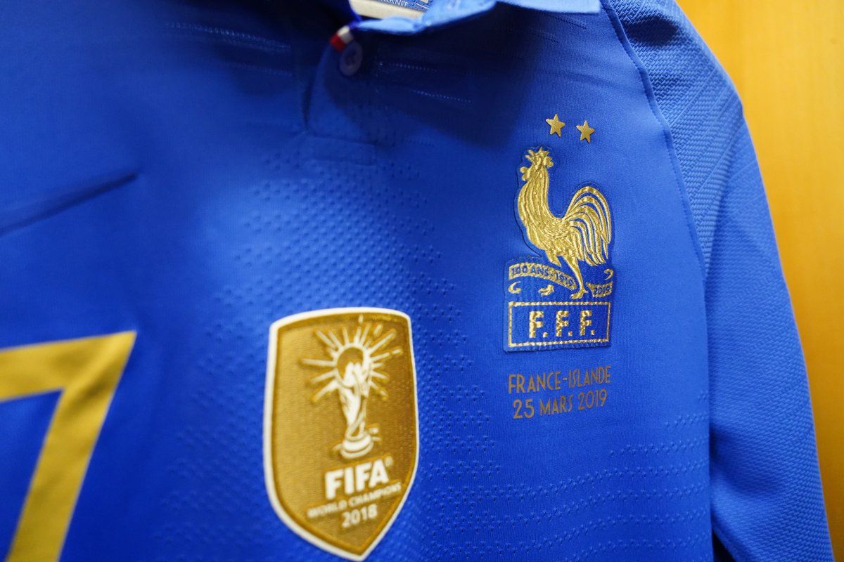
On the other hand, this looks class from nike, I kinda dig the proper button up collar on the vapor template.
nike-france-centenary-kit-2.jpg

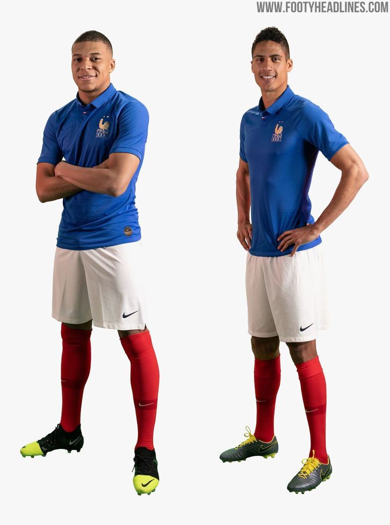
https://www.footyheadlines.com/2018/10/nike-france-centenary-kit.html

class touch by nike to mute their own logo and make the badge the standout.
 
manchester-city-mashup-jersey-2.jpg

https://www.footyheadlines.com/2019/03/nike-manchester-city-celebration-mashup-jersey.html

This whole 'mashup jersey' thing is getting a bit out of hand, made sense with Arsenal a few years back and Inter and Barca's ones this year were fine as they had/have been working together for a long time, but Man City? They've only been with nike for 6 years, a quarter of the shirt is this year's designs! The others were a kind of cool throwback, but this just screams 'one last cash grab' from nike.
player looks thrilled with it
 

Log in to remove this ad.

Yeah I'm all about that long sleeve:

on-pitch-nike-france-centenary-kit-5.jpg

on-pitch-nike-france-centenary-kit-4.jpg


Love the updated coq with the little scroll behind it.

The subtlety of the on-pitch strip is wrecked by the World Cup winners badge, the numbers, it just complicates it a little too much. And the blue is slightly too bright for me. But it's pretty cool, nice to see Nike throw it back a few years and go to more classic silhouettes.

Wonder how Euro will look next year?
 
roma-19-20-home-kit-2.jpg


Loving this cotton collar on the new AS Roma strip.

The one thing I really don't like about wearing modern shirts is the material. Nike, up until about 2010 and Umbro from that golden 2009-2011 period used really comfortable materials with cotton collars and cuffs which felt heavier and more t-shirt like, but all these recent ones are just polyester top to bottom.
 
Yeah I'm all about that long sleeve:

on-pitch-nike-france-centenary-kit-5.jpg

on-pitch-nike-france-centenary-kit-4.jpg


Love the updated coq with the little scroll behind it.

The subtlety of the on-pitch strip is wrecked by the World Cup winners badge, the numbers, it just complicates it a little too much. And the blue is slightly too bright for me. But it's pretty cool, nice to see Nike throw it back a few years and go to more classic silhouettes.

Wonder how Euro will look next year?

The World Cup winners badge really is an eyesore, it ruined the Germany kit before it too.
 
Juventus 19/20 home:

juventus-19-20-home-kit-2.jpg
juventus-19-20-home-kit-5.jpg


Real Madrid 19/20 third:

real-madrid-19-20-third-kit-2.jpg

Weird Footyheadlines are reporting on that Juve one - I’d honestly expect that to be a fake.
 
Watford 2019/20 kit ;)

https://www.watfordfc.com/teams/fir...t-re-leaked-imagery-201920-watford-home-shirt

Club Statement: Re: Leaked Imagery Of 2019/20 Watford Home Shirt
Watford FC are aware of images circulating on social media suggesting the final design of the Club’s home shirt for the 2019/20 campaign, however the Club would like to confirm that these are false.

In a bid to clear up any confusion relating to these images, Watford have taken the frustrating decision to bring forward the launch date of the official 2019/20 home strip to April 1.
Screenshot%202019-04-01%20at%2009.14.14.png

Vividly using the Club’s primary three colours, a striking lattice design pays homage to what will be the Golden Boys’ 13th season in the top-flight, with each coloured diamond representing an individual campaign throughout our history.

The shirt has been created using a revolutionary meshed fibre that regulates body temperature and controls sweating, meaning each player need only worry about their performance on the pitch.

Lightweight and machine washable, the strip fully embodies the Club’s values of empowerment, togetherness and diversity in stunning fashion.
We acknowledge that the debate over red or black shorts has divided fans for years and so, with a view to bridging that rift, the new strip includes the bold choice of alabaster white shorts, with the lattice design also woven into the yellow socks to complete the prominent ensemble.

The Club will also be undertaking a complete security audit across the business to ensure absolutely no details are revealed of the all navy-blue away strip for the 2019/20 season.
 

(Log in to remove this ad.)

Status
Not open for further replies.

Remove this Banner Ad

Back
Top