Andonis1997
Sporting masochist
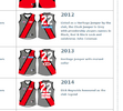
Well this photo also appeared on that website you linked, 11 May 1912:I would speculate that the 1912 version may have been new jumpers issued as they were the first jumpers with numbers on them.
Perhaps they had to get a new set, with numbers, and got a less detailed monogram sewn on.
Then at the end of that season determined the scripted monogram was what they wanted.
I would be interested in more photos than can be found at this site:
| Carlton Team Photos
www.hiddenfootyhistories.org
And a really good front on image of the 1912 monogram would be helpful
Looks like every version of it is slightly different to the next. I came up with this
View attachment 2365559
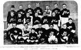
They also reference Blueseum so they're interchangable sources at this stage, but can't seem to find any others.
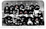
It definitely looks like both the top of the Γ and C have a 'ribbon' design like you've got on the skinnier C already, however not the middle '-' of the F. I'll keep digging.
I'd argue though that the large C is a bit more circular too, but that's a very good start. If you reduce the width of the F and the large C, I think that will pretty much get us there for the basic shape. Old mate in the middle row (on the right) would be the perfect large C I think. I drew in blue where the notches in the FC are, as well as the flat part in the '-'.
Next when I get the chance, I'm going to try pull apart the 1927 monogram - looking a bit too angular for my liking
 Thanks Mero!


