Remove this Banner Ad

Workshop Jumper Ideas for 2026

  • Thread starter Thread starter Rubber Arm
  • Start date Start date
  • Tagged users Tagged users None

🥰 Love BigFooty? Join now for free.

Status
Not open for further replies.
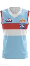
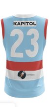
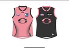
Gold coast have almost fallen arse backwards into an opportunity to have a bold, unique identity with the pink. I'd just lean into it and embrace it 100%. Wear it as much as possible in the finals and really solidify it if they do well.
 
The pink is just a novelty, no way it persists or stays relevant after constant exposure to it.

Pink has had a few moments. that blink 182, Bam Margera era of 2003-2006 and then again around 2013-2015 in sport (Miami Heat, adidas away football kits) and looking back it’s all pretty much clearly just a moment, there’s nothing longlasting feeling to it.

The only reason it’s successful is because everything else about the redesign was so poorly done.
Kinda agree with this, I really liked the Suns pink guernsey when they first wore it in gather round but I’ve liked it less and less each time since.

Wear it twice a year (gather round and a special themed home game) and have an actual red and gold jumper for their home guernsey.
 
Last edited:

Log in to remove this Banner Ad

The pink is just a novelty, no way it persists or stays relevant after constant exposure to it.

Pink has had a few moments. that blink 182, Bam Margera era of 2003-2006 and then again around 2013-2015 in sport (Miami Heat, adidas away football kits) and looking back it’s all pretty much clearly just a moment, there’s nothing longlasting feeling to it.

The only reason it’s successful is because everything else about the redesign was so poorly done.

That’s not really true. There’s Palermo, Inter Miami, Stade Francais, Sydney Sixers, Rajasthan Royals who all use pink as a big part of their brand. There’s no reason Gold Coast couldn’t do the same.
 
That’s not really true. There’s Palermo, Inter Miami, Stade Francais, Sydney Sixers, Rajasthan Royals who all use pink as a big part of their brand. There’s no reason Gold Coast couldn’t do the same.
There’s basically no consistency here - T20 teams choose kooky colours to stand out, Palermo is a hundred year old football club and anomaly.

The Suns rebrand is even worse than their original image and their pink jumper basically makes no sense, it appeals to children and people on here like it because it’s novel. It has zero association with the team or area and the core design is rubbish.

The lack of consistency between the examples is a good thing.

The Suns are a new club so anything can “make sense” for them. Pink sunsets, done. No less contrived than the red/yellow colourway that was likely selected because the rest of the league is mostly some black or blue variation. Pink can and does work.
 
There’s basically no consistency here - T20 teams choose kooky colours to stand out, Palermo is a hundred year old football club and anomaly.

The Suns rebrand is even worse than their original image and their pink jumper basically makes no sense, it appeals to children and people on here like it because it’s novel. It has zero association with the team or area and the core design is rubbish.
Gold Coast fans seem to like the pink.
 
Changing to the pink as the main colour seems like a win for all involved. Gives the team a much more distinct identity from the other red-gold-blue sides, gives the fans more attractive merch options and fixes a lot of the branding issues that they’ve had since their inception.
 
Changing to the pink as the main colour seems like a win for all involved. Gives the team a much more distinct identity from the other red-gold-blue sides, gives the fans more attractive merch options and fixes a lot of the branding issues that they’ve had since their inception.
Agreed. And doesn't mean they can't have a red away guernsey or clash.
 
My only issue with the pink so far, is the use of Grey as the second colour. Not saying it feels too similar to the GWS branding of Orange/Grey with having (not the same as orange but similar) Pink/Grey.

Just doesn't sit right with me that GC do a similar enough brand to us. I'd be fine with Pink, Black, Blue (or yellow) as a Miami Vice theme, but just not only Pink/Grey
 

Remove this Banner Ad

My only issue with the pink so far, is the use of Grey as the second colour. Not saying it feels too similar to the GWS branding of Orange/Grey with having (not the same as orange but similar) Pink/Grey.

Just doesn't sit right with me that GC do a similar enough brand to us. I'd be fine with Pink, Black, Blue (or yellow) as a Miami Vice theme, but just not only Pink/Grey
Pink, black and red?
 
My only issue with the pink so far, is the use of Grey as the second colour. Not saying it feels too similar to the GWS branding of Orange/Grey with having (not the same as orange but similar) Pink/Grey.

Just doesn't sit right with me that GC do a similar enough brand to us. I'd be fine with Pink, Black, Blue (or yellow) as a Miami Vice theme, but just not only Pink/Grey
i have to agree - i think it should be a midnight blue for shorts and the charcoal features.
and then i think there should be an inverse for the Qclash and away games in NSW

ill try mock these up unless someone else wants to
 
what I reckon each team should have
 

Attachments

  • IMG_1381.jpeg
    IMG_1381.jpeg
    105 KB · Views: 62
  • IMG_1382.jpeg
    IMG_1382.jpeg
    136.9 KB · Views: 56
  • IMG_1384.jpeg
    IMG_1384.jpeg
    81.8 KB · Views: 50
  • IMG_1385.jpeg
    IMG_1385.jpeg
    103.8 KB · Views: 44
  • IMG_1386.jpeg
    IMG_1386.jpeg
    95.3 KB · Views: 46
  • IMG_1387.jpeg
    IMG_1387.jpeg
    91.8 KB · Views: 42
  • IMG_1388.jpeg
    IMG_1388.jpeg
    135.9 KB · Views: 44
  • IMG_1389.jpeg
    IMG_1389.jpeg
    147 KB · Views: 41
  • IMG_1390.jpeg
    IMG_1390.jpeg
    135.3 KB · Views: 46
  • IMG_1391.jpeg
    IMG_1391.jpeg
    112 KB · Views: 48
  • IMG_1392.jpeg
    IMG_1392.jpeg
    94.6 KB · Views: 47
  • IMG_1393.jpeg
    IMG_1393.jpeg
    110.2 KB · Views: 49
  • IMG_1394.jpeg
    IMG_1394.jpeg
    108.5 KB · Views: 44
  • IMG_1395.jpeg
    IMG_1395.jpeg
    100 KB · Views: 43
  • IMG_1396.jpeg
    IMG_1396.jpeg
    99.8 KB · Views: 39
  • IMG_1397.jpeg
    IMG_1397.jpeg
    97.8 KB · Views: 43
  • IMG_1398.jpeg
    IMG_1398.jpeg
    127.9 KB · Views: 47
  • IMG_1399.jpeg
    IMG_1399.jpeg
    99.5 KB · Views: 65
My only issue with the pink so far, is the use of Grey as the second colour. Not saying it feels too similar to the GWS branding of Orange/Grey with having (not the same as orange but similar) Pink/Grey.

Just doesn't sit right with me that GC do a similar enough brand to us. I'd be fine with Pink, Black, Blue (or yellow) as a Miami Vice theme, but just not only Pink/Grey
Yeah definitely agree. It's tricky to come up with a good secondary colour for pink though, or at least one that's different enough from GWS. Navy blue would be nice but that would be a huge departure from their current branding, not sure they'd want to do that.
 
Yeah definitely agree. It's tricky to come up with a good secondary colour for pink though, or at least one that's different enough from GWS. Navy blue would be nice but that would be a huge departure from their current branding, not sure they'd want to do that.
Would it?
Screenshot_20250805_171714_Samsung Internet.jpg
Sure, it's the most miniscule part of their home guernsey, but this blue looks navy every time I see it on TV.
 
Last edited:
The AFLW side have been using this combo for training kit, I'm not the biggest fan of the blue but it gives a rough idea as to what pink and a lighter blue could look like. I'd prefer black to be the second colour alongside pink and have blue as the tertiary though.

1754382992217.png
 

🥰 Love BigFooty? Join now for free.

Going with a Chicago Bulls pinstripe inspired Essendon clash. Was unsure the white on the collar would make it too much like St Kilda but I think it just provides some contrast and ties in with the number and logo while still giving strong Bombers vibes.

1754393511256.png
 
The AFLW side have been using this combo for training kit, I'm not the biggest fan of the blue but it gives a rough idea as to what pink and a lighter blue could look like. I'd prefer black to be the second colour alongside pink and have blue as the tertiary though.

View attachment 2386939

Needs to be a darker midnight blue and a more vibrant pink.

IMG_5620.jpeg
 
Status
Not open for further replies.

Remove this Banner Ad

Remove this Banner Ad

🥰 Love BigFooty? Join now for free.

Back
Top Bottom